Compare commits
| Author | SHA1 | Date | |
|---|---|---|---|
 Hooray Hooray
|
42a0a8cf8f | ||
|
Hooray
|
3e02a0d9cf | ||
|
Hooray
|
b9bcd67ffe | ||
|
Hooray
|
b25955d8e8 | ||
|
Hooray
|
a476217ffd | ||
|
Hooray
|
c916a5dc0a | ||
|
Hooray
|
5f580bbf00 | ||
|
Hooray
|
499a4e8d9c | ||
|
Hooray
|
268ce5cca9 | ||
|
Hooray
|
36634f2b15 | ||
|
Hooray
|
b6ff0d1625 | ||
|
Hooray
|
ecf4040aac | ||
|
Hooray
|
e09a4c67e4 | ||
|
Hooray
|
132cfdef46 | ||
|
Hooray
|
528044ac85 | ||
|
Hooray
|
7cf493a6f8 | ||
|
Hooray
|
8bef84cec2 | ||
|
Hooray
|
169f4d5701 | ||
|
Hooray
|
ed1ff3e2ab |
@@ -0,0 +1,226 @@
|
||||
---
|
||||
name: design-taste-frontend
|
||||
description: Senior UI/UX Engineer. Architect digital interfaces overriding default LLM biases. Enforces metric-based rules, strict component architecture, CSS hardware acceleration, and balanced design engineering.
|
||||
---
|
||||
|
||||
# High-Agency Frontend Skill
|
||||
|
||||
## 1. ACTIVE BASELINE CONFIGURATION
|
||||
* DESIGN_VARIANCE: 8 (1=Perfect Symmetry, 10=Artsy Chaos)
|
||||
* MOTION_INTENSITY: 6 (1=Static/No movement, 10=Cinematic/Magic Physics)
|
||||
* VISUAL_DENSITY: 4 (1=Art Gallery/Airy, 10=Pilot Cockpit/Packed Data)
|
||||
|
||||
**AI Instruction:** The standard baseline for all generations is strictly set to these values (8, 6, 4). Do not ask the user to edit this file. Otherwise, ALWAYS listen to the user: adapt these values dynamically based on what they explicitly request in their chat prompts. Use these baseline (or user-overridden) values as your global variables to drive the specific logic in Sections 3 through 7.
|
||||
|
||||
## 2. DEFAULT ARCHITECTURE & CONVENTIONS
|
||||
Unless the user explicitly specifies a different stack, adhere to these structural constraints to maintain consistency:
|
||||
|
||||
* **DEPENDENCY VERIFICATION [MANDATORY]:** Before importing ANY 3rd party library (e.g. `framer-motion`, `lucide-react`, `zustand`), you MUST check `package.json`. If the package is missing, you MUST output the installation command (e.g. `npm install package-name`) before providing the code. **Never** assume a library exists.
|
||||
* **Framework & Interactivity:** React or Next.js. Default to Server Components (`RSC`).
|
||||
* **RSC SAFETY:** Global state works ONLY in Client Components. In Next.js, wrap providers in a `"use client"` component.
|
||||
* **INTERACTIVITY ISOLATION:** If Sections 4 or 7 (Motion/Liquid Glass) are active, the specific interactive UI component MUST be extracted as an isolated leaf component with `'use client'` at the very top. Server Components must exclusively render static layouts.
|
||||
* **State Management:** Use local `useState`/`useReducer` for isolated UI. Use global state strictly for deep prop-drilling avoidance.
|
||||
* **Styling Policy:** Use Tailwind CSS (v3/v4) for 90% of styling.
|
||||
* **TAILWIND VERSION LOCK:** Check `package.json` first. Do not use v4 syntax in v3 projects.
|
||||
* **T4 CONFIG GUARD:** For v4, do NOT use `tailwindcss` plugin in `postcss.config.js`. Use `@tailwindcss/postcss` or the Vite plugin.
|
||||
* **ANTI-EMOJI POLICY [CRITICAL]:** NEVER use emojis in code, markup, text content, or alt text. Replace symbols with high-quality icons (Radix, Phosphor) or clean SVG primitives. Emojis are BANNED.
|
||||
* **Responsiveness & Spacing:**
|
||||
* Standardize breakpoints (`sm`, `md`, `lg`, `xl`).
|
||||
* Contain page layouts using `max-w-[1400px] mx-auto` or `max-w-7xl`.
|
||||
* **Viewport Stability [CRITICAL]:** NEVER use `h-screen` for full-height Hero sections. ALWAYS use `min-h-[100dvh]` to prevent catastrophic layout jumping on mobile browsers (iOS Safari).
|
||||
* **Grid over Flex-Math:** NEVER use complex flexbox percentage math (`w-[calc(33%-1rem)]`). ALWAYS use CSS Grid (`grid grid-cols-1 md:grid-cols-3 gap-6`) for reliable structures.
|
||||
* **Icons:** You MUST use exactly `@phosphor-icons/react` or `@radix-ui/react-icons` as the import paths (check installed version). Standardize `strokeWidth` globally (e.g., exclusively use `1.5` or `2.0`).
|
||||
|
||||
|
||||
## 3. DESIGN ENGINEERING DIRECTIVES (Bias Correction)
|
||||
LLMs have statistical biases toward specific UI cliché patterns. Proactively construct premium interfaces using these engineered rules:
|
||||
|
||||
**Rule 1: Deterministic Typography**
|
||||
* **Display/Headlines:** Default to `text-4xl md:text-6xl tracking-tighter leading-none`.
|
||||
* **ANTI-SLOP:** Discourage `Inter` for "Premium" or "Creative" vibes. Force unique character using `Geist`, `Outfit`, `Cabinet Grotesk`, or `Satoshi`.
|
||||
* **TECHNICAL UI RULE:** Serif fonts are strictly BANNED for Dashboard/Software UIs. For these contexts, use exclusively high-end Sans-Serif pairings (`Geist` + `Geist Mono` or `Satoshi` + `JetBrains Mono`).
|
||||
* **Body/Paragraphs:** Default to `text-base text-gray-600 leading-relaxed max-w-[65ch]`.
|
||||
|
||||
**Rule 2: Color Calibration**
|
||||
* **Constraint:** Max 1 Accent Color. Saturation < 80%.
|
||||
* **THE LILA BAN:** The "AI Purple/Blue" aesthetic is strictly BANNED. No purple button glows, no neon gradients. Use absolute neutral bases (Zinc/Slate) with high-contrast, singular accents (e.g. Emerald, Electric Blue, or Deep Rose).
|
||||
* **COLOR CONSISTENCY:** Stick to one palette for the entire output. Do not fluctuate between warm and cool grays within the same project.
|
||||
|
||||
**Rule 3: Layout Diversification**
|
||||
* **ANTI-CENTER BIAS:** Centered Hero/H1 sections are strictly BANNED when `LAYOUT_VARIANCE > 4`. Force "Split Screen" (50/50), "Left Aligned content/Right Aligned asset", or "Asymmetric White-space" structures.
|
||||
|
||||
**Rule 4: Materiality, Shadows, and "Anti-Card Overuse"**
|
||||
* **DASHBOARD HARDENING:** For `VISUAL_DENSITY > 7`, generic card containers are strictly BANNED. Use logic-grouping via `border-t`, `divide-y`, or purely negative space. Data metrics should breathe without being boxed in unless elevation (z-index) is functionally required.
|
||||
* **Execution:** Use cards ONLY when elevation communicates hierarchy. When a shadow is used, tint it to the background hue.
|
||||
|
||||
**Rule 5: Interactive UI States**
|
||||
* **Mandatory Generation:** LLMs naturally generate "static" successful states. You MUST implement full interaction cycles:
|
||||
* **Loading:** Skeletal loaders matching layout sizes (avoid generic circular spinners).
|
||||
* **Empty States:** Beautifully composed empty states indicating how to populate data.
|
||||
* **Error States:** Clear, inline error reporting (e.g., forms).
|
||||
* **Tactile Feedback:** On `:active`, use `-translate-y-[1px]` or `scale-[0.98]` to simulate a physical push indicating success/action.
|
||||
|
||||
**Rule 6: Data & Form Patterns**
|
||||
* **Forms:** Label MUST sit above input. Helper text is optional but should exist in markup. Error text below input. Use a standard `gap-2` for input blocks.
|
||||
|
||||
## 4. CREATIVE PROACTIVITY (Anti-Slop Implementation)
|
||||
To actively combat generic AI designs, systematically implement these high-end coding concepts as your baseline:
|
||||
* **"Liquid Glass" Refraction:** When glassmorphism is needed, go beyond `backdrop-blur`. Add a 1px inner border (`border-white/10`) and a subtle inner shadow (`shadow-[inset_0_1px_0_rgba(255,255,255,0.1)]`) to simulate physical edge refraction.
|
||||
* **Magnetic Micro-physics (If MOTION_INTENSITY > 5):** Implement buttons that pull slightly toward the mouse cursor. **CRITICAL:** NEVER use React `useState` for magnetic hover or continuous animations. Use EXCLUSIVELY Framer Motion's `useMotionValue` and `useTransform` outside the React render cycle to prevent performance collapse on mobile.
|
||||
* **Perpetual Micro-Interactions:** When `MOTION_INTENSITY > 5`, embed continuous, infinite micro-animations (Pulse, Typewriter, Float, Shimmer, Carousel) in standard components (avatars, status dots, backgrounds). Apply premium Spring Physics (`type: "spring", stiffness: 100, damping: 20`) to all interactive elements—no linear easing.
|
||||
* **Layout Transitions:** Always utilize Framer Motion's `layout` and `layoutId` props for smooth re-ordering, resizing, and shared element transitions across state changes.
|
||||
* **Staggered Orchestration:** Do not mount lists or grids instantly. Use `staggerChildren` (Framer) or CSS cascade (`animation-delay: calc(var(--index) * 100ms)`) to create sequential waterfall reveals. **CRITICAL:** For `staggerChildren`, the Parent (`variants`) and Children MUST reside in the identical Client Component tree. If data is fetched asynchronously, pass the data as props into a centralized Parent Motion wrapper.
|
||||
|
||||
## 5. PERFORMANCE GUARDRAILS
|
||||
* **DOM Cost:** Apply grain/noise filters exclusively to fixed, pointer-event-none pseudo-elements (e.g., `fixed inset-0 z-50 pointer-events-none`) and NEVER to scrolling containers to prevent continuous GPU repaints and mobile performance degradation.
|
||||
* **Hardware Acceleration:** Never animate `top`, `left`, `width`, or `height`. Animate exclusively via `transform` and `opacity`.
|
||||
* **Z-Index Restraint:** NEVER spam arbitrary `z-50` or `z-10` unprompted. Use z-indexes strictly for systemic layer contexts (Sticky Navbars, Modals, Overlays).
|
||||
|
||||
## 6. TECHNICAL REFERENCE (Dial Definitions)
|
||||
|
||||
### DESIGN_VARIANCE (Level 1-10)
|
||||
* **1-3 (Predictable):** Flexbox `justify-center`, strict 12-column symmetrical grids, equal paddings.
|
||||
* **4-7 (Offset):** Use `margin-top: -2rem` overlapping, varied image aspect ratios (e.g., 4:3 next to 16:9), left-aligned headers over center-aligned data.
|
||||
* **8-10 (Asymmetric):** Masonry layouts, CSS Grid with fractional units (e.g., `grid-template-columns: 2fr 1fr 1fr`), massive empty zones (`padding-left: 20vw`).
|
||||
* **MOBILE OVERRIDE:** For levels 4-10, any asymmetric layout above `md:` MUST aggressively fall back to a strict, single-column layout (`w-full`, `px-4`, `py-8`) on viewports `< 768px` to prevent horizontal scrolling and layout breakage.
|
||||
|
||||
### MOTION_INTENSITY (Level 1-10)
|
||||
* **1-3 (Static):** No automatic animations. CSS `:hover` and `:active` states only.
|
||||
* **4-7 (Fluid CSS):** Use `transition: all 0.3s cubic-bezier(0.16, 1, 0.3, 1)`. Use `animation-delay` cascades for load-ins. Focus strictly on `transform` and `opacity`. Use `will-change: transform` sparingly.
|
||||
* **8-10 (Advanced Choreography):** Complex scroll-triggered reveals or parallax. Use Framer Motion hooks. NEVER use `window.addEventListener('scroll')`.
|
||||
|
||||
### VISUAL_DENSITY (Level 1-10)
|
||||
* **1-3 (Art Gallery Mode):** Lots of white space. Huge section gaps. Everything feels very expensive and clean.
|
||||
* **4-7 (Daily App Mode):** Normal spacing for standard web apps.
|
||||
* **8-10 (Cockpit Mode):** Tiny paddings. No card boxes; just 1px lines to separate data. Everything is packed. **Mandatory:** Use Monospace (`font-mono`) for all numbers.
|
||||
|
||||
## 7. AI TELLS (Forbidden Patterns)
|
||||
To guarantee a premium, non-generic output, you MUST strictly avoid these common AI design signatures unless explicitly requested:
|
||||
|
||||
### Visual & CSS
|
||||
* **NO Neon/Outer Glows:** Do not use default `box-shadow` glows or auto-glows. Use inner borders or subtle tinted shadows.
|
||||
* **NO Pure Black:** Never use `#000000`. Use Off-Black, Zinc-950, or Charcoal.
|
||||
* **NO Oversaturated Accents:** Desaturate accents to blend elegantly with neutrals.
|
||||
* **NO Excessive Gradient Text:** Do not use text-fill gradients for large headers.
|
||||
* **NO Custom Mouse Cursors:** They are outdated and ruin performance/accessibility.
|
||||
|
||||
### Typography
|
||||
* **NO Inter Font:** Banned. Use `Geist`, `Outfit`, `Cabinet Grotesk`, or `Satoshi`.
|
||||
* **NO Oversized H1s:** The first heading should not scream. Control hierarchy with weight and color, not just massive scale.
|
||||
* **Serif Constraints:** Use Serif fonts ONLY for creative/editorial designs. **NEVER** use Serif on clean Dashboards.
|
||||
|
||||
### Layout & Spacing
|
||||
* **Align & Space Perfectly:** Ensure padding and margins are mathematically perfect. Avoid floating elements with awkward gaps.
|
||||
* **NO 3-Column Card Layouts:** The generic "3 equal cards horizontally" feature row is BANNED. Use a 2-column Zig-Zag, asymmetric grid, or horizontal scrolling approach instead.
|
||||
|
||||
### Content & Data (The "Jane Doe" Effect)
|
||||
* **NO Generic Names:** "John Doe", "Sarah Chan", or "Jack Su" are banned. Use highly creative, realistic-sounding names.
|
||||
* **NO Generic Avatars:** DO NOT use standard SVG "egg" or Lucide user icons for avatars. Use creative, believable photo placeholders or specific styling.
|
||||
* **NO Fake Numbers:** Avoid predictable outputs like `99.99%`, `50%`, or basic phone numbers (`1234567`). Use organic, messy data (`47.2%`, `+1 (312) 847-1928`).
|
||||
* **NO Startup Slop Names:** "Acme", "Nexus", "SmartFlow". Invent premium, contextual brand names.
|
||||
* **NO Filler Words:** Avoid AI copywriting clichés like "Elevate", "Seamless", "Unleash", or "Next-Gen". Use concrete verbs.
|
||||
|
||||
### External Resources & Components
|
||||
* **NO Broken Unsplash Links:** Do not use Unsplash. Use absolute, reliable placeholders like `https://picsum.photos/seed/{random_string}/800/600` or SVG UI Avatars.
|
||||
* **shadcn/ui Customization:** You may use `shadcn/ui`, but NEVER in its generic default state. You MUST customize the radii, colors, and shadows to match the high-end project aesthetic.
|
||||
* **Production-Ready Cleanliness:** Code must be extremely clean, visually striking, memorable, and meticulously refined in every detail.
|
||||
|
||||
## 8. THE CREATIVE ARSENAL (High-End Inspiration)
|
||||
Do not default to generic UI. Pull from this library of advanced concepts to ensure the output is visually striking and memorable. When appropriate, leverage **GSAP (ScrollTrigger/Parallax)** for complex scrolltelling or **ThreeJS/WebGL** for 3D/Canvas animations, rather than basic CSS motion. **CRITICAL:** Never mix GSAP/ThreeJS with Framer Motion in the same component tree. Default to Framer Motion for UI/Bento interactions. Use GSAP/ThreeJS EXCLUSIVELY for isolated full-page scrolltelling or canvas backgrounds, wrapped in strict useEffect cleanup blocks.
|
||||
|
||||
### The Standard Hero Paradigm
|
||||
* Stop doing centered text over a dark image. Try asymmetric Hero sections: Text cleanly aligned to the left or right. The background should feature a high-quality, relevant image with a subtle stylistic fade (darkening or lightening gracefully into the background color depending on if it is Light or Dark mode).
|
||||
|
||||
### Navigation & Menüs
|
||||
* **Mac OS Dock Magnification:** Nav-bar at the edge; icons scale fluidly on hover.
|
||||
* **Magnetic Button:** Buttons that physically pull toward the cursor.
|
||||
* **Gooey Menu:** Sub-items detach from the main button like a viscous liquid.
|
||||
* **Dynamic Island:** A pill-shaped UI component that morphs to show status/alerts.
|
||||
* **Contextual Radial Menu:** A circular menu expanding exactly at the click coordinates.
|
||||
* **Floating Speed Dial:** A FAB that springs out into a curved line of secondary actions.
|
||||
* **Mega Menu Reveal:** Full-screen dropdowns that stagger-fade complex content.
|
||||
|
||||
### Layout & Grids
|
||||
* **Bento Grid:** Asymmetric, tile-based grouping (e.g., Apple Control Center).
|
||||
* **Masonry Layout:** Staggered grid without fixed row heights (e.g., Pinterest).
|
||||
* **Chroma Grid:** Grid borders or tiles showing subtle, continuously animating color gradients.
|
||||
* **Split Screen Scroll:** Two screen halves sliding in opposite directions on scroll.
|
||||
* **Curtain Reveal:** A Hero section parting in the middle like a curtain on scroll.
|
||||
|
||||
### Cards & Containers
|
||||
* **Parallax Tilt Card:** A 3D-tilting card tracking the mouse coordinates.
|
||||
* **Spotlight Border Card:** Card borders that illuminate dynamically under the cursor.
|
||||
* **Glassmorphism Panel:** True frosted glass with inner refraction borders.
|
||||
* **Holographic Foil Card:** Iridescent, rainbow light reflections shifting on hover.
|
||||
* **Tinder Swipe Stack:** A physical stack of cards the user can swipe away.
|
||||
* **Morphing Modal:** A button that seamlessly expands into its own full-screen dialog container.
|
||||
|
||||
### Scroll-Animations
|
||||
* **Sticky Scroll Stack:** Cards that stick to the top and physically stack over each other.
|
||||
* **Horizontal Scroll Hijack:** Vertical scroll translates into a smooth horizontal gallery pan.
|
||||
* **Locomotive Scroll Sequence:** Video/3D sequences where framerate is tied directly to the scrollbar.
|
||||
* **Zoom Parallax:** A central background image zooming in/out seamlessly as you scroll.
|
||||
* **Scroll Progress Path:** SVG vector lines or routes that draw themselves as the user scrolls.
|
||||
* **Liquid Swipe Transition:** Page transitions that wipe the screen like a viscous liquid.
|
||||
|
||||
### Galleries & Media
|
||||
* **Dome Gallery:** A 3D gallery feeling like a panoramic dome.
|
||||
* **Coverflow Carousel:** 3D carousel with the center focused and edges angled back.
|
||||
* **Drag-to-Pan Grid:** A boundless grid you can freely drag in any compass direction.
|
||||
* **Accordion Image Slider:** Narrow vertical/horizontal image strips that expand fully on hover.
|
||||
* **Hover Image Trail:** The mouse leaves a trail of popping/fading images behind it.
|
||||
* **Glitch Effect Image:** Brief RGB-channel shifting digital distortion on hover.
|
||||
|
||||
### Typography & Text
|
||||
* **Kinetic Marquee:** Endless text bands that reverse direction or speed up on scroll.
|
||||
* **Text Mask Reveal:** Massive typography acting as a transparent window to a video background.
|
||||
* **Text Scramble Effect:** Matrix-style character decoding on load or hover.
|
||||
* **Circular Text Path:** Text curved along a spinning circular path.
|
||||
* **Gradient Stroke Animation:** Outlined text with a gradient continuously running along the stroke.
|
||||
* **Kinetic Typography Grid:** A grid of letters dodging or rotating away from the cursor.
|
||||
|
||||
### Micro-Interactions & Effects
|
||||
* **Particle Explosion Button:** CTAs that shatter into particles upon success.
|
||||
* **Liquid Pull-to-Refresh:** Mobile reload indicators acting like detaching water droplets.
|
||||
* **Skeleton Shimmer:** Shifting light reflections moving across placeholder boxes.
|
||||
* **Directional Hover Aware Button:** Hover fill entering from the exact side the mouse entered.
|
||||
* **Ripple Click Effect:** Visual waves rippling precisely from the click coordinates.
|
||||
* **Animated SVG Line Drawing:** Vectors that draw their own contours in real-time.
|
||||
* **Mesh Gradient Background:** Organic, lava-lamp-like animated color blobs.
|
||||
* **Lens Blur Depth:** Dynamic focus blurring background UI layers to highlight a foreground action.
|
||||
|
||||
## 9. THE "MOTION-ENGINE" BENTO PARADIGM
|
||||
When generating modern SaaS dashboards or feature sections, you MUST utilize the following "Bento 2.0" architecture and motion philosophy. This goes beyond static cards and enforces a "Vercel-core meets Dribbble-clean" aesthetic heavily reliant on perpetual physics.
|
||||
|
||||
### A. Core Design Philosophy
|
||||
* **Aesthetic:** High-end, minimal, and functional.
|
||||
* **Palette:** Background in `#f9fafb`. Cards are pure white (`#ffffff`) with a 1px border of `border-slate-200/50`.
|
||||
* **Surfaces:** Use `rounded-[2.5rem]` for all major containers. Apply a "diffusion shadow" (a very light, wide-spreading shadow, e.g., `shadow-[0_20px_40px_-15px_rgba(0,0,0,0.05)]`) to create depth without clutter.
|
||||
* **Typography:** Strict `Geist`, `Satoshi`, or `Cabinet Grotesk` font stack. Use subtle tracking (`tracking-tight`) for headers.
|
||||
* **Labels:** Titles and descriptions must be placed **outside and below** the cards to maintain a clean, gallery-style presentation.
|
||||
* **Pixel-Perfection:** Use generous `p-8` or `p-10` padding inside cards.
|
||||
|
||||
### B. The Animation Engine Specs (Perpetual Motion)
|
||||
All cards must contain **"Perpetual Micro-Interactions."** Use the following Framer Motion principles:
|
||||
* **Spring Physics:** No linear easing. Use `type: "spring", stiffness: 100, damping: 20` for a premium, weighty feel.
|
||||
* **Layout Transitions:** Heavily utilize the `layout` and `layoutId` props to ensure smooth re-ordering, resizing, and shared element state transitions.
|
||||
* **Infinite Loops:** Every card must have an "Active State" that loops infinitely (Pulse, Typewriter, Float, or Carousel) to ensure the dashboard feels "alive".
|
||||
* **Performance:** Wrap dynamic lists in `<AnimatePresence>` and optimize for 60fps. **PERFORMANCE CRITICAL:** Any perpetual motion or infinite loop MUST be memoized (React.memo) and completely isolated in its own microscopic Client Component. Never trigger re-renders in the parent layout.
|
||||
|
||||
### C. The 5-Card Archetypes (Micro-Animation Specs)
|
||||
Implement these specific micro-animations when constructing Bento grids (e.g., Row 1: 3 cols | Row 2: 2 cols split 70/30):
|
||||
1. **The Intelligent List:** A vertical stack of items with an infinite auto-sorting loop. Items swap positions using `layoutId`, simulating an AI prioritizing tasks in real-time.
|
||||
2. **The Command Input:** A search/AI bar with a multi-step Typewriter Effect. It cycles through complex prompts, including a blinking cursor and a "processing" state with a shimmering loading gradient.
|
||||
3. **The Live Status:** A scheduling interface with "breathing" status indicators. Include a pop-up notification badge that emerges with an "Overshoot" spring effect, stays for 3 seconds, and vanishes.
|
||||
4. **The Wide Data Stream:** A horizontal "Infinite Carousel" of data cards or metrics. Ensure the loop is seamless (using `x: ["0%", "-100%"]`) with a speed that feels effortless.
|
||||
5. **The Contextual UI (Focus Mode):** A document view that animates a staggered highlight of a text block, followed by a "Float-in" of a floating action toolbar with micro-icons.
|
||||
|
||||
## 10. FINAL PRE-FLIGHT CHECK
|
||||
Evaluate your code against this matrix before outputting. This is the **last** filter you apply to your logic.
|
||||
- [ ] Is global state used appropriately to avoid deep prop-drilling rather than arbitrarily?
|
||||
- [ ] Is mobile layout collapse (`w-full`, `px-4`, `max-w-7xl mx-auto`) guaranteed for high-variance designs?
|
||||
- [ ] Do full-height sections safely use `min-h-[100dvh]` instead of the bugged `h-screen`?
|
||||
- [ ] Do `useEffect` animations contain strict cleanup functions?
|
||||
- [ ] Are empty, loading, and error states provided?
|
||||
- [ ] Are cards omitted in favor of spacing where possible?
|
||||
- [ ] Did you strictly isolate CPU-heavy perpetual animations in their own Client Components?
|
||||
@@ -0,0 +1,111 @@
|
||||
---
|
||||
name: fa-crud-page-generator
|
||||
description: "为 Fantastic-admin 框架生成完整的 CRUD 业务模块,包含列表页、详情/编辑页、表单组件、API 模块和 Mock 数据。当用户说:'帮我做一个商品管理页面'、'搭一个用户列表,能搜索、能分页、能新增编辑删除'、'生成一个订单模块'、'我需要一个带增删改查的页面'、'快速搭一个管理页面骨架',即使用户只是说'新建一个 XX 管理模块'也应触发此技能。"
|
||||
---
|
||||
|
||||
# CRUD 页面生成器
|
||||
|
||||
在 Fantastic-admin 框架中生成完整的 CRUD 业务模块,一次性生成所有相关文件,让开发者专注于业务逻辑而非重复代码。
|
||||
|
||||
**生成的文件清单:**
|
||||
- `apps/<app>/src/views/{path}/{name}/list.vue` — 列表页(搜索栏 + 表格 + 分页)
|
||||
- `apps/<app>/src/views/{path}/{name}/detail.vue` — 详情/编辑页(仅 router 模式需要)
|
||||
- `apps/<app>/src/views/{path}/{name}/components/DetailForm/index.vue` — 表单组件
|
||||
- `apps/<app>/src/api/modules/{fileName}.ts` — API 模块
|
||||
- `apps/<app>/src/api/modules/{fileName}.fake.ts` — Mock 数据(可选)
|
||||
|
||||
---
|
||||
|
||||
## 第一步:确认工作区(必须阻塞等待用户回复)
|
||||
|
||||
本项目是 monorepo 架构,`apps/` 目录下存放各应用。**在执行任何文件读写操作之前**,必须先确认目标应用:
|
||||
|
||||
1. 执行 `ls apps/` 列出所有可用应用
|
||||
2. **立即向用户提问**,明确询问要在哪个应用中生成 CRUD 模块,并**停止等待回复**
|
||||
3. 收到用户明确回复后,才能继续后续步骤
|
||||
|
||||
> **严格规则**:如果用户没有在请求中明确说明目标应用(例如"在 example 应用中"、"apps/core"),则必须提问,不得自行猜测或默认选择任何应用。
|
||||
|
||||
确认后,后续所有文件路径均以该应用目录为根。
|
||||
|
||||
---
|
||||
|
||||
## 工作流程
|
||||
|
||||
### Step 1:收集基本信息
|
||||
|
||||
向用户询问以下内容(可合并为一次提问):
|
||||
|
||||
1. **模块名**(英文,用于文件名和路由,如 `user`、`product`、`order`)
|
||||
2. **模块中文名**(用于页面标题和提示文字,如 `用户`、`商品`、`订单`)
|
||||
3. **存放路径**(在 `apps/<app>/src/views/` 下的子目录,如 `system`、`mall/product`,留空则直接放在 `src/views/` 下)
|
||||
|
||||
### Step 2:收集字段信息
|
||||
|
||||
询问用户该模块有哪些字段,每个字段需要:
|
||||
- **字段名**(英文,如 `name`、`status`、`createdAt`)
|
||||
- **中文标签**(如 `姓名`、`状态`、`创建时间`)
|
||||
- **字段类型**(`string` | `number` | `boolean` | `date`)
|
||||
- **是否在列表中显示**
|
||||
- **是否在搜索栏中显示**
|
||||
- **是否在表单中显示**(新增/编辑)
|
||||
- **是否必填**(表单验证)
|
||||
|
||||
如果用户没有提供字段信息,使用默认字段 `title`(标题,string,必填)作为示例占位,并在生成后提示用户替换。
|
||||
|
||||
### Step 3:收集功能选项
|
||||
|
||||
以下三个选项会直接影响生成的文件结构,需要在同一轮提问中一起确认,避免后续重复生成:
|
||||
|
||||
4. **详情展示模式**:
|
||||
- `router` — 跳转到独立的详情页(默认,适合复杂表单)
|
||||
- `modal` — 弹窗(适合简单表单)
|
||||
- `drawer` — 抽屉(适合中等复杂度表单)
|
||||
5. **是否生成 Mock 数据**(是/否,开发阶段推荐开启)
|
||||
6. **是否同时生成路由配置**(是/否,仅 `app.routeBaseOn` 为 `frontend` 时有效;选是时需额外询问归属的主导航分组名称)
|
||||
|
||||
### Step 4:确认并生成
|
||||
|
||||
汇总信息,展示将要生成的文件列表,确认后写入文件。
|
||||
|
||||
---
|
||||
|
||||
## 命名规范
|
||||
|
||||
给定模块名 `name` 和路径 `path`(相对于 `apps/<app>/src/views/`):
|
||||
|
||||
| 用途 | 规则 | 示例(path=system, name=user) |
|
||||
|------|------|-------------------------------|
|
||||
| 视图目录 | `apps/<app>/src/views/{path}/{snakeCase(name)}/` | `apps/<app>/src/views/system/user/` |
|
||||
| API 文件名 | path 非空时:`{camelCase(path)}_{camelCase(name)}`;path 为空时:`{camelCase(name)}` | `systemUser` |
|
||||
| 组件名 | `PascalCase({path}-{name}-list/detail)` | `SystemUserList` |
|
||||
| API URL 前缀 | `/{path}/{snakeCase(name)}/` | `/system/user/` |
|
||||
|
||||
**snakeCase 规则**:多个单词用下划线连接,如 `productCategory` → `product_category`
|
||||
|
||||
---
|
||||
|
||||
## 代码模板
|
||||
|
||||
详细的代码模板见 [references/templates.md](references/templates.md),其中也包含 faker.js 字段类型映射表。
|
||||
|
||||
生成代码时,根据用户提供的字段信息替换模板中的占位符:
|
||||
- 列表页的 `ElTableColumn` 根据"列表显示"字段生成
|
||||
- 搜索栏的 `ElFormItem` 根据"搜索显示"字段生成
|
||||
- 表单组件的 `ElFormItem` 根据"表单显示"字段生成
|
||||
- API 模块的 TypeScript 类型根据字段定义生成
|
||||
- Mock 数据根据字段类型使用合适的 faker.js 方法生成(见 templates.md 中的映射表)
|
||||
|
||||
---
|
||||
|
||||
## 路由生成(可选)
|
||||
|
||||
如果用户选择同时生成路由,先读取 `apps/<app>/src/settings.ts` 确认 `app.routeBaseOn === 'frontend'`,然后使用 `fa-route-generator` 技能生成对应路由配置:
|
||||
- **router 模式**:生成列表路由 + 详情路由(详情路由带 `menu: false` 和 `activeMenu` 指向列表)
|
||||
- **modal/drawer 模式**:只生成列表路由
|
||||
|
||||
---
|
||||
|
||||
## 生成后提示用户
|
||||
|
||||
文件生成完成后简要告知:如果未生成路由,可用 `fa-route-generator` 技能添加;生成了 `.fake.ts` 则 API 请求会自动走 mock;表单字段类型(Select、DatePicker 等)需根据业务自行替换。
|
||||
@@ -0,0 +1,614 @@
|
||||
# CRUD 代码模板
|
||||
|
||||
以下模板基于 `src/views/pages_example/manager` 真实模块提炼,使用以下占位符:
|
||||
|
||||
- `{cname}` — 模块中文名,如 `用户`
|
||||
- `{componentNameList}` — 列表页组件名(PascalCase),如 `SystemUserList`
|
||||
- `{componentNameDetail}` — 详情页组件名(PascalCase),如 `SystemUserDetail`
|
||||
- `{fileName}` — API 文件名(camelCase),如 `systemUser`
|
||||
- `{apiPrefix}` — API URL 前缀(无前导斜杠),如 `system/user`
|
||||
- `{routeListName}` — 列表路由 name,如 `systemUserList`
|
||||
- `{routeDetailName}` — 详情路由 name,如 `systemUserDetail`(仅 router 模式)
|
||||
|
||||
---
|
||||
|
||||
## list.vue 模板
|
||||
|
||||
```vue
|
||||
<script setup lang="ts">
|
||||
import api{FileName} from '@/api/modules/{fileName}'
|
||||
import eventBus from '@/utils/eventBus'
|
||||
import DetailForm from './components/DetailForm/index.vue'
|
||||
|
||||
defineOptions({
|
||||
name: '{componentNameList}',
|
||||
})
|
||||
|
||||
const router = useRouter()
|
||||
const { pagination, getParams, onSizeChange, onCurrentChange, onSortChange } = usePagination()
|
||||
|
||||
// 表格是否自适应高度
|
||||
const tableAutoHeight = ref(false)
|
||||
|
||||
/**
|
||||
* 详情展示模式
|
||||
* router 路由跳转
|
||||
* modal 模态框
|
||||
* drawer 抽屉
|
||||
*/
|
||||
const formMode = ref<'router' | 'modal' | 'drawer'>('{formMode}')
|
||||
|
||||
// 详情
|
||||
const formModeProps = ref({
|
||||
id: '',
|
||||
})
|
||||
|
||||
// 搜索
|
||||
const searchDefault = {
|
||||
{searchDefaults}
|
||||
}
|
||||
const search = ref({ ...searchDefault })
|
||||
function searchReset() {
|
||||
Object.assign(search.value, searchDefault)
|
||||
}
|
||||
|
||||
// 批量操作
|
||||
const batch = ref({
|
||||
enable: true,
|
||||
selectionDataList: [],
|
||||
})
|
||||
|
||||
// 列表
|
||||
const loading = ref(false)
|
||||
const dataList = ref([])
|
||||
|
||||
onMounted(() => {
|
||||
getDataList()
|
||||
if (formMode.value === 'router') {
|
||||
eventBus.on('get-data-list', () => {
|
||||
getDataList()
|
||||
})
|
||||
}
|
||||
})
|
||||
|
||||
onBeforeUnmount(() => {
|
||||
if (formMode.value === 'router') {
|
||||
eventBus.off('get-data-list')
|
||||
}
|
||||
})
|
||||
|
||||
function getDataList() {
|
||||
loading.value = true
|
||||
const params = {
|
||||
...getParams(),
|
||||
{searchParams}
|
||||
}
|
||||
api{FileName}.list(params).then((res: any) => {
|
||||
loading.value = false
|
||||
dataList.value = res.data.list
|
||||
pagination.value.total = res.data.total
|
||||
})
|
||||
}
|
||||
|
||||
// 每页数量切换
|
||||
function sizeChange(size: number) {
|
||||
onSizeChange(size).then(() => getDataList())
|
||||
}
|
||||
|
||||
// 当前页码切换(翻页)
|
||||
function currentChange(page = 1) {
|
||||
onCurrentChange(page).then(() => getDataList())
|
||||
}
|
||||
|
||||
// 字段排序
|
||||
function sortChange({ prop, order }: { prop: string, order: string }) {
|
||||
onSortChange(prop, order).then(() => getDataList())
|
||||
}
|
||||
|
||||
const formRef = ref<InstanceType<typeof DetailForm>>()
|
||||
|
||||
const { open: openModal, update: updateModal } = useFaModal().create({
|
||||
destroyOnClose: true,
|
||||
closeOnClickOverlay: false,
|
||||
closeOnPressEscape: false,
|
||||
beforeClose: (action, done) => {
|
||||
if (action === 'confirm') {
|
||||
// 调用 DetailForm 组件内部 submit 方法
|
||||
formRef.value?.submit().then(() => {
|
||||
getDataList()
|
||||
done()
|
||||
})
|
||||
}
|
||||
else {
|
||||
done()
|
||||
}
|
||||
},
|
||||
content: () => h(DetailForm, {
|
||||
ref: formRef,
|
||||
id: formModeProps.value.id,
|
||||
}),
|
||||
})
|
||||
|
||||
const { open: openDrawer, update: updateDrawer } = useFaDrawer().create({
|
||||
destroyOnClose: true,
|
||||
closeOnClickOverlay: false,
|
||||
closeOnPressEscape: false,
|
||||
beforeClose: (action, done) => {
|
||||
if (action === 'confirm') {
|
||||
// 调用 DetailForm 组件内部 submit 方法
|
||||
formRef.value?.submit().then(() => {
|
||||
getDataList()
|
||||
done()
|
||||
})
|
||||
}
|
||||
else {
|
||||
done()
|
||||
}
|
||||
},
|
||||
content: () => h(DetailForm, {
|
||||
ref: formRef,
|
||||
id: formModeProps.value.id,
|
||||
}),
|
||||
})
|
||||
|
||||
function onCreate() {
|
||||
if (formMode.value === 'router') {
|
||||
router.push({ name: '{routeDetailName}' })
|
||||
}
|
||||
else {
|
||||
formModeProps.value.id = ''
|
||||
if (formMode.value === 'modal') {
|
||||
updateModal({ title: '新增{cname}' })
|
||||
openModal()
|
||||
}
|
||||
else {
|
||||
updateDrawer({ title: '新增{cname}' })
|
||||
openDrawer()
|
||||
}
|
||||
}
|
||||
}
|
||||
|
||||
function onEdit(row: any) {
|
||||
if (formMode.value === 'router') {
|
||||
router.push({ name: '{routeDetailName}', params: { id: row.id } })
|
||||
}
|
||||
else {
|
||||
formModeProps.value.id = row.id
|
||||
if (formMode.value === 'modal') {
|
||||
updateModal({ title: '编辑{cname}' })
|
||||
openModal()
|
||||
}
|
||||
else {
|
||||
updateDrawer({ title: '编辑{cname}' })
|
||||
openDrawer()
|
||||
}
|
||||
}
|
||||
}
|
||||
|
||||
function onDel(row: any) {
|
||||
useFaModal().confirm({
|
||||
title: '确认信息',
|
||||
content: `确认删除「${row.{firstField}}」吗?`,
|
||||
onConfirm: () => {
|
||||
api{FileName}.delete(row.id).then(() => {
|
||||
getDataList()
|
||||
faToast.success('删除成功')
|
||||
})
|
||||
},
|
||||
})
|
||||
}
|
||||
</script>
|
||||
|
||||
<template>
|
||||
<div :class="{ 'absolute flex flex-col size-full': tableAutoHeight }">
|
||||
<FaPageHeader title="{cname}管理" class="mb-0" />
|
||||
<FaPageMain :class="{ 'flex-1 overflow-auto': tableAutoHeight }" :main-class="{ 'flex-1 flex flex-col overflow-auto': tableAutoHeight }">
|
||||
<FaSearchBar :show-toggle="false">
|
||||
<template #default="{ fold, toggle }">
|
||||
<div class="gap-x-8 gap-y-2 grid grid-cols-[repeat(auto-fit,minmax(300px,1fr))]">
|
||||
{fields.search}
|
||||
<div class="flex gap-2 col-end--1 justify-end">
|
||||
<FaButton variant="outline" @click="searchReset(); currentChange()">
|
||||
重置
|
||||
</FaButton>
|
||||
<FaButton type="primary" @click="currentChange()">
|
||||
<FaIcon name="i-ri:search-line" />
|
||||
筛选
|
||||
</FaButton>
|
||||
<FaButton variant="ghost" @click="toggle">
|
||||
{{ fold ? '展开' : '收起' }}
|
||||
<FaIcon :name="fold ? 'i-ep:caret-bottom' : 'i-ep:caret-top'" />
|
||||
</FaButton>
|
||||
</div>
|
||||
</div>
|
||||
</template>
|
||||
</FaSearchBar>
|
||||
<div class="mx--5 my-4 border-t border-t-dashed" />
|
||||
<div class="flex-center-between gap-2">
|
||||
<FaButton v-if="batch.enable" variant="outline" :disabled="!batch.selectionDataList.length">
|
||||
批量操作
|
||||
</FaButton>
|
||||
<FaButton @click="onCreate">
|
||||
<FaIcon name="i-ri:add-line" />
|
||||
新增
|
||||
</FaButton>
|
||||
</div>
|
||||
<ElTable v-loading="loading" class="my-4" :data="dataList" stripe highlight-current-row border height="100%" @sort-change="sortChange" @selection-change="batch.selectionDataList = $event">
|
||||
<ElTableColumn v-if="batch.enable" type="selection" align="center" fixed />
|
||||
{fields.list}
|
||||
<ElTableColumn label="操作" width="120" align="center" fixed="right">
|
||||
<template #default="scope">
|
||||
<div class="flex-center gap-2">
|
||||
<FaButton variant="outline" size="icon-sm" @click="onEdit(scope.row)">
|
||||
<FaIcon name="i-ri:edit-line" />
|
||||
</FaButton>
|
||||
<FaDropdown
|
||||
:items="[
|
||||
[
|
||||
{ label: '删除', variant: 'destructive', handle: () => onDel(scope.row) },
|
||||
],
|
||||
]"
|
||||
>
|
||||
<FaButton variant="outline" size="icon-sm">
|
||||
<FaIcon name="i-ri:more-line" />
|
||||
</FaButton>
|
||||
</FaDropdown>
|
||||
</div>
|
||||
</template>
|
||||
</ElTableColumn>
|
||||
</ElTable>
|
||||
<FaPagination :page="pagination.page" :size="pagination.size" :total="pagination.total" @page-change="currentChange" @size-change="sizeChange" />
|
||||
</FaPageMain>
|
||||
</div>
|
||||
</template>
|
||||
```
|
||||
|
||||
> 注意:`list.vue` 不需要 `<style scoped>` 块,所有样式均通过 UnoCSS 工具类实现。
|
||||
|
||||
---
|
||||
|
||||
## detail.vue 模板(仅 router 模式)
|
||||
|
||||
```vue
|
||||
<script setup lang="ts">
|
||||
import eventBus from '@/utils/eventBus'
|
||||
import DetailForm from './components/DetailForm/index.vue'
|
||||
|
||||
defineOptions({
|
||||
name: '{componentNameDetail}',
|
||||
})
|
||||
|
||||
const route = useRoute()
|
||||
const router = useRouter()
|
||||
|
||||
const formRef = useTemplateRef('formRef')
|
||||
|
||||
function onSubmit() {
|
||||
formRef.value?.submit().then(() => {
|
||||
eventBus.emit('get-data-list')
|
||||
onCancel()
|
||||
})
|
||||
}
|
||||
|
||||
function onCancel() {
|
||||
router.back({ name: '{routeListName}' })
|
||||
}
|
||||
</script>
|
||||
|
||||
<template>
|
||||
<div>
|
||||
<FaFixedBar position="top" class="p-0">
|
||||
<FaPageHeader :title="route.params.id ? '编辑{cname}' : '新增{cname}'" class="mb-0 border-b-none">
|
||||
<FaButton variant="outline" size="sm" class="rounded-full" @click="onCancel">
|
||||
<FaIcon name="i-ep:arrow-left" />
|
||||
返回
|
||||
</FaButton>
|
||||
</FaPageHeader>
|
||||
</FaFixedBar>
|
||||
<FaPageMain>
|
||||
<ElRow>
|
||||
<ElCol :md="24" :lg="16">
|
||||
<DetailForm :id="route.params.id as string" ref="formRef" />
|
||||
</ElCol>
|
||||
</ElRow>
|
||||
</FaPageMain>
|
||||
<FaFixedBar position="bottom" class="flex-center gap-4">
|
||||
<FaButton @click="onSubmit">
|
||||
提交
|
||||
</FaButton>
|
||||
<FaButton variant="outline" @click="onCancel">
|
||||
取消
|
||||
</FaButton>
|
||||
</FaFixedBar>
|
||||
</div>
|
||||
</template>
|
||||
```
|
||||
|
||||
---
|
||||
|
||||
## components/DetailForm/index.vue 模板
|
||||
|
||||
```vue
|
||||
<script setup lang="ts">
|
||||
import type { FormInstance, FormRules } from 'element-plus'
|
||||
import api{FileName} from '@/api/modules/{fileName}'
|
||||
|
||||
export interface Props {
|
||||
id?: number | string
|
||||
}
|
||||
const props = withDefaults(
|
||||
defineProps<Props>(),
|
||||
{
|
||||
id: '',
|
||||
},
|
||||
)
|
||||
|
||||
const loading = ref(false)
|
||||
const formRef = useTemplateRef<FormInstance>('formRef')
|
||||
const form = ref({
|
||||
id: props.id,
|
||||
{fields.formInit}
|
||||
})
|
||||
const formRules = ref<FormRules>({
|
||||
{fields.rules}
|
||||
})
|
||||
|
||||
onMounted(() => {
|
||||
if (form.value.id !== '') {
|
||||
getInfo()
|
||||
}
|
||||
})
|
||||
|
||||
function getInfo() {
|
||||
loading.value = true
|
||||
api{FileName}.detail(form.value.id).then((res: any) => {
|
||||
loading.value = false
|
||||
{fields.formAssign}
|
||||
}).catch(() => {
|
||||
loading.value = false
|
||||
})
|
||||
}
|
||||
|
||||
defineExpose({
|
||||
submit() {
|
||||
return new Promise<void>((resolve) => {
|
||||
formRef.value?.validate((valid) => {
|
||||
if (valid) {
|
||||
if (form.value.id === '') {
|
||||
api{FileName}.create(form.value).then(() => {
|
||||
faToast.success('新增成功')
|
||||
resolve()
|
||||
})
|
||||
}
|
||||
else {
|
||||
api{FileName}.edit(form.value).then(() => {
|
||||
faToast.success('编辑成功')
|
||||
resolve()
|
||||
})
|
||||
}
|
||||
}
|
||||
})
|
||||
})
|
||||
},
|
||||
})
|
||||
</script>
|
||||
|
||||
<template>
|
||||
<div v-loading="loading">
|
||||
<ElForm ref="formRef" :model="form" :rules="formRules" label-width="120px" label-suffix=":">
|
||||
{fields.form}
|
||||
</ElForm>
|
||||
</div>
|
||||
</template>
|
||||
```
|
||||
|
||||
---
|
||||
|
||||
## api.ts 模板
|
||||
|
||||
```typescript
|
||||
import api from '../index'
|
||||
|
||||
export default {
|
||||
list: (data: {
|
||||
{searchTypes}
|
||||
from: number
|
||||
limit: number
|
||||
}) => api.get('{apiPrefix}/list', {
|
||||
params: data,
|
||||
fake: true,
|
||||
}),
|
||||
|
||||
detail: (id: number | string) => api.get('{apiPrefix}/detail', {
|
||||
params: { id },
|
||||
fake: true,
|
||||
}),
|
||||
|
||||
create: (data: any) => api.post('{apiPrefix}/create', data, {
|
||||
fake: true,
|
||||
}),
|
||||
|
||||
edit: (data: any) => api.post('{apiPrefix}/edit', data, {
|
||||
fake: true,
|
||||
}),
|
||||
|
||||
delete: (id: number | string) => api.post('{apiPrefix}/delete', { id }, {
|
||||
fake: true,
|
||||
}),
|
||||
}
|
||||
```
|
||||
|
||||
> 不需要 Mock 数据时,去掉所有 `fake: true` 选项即可。
|
||||
|
||||
---
|
||||
|
||||
## fake.ts 模板
|
||||
|
||||
```typescript
|
||||
import { faker } from '@faker-js/faker/locale/zh_CN'
|
||||
import { defineFakeRoute } from 'vite-plugin-fake-server/client'
|
||||
|
||||
const {moduleName}List: any[] = []
|
||||
for (let i = 0; i < 50; i++) {
|
||||
{moduleName}List.push({
|
||||
id: i + 1,
|
||||
{fields.mock}
|
||||
})
|
||||
}
|
||||
|
||||
export default defineFakeRoute([
|
||||
{
|
||||
url: '/fake/{apiPrefix}/list',
|
||||
method: 'get',
|
||||
response: ({ query }) => {
|
||||
const { {searchQueryFields}, from, limit } = query
|
||||
let list = {moduleName}List
|
||||
{searchFilters}
|
||||
const pageList = list.filter((_item, index) => {
|
||||
return index >= ~~from && index < (~~from + ~~limit)
|
||||
})
|
||||
return {
|
||||
error: '',
|
||||
status: 1,
|
||||
data: {
|
||||
list: pageList,
|
||||
total: list.length,
|
||||
},
|
||||
}
|
||||
},
|
||||
},
|
||||
{
|
||||
url: '/fake/{apiPrefix}/detail',
|
||||
method: 'get',
|
||||
response: ({ query }) => {
|
||||
const info = {moduleName}List.filter(item => item.id === ~~query.id)
|
||||
return {
|
||||
error: '',
|
||||
status: 1,
|
||||
data: info[0],
|
||||
}
|
||||
},
|
||||
},
|
||||
{
|
||||
url: '/fake/{apiPrefix}/create',
|
||||
method: 'post',
|
||||
response: () => {
|
||||
return { error: '', status: 1, data: { isSuccess: true } }
|
||||
},
|
||||
},
|
||||
{
|
||||
url: '/fake/{apiPrefix}/edit',
|
||||
method: 'post',
|
||||
response: () => {
|
||||
return { error: '', status: 1, data: { isSuccess: true } }
|
||||
},
|
||||
},
|
||||
{
|
||||
url: '/fake/{apiPrefix}/delete',
|
||||
method: 'post',
|
||||
response: () => {
|
||||
return { error: '', status: 1, data: { isSuccess: true } }
|
||||
},
|
||||
},
|
||||
])
|
||||
```
|
||||
|
||||
---
|
||||
|
||||
## 字段生成规则
|
||||
|
||||
### 搜索栏字段
|
||||
|
||||
每个搜索字段用 `FaLabel` 包裹,内部控件根据字段类型自行选择合适的 Fa* 或 El* 组件。次要搜索条件加 `v-show="!fold"` 实现折叠。
|
||||
|
||||
```vue
|
||||
<FaLabel label="{label}" class="col-span-1">
|
||||
<!-- 内部放对应的输入控件,string 用 FaInput,枚举用 FaSelect,日期用 ElDatePicker 等 -->
|
||||
</FaLabel>
|
||||
```
|
||||
|
||||
### 列表列
|
||||
|
||||
普通列直接用 `prop` 渲染,需要自定义展示时使用 `#default` slot:
|
||||
|
||||
```vue
|
||||
<!-- 普通列 -->
|
||||
<ElTableColumn prop="{field}" label="{label}" />
|
||||
|
||||
<!-- 需要自定义渲染时 -->
|
||||
<ElTableColumn prop="{field}" label="{label}" width="100" align="center">
|
||||
<template #default="scope">
|
||||
<!-- 根据字段含义选择合适的展示方式,如 ElTag、FaSwitch 等 -->
|
||||
</template>
|
||||
</ElTableColumn>
|
||||
```
|
||||
|
||||
### 表单字段
|
||||
|
||||
每个表单字段用 `ElFormItem` 包裹,内部控件根据字段类型自行选择合适的 Fa* 或 El* 组件,注意加 `class="w-full"`。
|
||||
|
||||
```vue
|
||||
<ElFormItem label="{label}" prop="{field}">
|
||||
<!-- 内部放对应的输入控件 -->
|
||||
</ElFormItem>
|
||||
```
|
||||
|
||||
### 表单验证规则
|
||||
|
||||
```typescript
|
||||
// 必填文本
|
||||
{field}: [
|
||||
{ required: true, message: '请输入{label}', trigger: 'blur' },
|
||||
],
|
||||
// 必填选择
|
||||
{field}: [
|
||||
{ required: true, message: '请选择{label}', trigger: 'change' },
|
||||
],
|
||||
```
|
||||
|
||||
### Mock 数据字段映射
|
||||
|
||||
| 字段类型 | faker 方法 |
|
||||
|---------|-----------|
|
||||
| 姓名 | `faker.person.fullName()` |
|
||||
| 账号/用户名 | `faker.person.firstName()` |
|
||||
| 手机号 | `faker.phone.number({ style: 'international' })` |
|
||||
| 邮箱 | `faker.internet.email()` |
|
||||
| 标题/名称 | `faker.lorem.words(3)` |
|
||||
| 描述 | `faker.lorem.sentence()` |
|
||||
| 数字(枚举) | `faker.number.int(2)` |
|
||||
| 布尔(状态) | `faker.datatype.boolean()` |
|
||||
| 金额 | `faker.number.float({ min: 10, max: 9999, fractionDigits: 2 })` |
|
||||
| 日期 | `faker.date.recent().toISOString()` |
|
||||
|
||||
### Mock 搜索过滤模式
|
||||
|
||||
**string 模糊匹配:**
|
||||
```typescript
|
||||
list = list.filter((item) => {
|
||||
return {field} ? item.{field}.includes({field}) : true
|
||||
})
|
||||
```
|
||||
|
||||
**枚举/数字精确匹配(注意:query 参数均为字符串,`0` 是 falsy,不能直接用 `{field} ?` 判断):**
|
||||
```typescript
|
||||
list = list.filter((item) => {
|
||||
return {field} !== undefined && {field} !== '' ? item.{field} === ~~{field} : true
|
||||
})
|
||||
```
|
||||
|
||||
---
|
||||
|
||||
## faker.js 字段类型映射
|
||||
|
||||
| 字段类型 | 推荐 faker 方法 |
|
||||
|---------|----------------|
|
||||
| string(名称类) | `faker.person.fullName()` 或 `faker.commerce.productName()` |
|
||||
| string(标题类) | `faker.lorem.words(3)` |
|
||||
| string(描述类) | `faker.lorem.sentence()` |
|
||||
| number(ID) | 自增 `i + 1` |
|
||||
| number(金额) | `faker.number.float({ min: 10, max: 9999, fractionDigits: 2 })` |
|
||||
| number(数量) | `faker.number.int({ min: 1, max: 100 })` |
|
||||
| boolean | `faker.datatype.boolean()` |
|
||||
| date | `faker.date.recent().toISOString()` |
|
||||
| status(枚举) | `faker.helpers.arrayElement([0, 1, 2])` |
|
||||
@@ -0,0 +1,135 @@
|
||||
---
|
||||
name: fa-feedback
|
||||
description: 当用户在使用 fa-* 系列技能(如 fa-framework-settings、fa-slot-creator、fa-form-builder、fa-route-generator、fa-store-generator、fa-page-optimizer、fa-theme-customizer 等)时,在同一个目标上经历了 3 次及以上的修改仍未达到预期效果,必须触发此技能。触发信号包括:用户反复要求调整同一处配置或代码、连续说"不对"/"再改改"/"还是不行"、对同一个功能点多次提出修正意见。即使用户没有明确表示"上报"或"反馈",只要检测到反复沟通修改的模式,就应主动触发。
|
||||
---
|
||||
|
||||
# Fantastic-admin 问题反馈
|
||||
|
||||
当用户在使用 fa-* 系列技能时遇到反复修改仍无法达到预期的情况,这通常意味着框架本身可能存在改进空间(比如 skill 指令不够精确、框架 API 不够直观、文档缺失等)。此时应主动询问用户是否愿意将问题反馈给框架作者。
|
||||
|
||||
## 触发条件
|
||||
|
||||
在当前对话中,如果满足以下任一条件,则触发此技能:
|
||||
|
||||
1. **同一目标的修改次数 >= 3 次**:用户针对同一个功能点或配置项,已经要求修改 3 次及以上
|
||||
2. **用户表达持续不满**:用户连续使用"不对"、"还是不行"、"再试试"、"跟我说的不一样"等表述
|
||||
3. **循环修改模式**:修改 A -> 改回 -> 再改 A,出现来回反复的情况
|
||||
|
||||
## 执行流程
|
||||
|
||||
### 第一步:分析问题
|
||||
|
||||
回顾当前对话历史,提炼以下信息:
|
||||
|
||||
1. **使用的技能**:用户在使用哪个 fa-* 技能
|
||||
2. **用户的原始需求**:用户最初想要实现什么
|
||||
3. **反复修改的焦点**:哪个具体的配置项/代码/功能点在被反复调整
|
||||
4. **未达预期的原因**:为什么始终无法满足用户的需求(是 skill 指令有误?框架 API 限制?还是理解偏差?)
|
||||
|
||||
### 第二步:询问用户
|
||||
|
||||
用以下方式询问用户(注意语气要友好自然,不要让用户感到被指责):
|
||||
|
||||
```
|
||||
我注意到在 [具体功能] 上我们已经来回调整了好几次,这很可能说明框架的 [skill/文档/API] 在这方面有改进空间。
|
||||
|
||||
你是否愿意将这个问题反馈给 Fantastic-admin 的作者?这有助于改进框架,让以后的使用体验更好。
|
||||
|
||||
如果你同意,我会帮你整理一份精简的问题描述,然后打开 GitHub Discussions 页面,内容会自动填好,你只需要检查一下就可以提交。
|
||||
```
|
||||
|
||||
- 如果用户**同意**,继续第三步
|
||||
- 如果用户**拒绝**,尊重用户的决定,继续协助解决当前问题,不再提及反馈
|
||||
|
||||
### 第三步:整理反馈内容
|
||||
|
||||
生成精简的反馈报告,格式如下:
|
||||
|
||||
**标题**(简洁明了,一句话概括问题):
|
||||
```
|
||||
[技能名称] 在 [场景] 下无法正确 [操作]
|
||||
```
|
||||
|
||||
**正文**(使用 Markdown 格式):
|
||||
```markdown
|
||||
## 问题描述
|
||||
|
||||
[一句话说明用户想做什么,以及遇到了什么问题]
|
||||
|
||||
## 使用的技能
|
||||
|
||||
[fa-xxx-xxx]
|
||||
|
||||
## 复现步骤
|
||||
|
||||
1. [用户的原始请求]
|
||||
2. [第一次修改及结果]
|
||||
3. [后续修改及结果]
|
||||
|
||||
## 期望行为
|
||||
|
||||
[用户期望的结果是什么]
|
||||
|
||||
## 实际行为
|
||||
|
||||
[实际发生了什么,为什么不符合预期]
|
||||
|
||||
## 可能的原因
|
||||
|
||||
[基于分析,推测问题可能出在哪里,比如 skill 指令、框架 API、默认配置等]
|
||||
```
|
||||
|
||||
内容整理原则:
|
||||
- **精简**:只保留关键信息,去掉对话中的冗余内容
|
||||
- **客观**:描述事实,不添加情绪化表达
|
||||
- **可操作**:让框架作者看到后能理解问题并采取行动
|
||||
|
||||
### 第四步:生成链接并打开
|
||||
|
||||
将整理好的标题和正文通过 URL 参数编码,拼接到 GitHub Discussions 链接中:
|
||||
|
||||
```
|
||||
https://github.com/orgs/fantastic-admin/discussions/new?category=通用&title={编码后的标题}&body={编码后的正文}
|
||||
```
|
||||
|
||||
使用以下方式生成并打开链接:
|
||||
|
||||
```bash
|
||||
# 生成 URL 编码的链接并打开
|
||||
python3 -c "
|
||||
import urllib.parse
|
||||
import subprocess
|
||||
|
||||
title = '''在此填入标题'''
|
||||
body = '''在此填入正文'''
|
||||
|
||||
params = urllib.parse.urlencode({
|
||||
'category': '通用',
|
||||
'title': title,
|
||||
'body': body
|
||||
}, quote_via=urllib.parse.quote)
|
||||
|
||||
url = f'https://github.com/orgs/fantastic-admin/discussions/new?{params}'
|
||||
print(f'链接已生成:{url}')
|
||||
subprocess.run(['open', url])
|
||||
"
|
||||
```
|
||||
|
||||
打开链接后,告诉用户:
|
||||
|
||||
```
|
||||
已在浏览器中打开 GitHub Discussions 页面。请检查预填的内容是否准确,确认无误后点击提交即可。
|
||||
|
||||
如果页面中的标题和内容没有自动填充(GitHub Discussions 可能不支持 URL 参数预填),你可以手动复制以下内容:
|
||||
|
||||
**标题**:[标题内容]
|
||||
|
||||
**内容**:
|
||||
[正文内容]
|
||||
```
|
||||
|
||||
始终同时展示原文内容作为备选方案,确保用户无论 URL 参数是否生效都能顺利提交反馈。
|
||||
|
||||
### 第五步:继续协助
|
||||
|
||||
反馈流程完成后,继续协助用户解决当前的问题,不要因为反馈流程中断用户的工作。
|
||||
@@ -0,0 +1,88 @@
|
||||
---
|
||||
name: fa-form-builder
|
||||
description: "为 Fantastic-admin 框架生成独立的表单页面,使用 vee-validate + zod 验证,全部使用框架内建 Fa* 组件。当用户说:'帮我做一个用户信息填写页'、'我只需要一个提交表单,不需要列表'、'做个设置页面,有几个输入框和保存按钮'、'生成一个注册/编辑/配置表单页'、'只要表单页,不需要增删改查',即使用户只是说'做个表单页面'也应触发此技能。"
|
||||
---
|
||||
|
||||
# 表单页面生成器
|
||||
|
||||
在 Fantastic-admin 框架中生成独立的 Router 表单页面,使用 vee-validate + zod 完成表单验证,全部使用框架内建 Fa* 组件,不引入任何 Element Plus 组件。
|
||||
|
||||
**生成的文件:**
|
||||
- `apps/<app>/src/views/{path}/{name}/index.vue` — 表单页面(含验证、提交骨架、固定操作栏)
|
||||
|
||||
---
|
||||
|
||||
## 第一步:确认工作区(必须阻塞等待用户回复)
|
||||
|
||||
本项目是 monorepo 架构,`apps/` 目录下存放各应用。**在执行任何文件读写操作之前**,必须先确认目标应用:
|
||||
|
||||
1. 执行 `ls apps/` 列出所有可用应用
|
||||
2. **立即向用户提问**,明确询问要在哪个应用中生成表单页面,并**停止等待回复**
|
||||
3. 收到用户明确回复后,才能继续后续步骤
|
||||
|
||||
> **严格规则**:如果用户没有在请求中明确说明目标应用(例如"在 example 应用中"、"apps/core"),则必须提问,不得自行猜测或默认选择任何应用。
|
||||
|
||||
确认后,后续所有文件路径均以该应用目录为根。
|
||||
|
||||
---
|
||||
|
||||
## 工作流程
|
||||
|
||||
### Step 1:收集基本信息
|
||||
|
||||
向用户询问(可合并为一次提问):
|
||||
|
||||
1. **模块名**(英文,用于文件路径,如 `user`、`profile`、`setting`)
|
||||
2. **模块中文名**(用于页面标题,如 `用户信息`、`个人资料`)
|
||||
3. **存放路径**(在 `apps/<app>/src/views/` 下的子目录,如 `system`、`account`,留空则直接放在 `src/views/` 下)
|
||||
|
||||
### Step 2:收集字段信息
|
||||
|
||||
询问用户该表单有哪些字段,每个字段需要:
|
||||
- **字段名**(英文,如 `name`、`avatar`、`status`)
|
||||
- **中文标签**(如 `姓名`、`头像`、`状态`)
|
||||
- **字段类型**(见 references/templates.md 中的字段类型映射表)
|
||||
- **是否必填**
|
||||
|
||||
如果用户没有提供字段信息,使用默认字段 `title`(标题,string,必填)作为示例占位,并在生成后提示用户替换。
|
||||
|
||||
### Step 3:判断布局
|
||||
|
||||
字段较多时单列会导致页面过长,双列更紧凑。根据字段数量和复杂度判断是否询问用户布局偏好:
|
||||
|
||||
- **单列**:`max-w-600px`,`space-y-6`(字段少、字段较长时适合)
|
||||
- **双列**:`max-w-1200px`,`grid grid-cols-1 gap-x-8 gap-y-6 items-start md:grid-cols-2`(字段多、字段较短时适合)
|
||||
|
||||
### Step 4:确认并生成
|
||||
|
||||
汇总信息,展示将要生成的文件,确认后写入。
|
||||
|
||||
生成完成后提示:如需配置路由,请使用 `fa-route-generator` 技能;如需 API 模块,请手动创建。
|
||||
|
||||
---
|
||||
|
||||
## 命名规范
|
||||
|
||||
给定模块名 `name` 和路径 `path`(相对于 `apps/<app>/src/views/`):
|
||||
|
||||
| 用途 | 规则 | 示例(path=system, name=user) |
|
||||
|------|------|-------------------------------|
|
||||
| 视图目录 | `apps/<app>/src/views/{path}/{name}/` | `apps/<app>/src/views/system/user/` |
|
||||
| 组件名 | `PascalCase({path}-{name}-form)` | `SystemUserForm` |
|
||||
|
||||
---
|
||||
|
||||
## 代码模板
|
||||
|
||||
详细的代码模板和字段类型映射表见 [references/templates.md](references/templates.md)。
|
||||
|
||||
生成代码时替换模板中的占位符:
|
||||
- `{cname}` → 模块中文名
|
||||
- `{componentName}` → PascalCase 组件名
|
||||
- `{zodSchema}` → zod 字段定义(每个必填字段对应一行 zod 规则)
|
||||
- `{initialValues}` → 字段初始值(string 默认 `''`,boolean 默认 `false`,number 默认 `0`,array 默认 `[]`)
|
||||
- `{formItems}` → 各字段对应的 FormField 代码片段
|
||||
- `{maxWidth}` → 单列 `max-w-600px` / 双列 `max-w-1200px`
|
||||
- `{gridClass}` → 双列时 `grid grid-cols-1 gap-x-8 gap-y-6 items-start md:grid-cols-2` / 单列时 `space-y-6`
|
||||
|
||||
生成的代码是骨架:API 调用处用 `// TODO:` 注释标记,动态数据源(select options、upload action 等)用占位注释标记,用户根据实际接口替换。操作栏按钮使用 `FaButton`:取消用 `variant="outline"`,提交用默认 variant 并传 `:loading="isSubmitting"`。
|
||||
@@ -0,0 +1,286 @@
|
||||
# 表单页面代码模板
|
||||
|
||||
使用 vee-validate + zod 验证,全部使用 Fa* 内建组件,不引入任何 Element Plus 组件。
|
||||
|
||||
占位符说明:
|
||||
- `{cname}` — 模块中文名
|
||||
- `{componentName}` — 组件名(PascalCase)
|
||||
- `{zodSchema}` — zod 字段定义
|
||||
- `{initialValues}` — 表单初始值
|
||||
- `{formItems}` — FormField 列表
|
||||
- `{imports}` — 需要手动 import 的组件
|
||||
- `{maxWidth}` — 单列 `max-w-600px` / 双列 `max-w-1200px`
|
||||
- `{gridClass}` — 双列时 `grid grid-cols-1 gap-x-8 gap-y-6 items-start md:grid-cols-2` / 单列时 `space-y-6`
|
||||
|
||||
---
|
||||
|
||||
## index.vue 模板
|
||||
|
||||
```vue
|
||||
<script setup lang="ts">
|
||||
import { toTypedSchema } from '@vee-validate/zod'
|
||||
import { useForm } from 'vee-validate'
|
||||
import * as z from 'zod'
|
||||
import { FormControl, FormField, FormItem, FormLabel, FormMessage } from '@/ui/shadcn/ui/form'
|
||||
{imports}
|
||||
|
||||
defineOptions({
|
||||
name: '{componentName}',
|
||||
})
|
||||
|
||||
const router = useRouter()
|
||||
|
||||
const formSchema = toTypedSchema(z.object({
|
||||
{zodSchema}
|
||||
}))
|
||||
|
||||
const { handleSubmit, isSubmitting } = useForm({
|
||||
validationSchema: formSchema,
|
||||
initialValues: {
|
||||
{initialValues}
|
||||
},
|
||||
})
|
||||
|
||||
const loading = ref(false)
|
||||
|
||||
const onSubmit = handleSubmit(async (values) => {
|
||||
// TODO: 调用 API,如 apiXxx.create(values) 或 apiXxx.edit(values)
|
||||
})
|
||||
|
||||
function handleCancel() {
|
||||
router.back()
|
||||
}
|
||||
</script>
|
||||
|
||||
<template>
|
||||
<div>
|
||||
<FaPageHeader title="{cname}" />
|
||||
<FaPageMain>
|
||||
<div v-loading="loading" class="mx-auto {maxWidth}">
|
||||
<form class="{gridClass}" @submit="onSubmit">
|
||||
{formItems}
|
||||
</form>
|
||||
</div>
|
||||
</FaPageMain>
|
||||
<FaFixedBar position="bottom" class="flex gap-2 justify-center">
|
||||
<FaButton type="button" variant="outline" @click="handleCancel">
|
||||
取消
|
||||
</FaButton>
|
||||
<FaButton type="submit" :loading="isSubmitting" @click="onSubmit">
|
||||
提交
|
||||
</FaButton>
|
||||
</FaFixedBar>
|
||||
</div>
|
||||
</template>
|
||||
```
|
||||
|
||||
---
|
||||
|
||||
## 各字段类型的 FormField 片段
|
||||
|
||||
```vue
|
||||
<!-- FaInput(文本) -->
|
||||
<FormField v-slot="{ componentField }" name="{field}">
|
||||
<FormItem>
|
||||
<FormLabel>{label}</FormLabel>
|
||||
<FormControl>
|
||||
<FaInput v-bind="componentField" placeholder="请输入{label}" class="w-full" />
|
||||
</FormControl>
|
||||
<FormMessage />
|
||||
</FormItem>
|
||||
</FormField>
|
||||
|
||||
<!-- FaInput(密码)+ FaPasswordStrength -->
|
||||
<FormField v-slot="{ componentField }" name="{field}">
|
||||
<FormItem>
|
||||
<FormLabel>{label}</FormLabel>
|
||||
<FormControl>
|
||||
<div class="w-full space-y-2">
|
||||
<FaInput v-bind="componentField" type="password" placeholder="请输入{label}" class="w-full" />
|
||||
<FaPasswordStrength :model-value="componentField.modelValue" />
|
||||
</div>
|
||||
</FormControl>
|
||||
<FormMessage />
|
||||
</FormItem>
|
||||
</FormField>
|
||||
|
||||
<!-- FaTextarea -->
|
||||
<FormField v-slot="{ componentField }" name="{field}">
|
||||
<FormItem>
|
||||
<FormLabel>{label}</FormLabel>
|
||||
<FormControl>
|
||||
<FaTextarea v-bind="componentField" placeholder="请输入{label}" class="w-full" />
|
||||
</FormControl>
|
||||
<FormMessage />
|
||||
</FormItem>
|
||||
</FormField>
|
||||
|
||||
<!-- FaSelect -->
|
||||
<FormField v-slot="{ componentField }" name="{field}">
|
||||
<FormItem>
|
||||
<FormLabel>{label}</FormLabel>
|
||||
<FormControl>
|
||||
<FaSelect v-bind="componentField" :options="{field}Options" placeholder="请选择{label}" class="w-full" />
|
||||
</FormControl>
|
||||
<FormMessage />
|
||||
</FormItem>
|
||||
</FormField>
|
||||
<!-- script 中同时生成 options 占位:const {field}Options = ref([{ label: '选项1', value: 1 }]) -->
|
||||
|
||||
<!-- FaSwitch(componentField 会传字符串,需手动绑定 boolean) -->
|
||||
<FormField v-slot="{ value, handleChange }" name="{field}">
|
||||
<FormItem>
|
||||
<FormLabel>{label}</FormLabel>
|
||||
<FormControl>
|
||||
<FaSwitch :model-value="value" @update:model-value="handleChange" />
|
||||
</FormControl>
|
||||
<FormMessage />
|
||||
</FormItem>
|
||||
</FormField>
|
||||
|
||||
<!-- FaCheckbox(多选,手动维护数组) -->
|
||||
<FormField v-slot="{ value, handleChange }" name="{field}">
|
||||
<FormItem>
|
||||
<FormLabel>{label}</FormLabel>
|
||||
<div class="flex flex-wrap gap-4">
|
||||
<FaCheckbox
|
||||
v-for="opt in {field}Options"
|
||||
:key="opt.value"
|
||||
:model-value="value?.includes(opt.value)"
|
||||
@update:model-value="(checked) => handleChange(checked ? [...(value || []), opt.value] : (value || []).filter(v => v !== opt.value))"
|
||||
>
|
||||
{{ opt.label }}
|
||||
</FaCheckbox>
|
||||
</div>
|
||||
<FormMessage />
|
||||
</FormItem>
|
||||
</FormField>
|
||||
<!-- script 中同时生成 options 占位:const {field}Options = [{ label: '选项1', value: '1' }] -->
|
||||
|
||||
<!-- 日期(原生 input) -->
|
||||
<FormField v-slot="{ componentField }" name="{field}">
|
||||
<FormItem>
|
||||
<FormLabel>{label}</FormLabel>
|
||||
<FormControl>
|
||||
<input v-bind="componentField" type="date" class="w-full h-9 rounded-md border border-input bg-background px-3 py-1 text-sm" />
|
||||
</FormControl>
|
||||
<FormMessage />
|
||||
</FormItem>
|
||||
</FormField>
|
||||
|
||||
<!-- FaImageUpload -->
|
||||
<FormField v-slot="{ value, handleChange }" name="{field}">
|
||||
<FormItem>
|
||||
<FormLabel>{label}</FormLabel>
|
||||
<FormControl>
|
||||
<FaImageUpload :model-value="value" action="/upload/image" @update:model-value="handleChange" />
|
||||
</FormControl>
|
||||
<FormMessage />
|
||||
</FormItem>
|
||||
</FormField>
|
||||
|
||||
<!-- FaFileUpload -->
|
||||
<FormField v-slot="{ value, handleChange }" name="{field}">
|
||||
<FormItem>
|
||||
<FormLabel>{label}</FormLabel>
|
||||
<FormControl>
|
||||
<FaFileUpload :model-value="value" action="/upload/file" @update:model-value="handleChange" />
|
||||
</FormControl>
|
||||
<FormMessage />
|
||||
</FormItem>
|
||||
</FormField>
|
||||
|
||||
<!-- FaIconPicker -->
|
||||
<FormField v-slot="{ componentField }" name="{field}">
|
||||
<FormItem>
|
||||
<FormLabel>{label}</FormLabel>
|
||||
<FormControl>
|
||||
<FaIconPicker v-bind="componentField" />
|
||||
</FormControl>
|
||||
<FormMessage />
|
||||
</FormItem>
|
||||
</FormField>
|
||||
|
||||
<!-- FaNumberField -->
|
||||
<FormField v-slot="{ value, handleChange }" name="{field}">
|
||||
<FormItem>
|
||||
<FormLabel>{label}</FormLabel>
|
||||
<FormControl>
|
||||
<FaNumberField :model-value="value" class="w-full" @update:model-value="handleChange" />
|
||||
</FormControl>
|
||||
<FormMessage />
|
||||
</FormItem>
|
||||
</FormField>
|
||||
|
||||
<!-- 双列布局中需要占满整行的字段,加 md:col-span-2 -->
|
||||
<!-- <FormField ... class="md:col-span-2"><FormItem class="md:col-span-2"> -->
|
||||
```
|
||||
|
||||
---
|
||||
|
||||
## zod 验证规则片段
|
||||
|
||||
```typescript
|
||||
// 必填文本
|
||||
{field}: z.string().min(1, '请输入{label}'),
|
||||
|
||||
// 必填文本 + 最大长度
|
||||
{field}: z.string().min(1, '请输入{label}').max(50, '最多50个字符'),
|
||||
|
||||
// 必填数字(最小值)
|
||||
{field}: z.number({ message: '请输入{label}' }).min(0.01, '最小值为0.01'),
|
||||
|
||||
// 必填选择(string)
|
||||
{field}: z.string().min(1, '请选择{label}'),
|
||||
|
||||
// 必填选择(number)
|
||||
{field}: z.number({ message: '请选择{label}' }),
|
||||
|
||||
// 布尔(开关,非必填)
|
||||
{field}: z.boolean(),
|
||||
|
||||
// 数组(多选,非必填)
|
||||
{field}: z.array(z.string()),
|
||||
|
||||
// 图片上传(string[],必填至少一张)
|
||||
{field}: z.array(z.string()).min(1, '请上传{label}'),
|
||||
|
||||
// 非必填文本
|
||||
{field}: z.string().optional(),
|
||||
```
|
||||
|
||||
---
|
||||
|
||||
## 需要手动 import 的组件
|
||||
|
||||
以下组件不在自动导入范围内,使用时需在 script 顶部添加 import:
|
||||
|
||||
```typescript
|
||||
import FaImageUpload from '@/ui/components/FaImageUpload/index.vue'
|
||||
import FaFileUpload from '@/ui/components/FaFileUpload/index.vue'
|
||||
import FaIconPicker from '@/ui/components/FaIconPicker/index.vue'
|
||||
import FaNumberField from '@/ui/components/FaNumberField/index.vue'
|
||||
```
|
||||
|
||||
---
|
||||
|
||||
## 字段类型映射表
|
||||
|
||||
根据用户描述的关键词选择对应组件:
|
||||
|
||||
| 用户描述关键词 | 生成组件 | 备注 |
|
||||
|---|---|---|
|
||||
| 文本、名称、标题、账号、邮箱、手机 | `FaInput` | 默认文本输入 |
|
||||
| 密码 | `FaInput type="password"` | 自动添加 FaPasswordStrength |
|
||||
| 多行、描述、备注、内容、简介 | `FaTextarea` | |
|
||||
| 下拉、选择、类型、分类、状态(枚举值) | `FaSelect` | 生成 options 数组占位 |
|
||||
| 开关、启用、禁用、是否、boolean | `FaSwitch` | |
|
||||
| 复选、多选 | `FaCheckbox`(多个) | 每个选项一个 FaCheckbox,手动维护数组 |
|
||||
| 日期 | 原生 `<input type="date">` | 暂无 Fa 内建日期选择器 |
|
||||
| 日期时间 | 原生 `<input type="datetime-local">` | |
|
||||
| 图片、头像、封面、缩略图 | `FaImageUpload` | |
|
||||
| 文件、附件 | `FaFileUpload` | |
|
||||
| 图标 | `FaIconPicker` | |
|
||||
| 数字、金额、数量、年龄 | `FaNumberField` | |
|
||||
|
||||
字段类型不明确时,默认使用 `FaInput`。
|
||||
@@ -0,0 +1,43 @@
|
||||
---
|
||||
name: fa-framework-settings
|
||||
description: 管理和配置 Fantastic-admin 框架设置。当用户提到以下任何需求时必须使用此技能:开启/关闭水印、锁屏、错误日志、更新检查、哀悼模式、移动端访问;切换暗色/亮色/跟随系统主题;修改菜单模式(侧边栏/顶部/精简/面板);配置标签栏风格(fashion/card/square);启用/禁用工具栏功能(收藏夹、面包屑、搜索、通知、国际化、全屏、刷新);设置版权信息;配置认证/权限/登录过期;调整页面切换动画;配置居中布局;修改路由模式;以及任何涉及 src/settings/index.ts 的修改。
|
||||
---
|
||||
|
||||
# 框架设置
|
||||
|
||||
## 第一步:确认工作区(必须阻塞等待用户回复)
|
||||
|
||||
本项目是 monorepo 架构,`apps/` 目录下存放各应用。**在执行任何文件读写操作之前**,必须先确认目标应用:
|
||||
|
||||
1. 执行 `ls apps/` 列出所有可用应用
|
||||
2. **立即向用户提问**,明确询问要在哪个应用中修改设置,并**停止等待回复**
|
||||
3. 收到用户明确回复后,才能继续后续步骤
|
||||
|
||||
> **严格规则**:如果用户没有在请求中明确说明目标应用(例如"在 example 应用中"、"apps/core"),则必须提问,不得自行猜测或默认选择任何应用。
|
||||
|
||||
确认后,后续所有文件路径均以该应用目录为根,例如 `apps/<app>/src/settings.ts`。
|
||||
|
||||
## 核心文件
|
||||
|
||||
- `apps/<app>/src/settings.ts` - 当前配置文件(修改此文件)
|
||||
- `packages/settings/types.ts` - TypeScript 类型定义(只读参考)
|
||||
- `packages/settings/src/default.ts` - 默认完整配置(禁止修改,仅供参考)
|
||||
|
||||
## 工作流程
|
||||
|
||||
1. 读取 `apps/<app>/src/settings.ts` 了解当前配置
|
||||
2. 查阅 `packages/settings/types.ts` 中的类型定义了解可用选项
|
||||
3. 查阅 `packages/settings/src/default.ts` 了解默认值
|
||||
4. 仅修改 `apps/<app>/src/settings.ts`
|
||||
5. 修改后检查:与默认值相同的配置项直接移除——`settings.ts` 只需保留真正自定义的内容,框架会自动继承默认配置,这样维护时一眼就能看出哪些是项目定制的
|
||||
|
||||
## 配置领域
|
||||
|
||||
详细配置选项请参考:
|
||||
- **应用设置**: [references/app-settings.md](references/app-settings.md) - 认证、路由、功能开关、布局、主页、版权等
|
||||
- **主题设置**: [references/theme-settings.md](references/theme-settings.md) - 颜色方案、主题同步、圆角、色弱模式等
|
||||
- **导航菜单设置**: [references/menu-settings.md](references/menu-settings.md) - 导航菜单模式、风格、展开/收起行为、快捷键等
|
||||
- **顶栏设置**: [references/topbar-settings.md](references/topbar-settings.md) - 标签栏、工具栏、显示模式等
|
||||
- **标签栏设置**: [references/tabbar-settings.md](references/tabbar-settings.md) - 风格、图标、双击动作、记忆功能等
|
||||
- **工具栏设置**: [references/toolbar-settings.md](references/toolbar-settings.md) - 收藏夹、面包屑、搜索、通知、国际化等
|
||||
- **页面设置**: [references/page-settings.md](references/page-settings.md) - 快捷键、iframe 保活、切换动画、进度条等
|
||||
@@ -0,0 +1,210 @@
|
||||
# 应用设置 (app)
|
||||
|
||||
## 目录
|
||||
- [认证配置 (auth)](#认证配置-auth)
|
||||
- [路由配置](#路由配置)
|
||||
- [功能开关](#功能开关)
|
||||
- [布局配置 (layout)](#布局配置-layout)
|
||||
- [主页配置 (home)](#主页配置-home)
|
||||
- [版权配置 (copyright)](#版权配置-copyright)
|
||||
- [偏好设置 (preferences)](#偏好设置-preferences)
|
||||
|
||||
## 认证配置 (auth)
|
||||
|
||||
### permission
|
||||
- **类型**: `boolean`
|
||||
- **默认值**: `false`
|
||||
- **说明**: 是否开启权限功能,控制是否启用权限验证功能
|
||||
|
||||
### expiredMode
|
||||
- **类型**: `'redirect' | 'popup'`
|
||||
- **默认值**: `'redirect'`
|
||||
- **说明**: 登录过期模式
|
||||
- `'redirect'` - 跳转到登录页
|
||||
- `'popup'` - 弹出登录窗口
|
||||
|
||||
### multipleAccounts
|
||||
- **类型**: `boolean`
|
||||
- **默认值**: `false`
|
||||
- **说明**: 多账号管理,可同时登录多个账号,方便快速切换
|
||||
|
||||
**示例:**
|
||||
```typescript
|
||||
app: {
|
||||
auth: {
|
||||
permission: true,
|
||||
expiredMode: 'redirect',
|
||||
multipleAccounts: true,
|
||||
}
|
||||
}
|
||||
```
|
||||
|
||||
## 路由配置
|
||||
|
||||
### routeMode
|
||||
- **类型**: `'hash' | 'html5'`
|
||||
- **默认值**: `'hash'`
|
||||
- **说明**: 设置应用的路由模式
|
||||
- `'hash'` - Hash 模式
|
||||
- `'html5'` - HTML5 模式
|
||||
|
||||
### routeBaseOn
|
||||
- **类型**: `'frontend' | 'backend'
|
||||
- **默认值**: `'frontend'`
|
||||
- **说明**: 指定路由数据的来源方式
|
||||
- `'frontend'` - 前端
|
||||
- `'backend'` - 后端
|
||||
|
||||
## 功能开关
|
||||
|
||||
### dynamicTitle
|
||||
- **类型**: `boolean`
|
||||
- **默认值**: `false`
|
||||
- **说明**: 控制是否启用动态页面标题功能
|
||||
|
||||
### watermark
|
||||
- **类型**: `boolean`
|
||||
- **默认值**: `false`
|
||||
- **说明**: 控制是否在页面上显示水印
|
||||
|
||||
### feedback
|
||||
- **类型**: `boolean`
|
||||
- **默认值**: `false`
|
||||
- **说明**: 控制是否启用用户反馈功能
|
||||
|
||||
### lockScreen
|
||||
- **类型**: `boolean`
|
||||
- **默认值**: `false`
|
||||
- **说明**: 控制是否启用锁屏功能
|
||||
|
||||
### errorLog
|
||||
- **类型**: `boolean`
|
||||
- **默认值**: `false`
|
||||
- **说明**: 是否在非开发环境开启错误日志功能,具体业务代码在 `/src/utils/errorLog.ts`
|
||||
|
||||
### checkUpdates
|
||||
- **类型**: `boolean`
|
||||
- **默认值**: `false`
|
||||
- **说明**: 控制是否启用应用更新检查功能
|
||||
|
||||
### rip
|
||||
- **类型**: `boolean`
|
||||
- **默认值**: `false`
|
||||
- **说明**: 哀悼模式,开启后网站将会整体变灰
|
||||
|
||||
### mobile
|
||||
- **类型**: `boolean`
|
||||
- **默认值**: `true`
|
||||
- **说明**: 移动端访问,关闭后网站将禁用移动端访问
|
||||
|
||||
## 布局配置 (layout)
|
||||
|
||||
### center
|
||||
- **类型**: `boolean`
|
||||
- **默认值**: `false`
|
||||
- **说明**: 是否开启居中布局
|
||||
|
||||
### centerScope
|
||||
- **类型**: `'inner' | 'outer'`
|
||||
- **默认值**: `'inner'`
|
||||
- **说明**: 居中布局作用范围
|
||||
- `'inner'` - 内层
|
||||
- `'outer'` - 外层
|
||||
|
||||
### centerWidth
|
||||
- **类型**: `number`
|
||||
- **默认值**: `1400`
|
||||
- **说明**: 居中布局宽度(像素)
|
||||
|
||||
**示例:**
|
||||
```typescript
|
||||
app: {
|
||||
layout: {
|
||||
center: true,
|
||||
centerScope: 'outer',
|
||||
centerWidth: 1400,
|
||||
}
|
||||
}
|
||||
```
|
||||
|
||||
## 主页配置 (home)
|
||||
|
||||
### enable
|
||||
- **类型**: `boolean`
|
||||
- **默认值**: `true`
|
||||
- **说明**: 是否开启主页功能
|
||||
|
||||
### title
|
||||
- **类型**: `string`
|
||||
- **默认值**: `'主页'`
|
||||
- **说明**: 主页的标题
|
||||
|
||||
### fullPath
|
||||
- **类型**: `string`
|
||||
- **默认值**: `'/'`
|
||||
- **说明**: 主页的完整路由路径
|
||||
|
||||
**示例:**
|
||||
```typescript
|
||||
app: {
|
||||
home: {
|
||||
enable: true,
|
||||
title: 'app.route.home',
|
||||
fullPath: '/',
|
||||
}
|
||||
}
|
||||
```
|
||||
|
||||
## 版权配置 (copyright)
|
||||
|
||||
### enable
|
||||
- **类型**: `boolean`
|
||||
- **默认值**: `false`
|
||||
- **说明**: 是否开启版权信息显示,同时在路由 meta 对象里可以单独设置某个路由是否显示底部版权信息
|
||||
|
||||
### dates
|
||||
- **类型**: `string`
|
||||
- **默认值**: `''`
|
||||
- **说明**: 网站运行日期
|
||||
|
||||
### company
|
||||
- **类型**: `string`
|
||||
- **默认值**: `''`
|
||||
- **说明**: 版权信息中显示的公司名称
|
||||
|
||||
### website
|
||||
- **类型**: `string`
|
||||
- **默认值**: `''`
|
||||
- **说明**: 版权信息中显示的网站地址
|
||||
|
||||
**示例:**
|
||||
```typescript
|
||||
app: {
|
||||
copyright: {
|
||||
enable: true,
|
||||
dates: '2020-present',
|
||||
company: 'Fantastic-admin',
|
||||
website: 'https://fantastic-admin.hurui.me',
|
||||
}
|
||||
}
|
||||
```
|
||||
|
||||
## 偏好设置 (preferences)
|
||||
|
||||
控制用户偏好设置,可以控制各个功能模块的启用状态。
|
||||
|
||||
**类型**: `{ [key]: boolean | PreferencesBoolean }`
|
||||
|
||||
**示例:**
|
||||
```typescript
|
||||
app: {
|
||||
preferences: {
|
||||
theme: true, // 允许用户自定义主题设置
|
||||
menu: true, // 允许用户自定义菜单设置
|
||||
topbar: true, // 允许用户自定义顶栏设置
|
||||
tabbar: true, // 允许用户自定义标签栏设置
|
||||
toolbar: true, // 允许用户自定义工具栏设置
|
||||
page: true, // 允许用户自定义页面设置
|
||||
}
|
||||
}
|
||||
```
|
||||
@@ -0,0 +1,132 @@
|
||||
# 导航菜单设置 (menu)
|
||||
|
||||
## 目录
|
||||
- [导航菜单模式 (mode)](#导航菜单模式-mode)
|
||||
- [导航菜单风格 (style)](#导航菜单风格-style)
|
||||
- [暗色模式 (dark)](#暗色模式-dark)
|
||||
- [主导航点击模式 (mainMenuClickMode)](#主导航点击模式-mainmenuclickmode)
|
||||
- [次导航展开行为](#次导航展开行为)
|
||||
- [快捷键 (hotkeys)](#快捷键-hotkeys)
|
||||
|
||||
## 导航菜单模式 (mode)
|
||||
|
||||
- **类型**: `'side' | 'head' | 'single' | 'only-side' | 'only-head' | 'side-panel' | 'head-panel'`
|
||||
- **默认值**: `'side'`
|
||||
- **说明**: 设置导航菜单的显示模式
|
||||
- `'side'` - 侧边栏模式(有主导航菜单)
|
||||
- `'head'` - 顶部模式
|
||||
- `'single'` - 侧边栏模式(无主导航菜单)
|
||||
- `'only-side'` - 侧边栏精简模式
|
||||
- `'only-head'` - 顶部精简模式
|
||||
- `'side-panel'` - 侧边栏面板模式
|
||||
- `'head-panel'` - 顶部面板模式
|
||||
|
||||
## 导航菜单风格 (style)
|
||||
|
||||
- **类型**: `'' | 'arrow' | 'line' | 'dot'`
|
||||
- **默认值**: `''`
|
||||
- **说明**: 设置导航菜单的视觉风格
|
||||
- `''` - 默认风格
|
||||
- `'arrow'` - 箭头风格
|
||||
- `'line'` - 线条风格
|
||||
- `'dot'` - 圆点风格
|
||||
|
||||
## 暗色模式 (dark)
|
||||
|
||||
- **类型**: `boolean`
|
||||
- **默认值**: `false`
|
||||
- **说明**: 仅在亮色模式下生效,控制导航菜单是否使用暗色主题
|
||||
|
||||
## 主导航菜单点击模式 (mainMenuClickMode)
|
||||
|
||||
- **类型**: `'switch' | 'jump' | 'smart'`
|
||||
- **默认值**: `'switch'`
|
||||
- **说明**: 设置主导航菜单项的点击行为
|
||||
- `'switch'` - 切换
|
||||
- `'jump'` - 跳转
|
||||
- `'smart'` - 智能选择,判断次导航是否只有且只有一个可访问的菜单进行切换或跳转操作
|
||||
|
||||
## 次导航菜单展开行为
|
||||
|
||||
### subMenuUniqueExpand
|
||||
|
||||
- **类型**: `boolean`
|
||||
- **默认值**: `true`
|
||||
- **说明**: 次导航菜单是否只保持一个子项的展开
|
||||
|
||||
### subMenuCollapse
|
||||
|
||||
- **类型**: `boolean`
|
||||
- **默认值**: `false`
|
||||
- **说明**: 次导航菜单是否收起
|
||||
|
||||
### subMenuAutoCollapse
|
||||
|
||||
- **类型**: `boolean`
|
||||
- **默认值**: `false`
|
||||
- **说明**: 次导航菜单是否自动收起
|
||||
|
||||
### subMenuCollapseButton
|
||||
|
||||
- **类型**: `boolean`
|
||||
- **默认值**: `false`
|
||||
- **说明**: 是否开启次导航菜单的展开/收起按钮
|
||||
|
||||
## 快捷键 (hotkeys)
|
||||
|
||||
- **类型**: `boolean`
|
||||
- **默认值**: `false`
|
||||
- **说明**: 控制是否启用导航菜单相关的快捷键功能
|
||||
|
||||
## 完整示例
|
||||
|
||||
```typescript
|
||||
menu: {
|
||||
mode: 'side',
|
||||
style: 'dot',
|
||||
dark: false,
|
||||
mainMenuClickMode: 'switch',
|
||||
subMenuUniqueExpand: true,
|
||||
subMenuCollapse: false,
|
||||
subMenuAutoCollapse: false,
|
||||
subMenuCollapseButton: true,
|
||||
hotkeys: true,
|
||||
}
|
||||
```
|
||||
|
||||
## 常见配置
|
||||
|
||||
**顶部导航菜单模式:**
|
||||
```typescript
|
||||
menu: {
|
||||
mode: 'head',
|
||||
}
|
||||
```
|
||||
|
||||
**侧边栏精简模式:**
|
||||
```typescript
|
||||
menu: {
|
||||
mode: 'only-side',
|
||||
}
|
||||
```
|
||||
|
||||
**启用暗色导航菜单(仅亮色模式下):**
|
||||
```typescript
|
||||
menu: {
|
||||
dark: true,
|
||||
}
|
||||
```
|
||||
|
||||
**智能主导航菜单点击:**
|
||||
```typescript
|
||||
menu: {
|
||||
mainMenuClickMode: 'smart',
|
||||
}
|
||||
```
|
||||
|
||||
**启用次导航菜单收起按钮:**
|
||||
```typescript
|
||||
menu: {
|
||||
subMenuCollapseButton: true,
|
||||
}
|
||||
```
|
||||
@@ -0,0 +1,78 @@
|
||||
# 页面设置 (page)
|
||||
|
||||
## 目录
|
||||
- [快捷键 (hotkeys)](#快捷键-hotkeys)
|
||||
- [iframe 页面最大保活数量 (iframeKeepAliveMax)](#iframe-页面最大保活数量-iframekeepalivemax)
|
||||
- [页面切换动画 (transitionMode)](#页面切换动画-transitionmode)
|
||||
- [载入进度条 (progress)](#载入进度条-progress)
|
||||
|
||||
## 快捷键 (hotkeys)
|
||||
|
||||
- **类型**: `boolean`
|
||||
- **默认值**: `true`
|
||||
- **说明**: 控制是否启用页面相关的快捷键功能
|
||||
|
||||
## iframe 页面最大保活数量 (iframeKeepAliveMax)
|
||||
|
||||
- **类型**: `number`
|
||||
- **默认值**: `3`
|
||||
- **说明**: 设置 iframe 页面的最大保活数量
|
||||
|
||||
## 页面切换动画 (transitionMode)
|
||||
|
||||
- **类型**: `'' | 'fade' | 'slide-left' | 'slide-right' | 'slide-top' | 'slide-bottom'`
|
||||
- **默认值**: `''`
|
||||
- **说明**: 设置页面切换时的动画效果
|
||||
- `''` - 无动画
|
||||
- `'fade'` - 淡入淡出
|
||||
- `'slide-left'` - 向左滑动
|
||||
- `'slide-right'` - 向右滑动
|
||||
- `'slide-top'` - 向上滑动
|
||||
- `'slide-bottom'` - 向下滑动
|
||||
|
||||
## 载入进度条 (progress)
|
||||
|
||||
- **类型**: `boolean`
|
||||
- **默认值**: `true`
|
||||
- **说明**: 控制是否显示页面载入进度条
|
||||
|
||||
## 完整示例
|
||||
|
||||
```typescript
|
||||
page: {
|
||||
hotkeys: true,
|
||||
iframeKeepAliveMax: 3,
|
||||
transitionMode: 'fade',
|
||||
progress: true,
|
||||
}
|
||||
```
|
||||
|
||||
## 常见配置
|
||||
|
||||
**启用页面切换动画:**
|
||||
```typescript
|
||||
page: {
|
||||
transitionMode: 'slide-right',
|
||||
}
|
||||
```
|
||||
|
||||
**增加 iframe 保活数量:**
|
||||
```typescript
|
||||
page: {
|
||||
iframeKeepAliveMax: 9,
|
||||
}
|
||||
```
|
||||
|
||||
**禁用进度条:**
|
||||
```typescript
|
||||
page: {
|
||||
progress: false,
|
||||
}
|
||||
```
|
||||
|
||||
**禁用快捷键:**
|
||||
```typescript
|
||||
page: {
|
||||
hotkeys: false,
|
||||
}
|
||||
```
|
||||
@@ -0,0 +1,108 @@
|
||||
# 标签栏设置 (tabbar)
|
||||
|
||||
## 目录
|
||||
- [标签栏风格 (style)](#标签栏风格-style)
|
||||
- [最小最大宽度 (minMaxWidth)](#最小最大宽度-minmaxwidth)
|
||||
- [显示图标 (icon)](#显示图标-icon)
|
||||
- [双击执行动作 (dblclickAction)](#双击执行动作-dblclickaction)
|
||||
- [记忆功能 (memory)](#记忆功能-memory)
|
||||
- [快捷键 (hotkeys)](#快捷键-hotkeys)
|
||||
|
||||
## 标签栏风格 (style)
|
||||
|
||||
- **类型**: `'' | 'fashion' | 'card' | 'square'`
|
||||
- **默认值**: `''`
|
||||
- **说明**: 设置标签栏的视觉风格
|
||||
- `''` - 默认风格
|
||||
- `'fashion'` - 时尚风格
|
||||
- `'card'` - 卡片风格
|
||||
- `'square'` - 方块风格
|
||||
|
||||
## 最小最大宽度 (minMaxWidth)
|
||||
|
||||
- **类型**: `readonly [number | 'unset', number | 'unset']`
|
||||
- **默认值**: `[150, 150]`
|
||||
- **说明**: 设置标签的最小和最大宽度,当设置为 `'unset'` 时为自适应
|
||||
- `[150, 150]` - 固定宽度 150px
|
||||
- `[150, 'unset']` - 最小宽度 150px
|
||||
- `['unset', 150]` - 最大宽度 150px
|
||||
- `['unset', 'unset']` - 跟随文字长度自适应
|
||||
|
||||
## 显示图标 (icon)
|
||||
|
||||
- **类型**: `boolean`
|
||||
- **默认值**: `false`
|
||||
- **说明**: 控制标签是否显示图标
|
||||
|
||||
## 双击执行动作 (dblclickAction)
|
||||
|
||||
- **类型**: `'reload' | 'close' | 'pin' | 'maximize' | 'window'`
|
||||
- **默认值**: `'close'`
|
||||
- **说明**: 设置双击标签时执行的动作
|
||||
- `'reload'` - 刷新
|
||||
- `'close'` - 关闭
|
||||
- `'pin'` - 固定/取消固定
|
||||
- `'maximize'` - 最大化
|
||||
- `'window'` - 新窗口打开
|
||||
|
||||
## 记忆功能 (memory)
|
||||
|
||||
- **类型**: `boolean`
|
||||
- **默认值**: `false`
|
||||
- **说明**: 控制是否记住用户的标签操作状态
|
||||
|
||||
## 快捷键 (hotkeys)
|
||||
|
||||
- **类型**: `boolean`
|
||||
- **默认值**: `false`
|
||||
- **说明**: 控制是否启用标签栏相关的快捷键功能
|
||||
|
||||
## 完整示例
|
||||
|
||||
```typescript
|
||||
tabbar: {
|
||||
style: 'fashion',
|
||||
minMaxWidth: [150, 150],
|
||||
icon: true,
|
||||
dblclickAction: 'close',
|
||||
memory: true,
|
||||
hotkeys: true,
|
||||
}
|
||||
```
|
||||
|
||||
## 常见配置
|
||||
|
||||
**时尚风格标签栏:**
|
||||
```typescript
|
||||
tabbar: {
|
||||
style: 'fashion',
|
||||
}
|
||||
```
|
||||
|
||||
**显示图标:**
|
||||
```typescript
|
||||
tabbar: {
|
||||
icon: true,
|
||||
}
|
||||
```
|
||||
|
||||
**自适应宽度:**
|
||||
```typescript
|
||||
tabbar: {
|
||||
minMaxWidth: ['unset', 'unset'],
|
||||
}
|
||||
```
|
||||
|
||||
**双击刷新:**
|
||||
```typescript
|
||||
tabbar: {
|
||||
dblclickAction: 'reload',
|
||||
}
|
||||
```
|
||||
|
||||
**启用记忆功能:**
|
||||
```typescript
|
||||
tabbar: {
|
||||
memory: true,
|
||||
}
|
||||
```
|
||||
@@ -0,0 +1,96 @@
|
||||
# 主题设置 (theme)
|
||||
|
||||
## 目录
|
||||
- [主题同步 (sync)](#主题同步-sync)
|
||||
- [亮色主题 (light)](#亮色主题-light)
|
||||
- [暗色主题 (dark)](#暗色主题-dark)
|
||||
- [颜色方案 (colorScheme)](#颜色方案-colorscheme)
|
||||
- [圆角系数 (radius)](#圆角系数-radius)
|
||||
- [色弱模式 (colorAmblyopia)](#色弱模式-coloramblyopia)
|
||||
|
||||
## 主题同步 (sync)
|
||||
|
||||
- **类型**: `boolean`
|
||||
- **默认值**: `true`
|
||||
- **说明**: 当开启时,切换颜色方案将共用一套主题
|
||||
|
||||
## 亮色主题 (light)
|
||||
|
||||
- **类型**: `keyof typeof themes`
|
||||
- **默认值**: `'default'`
|
||||
- **说明**: 指定亮色模式下的主题
|
||||
|
||||
## 暗色主题 (dark)
|
||||
|
||||
- **类型**: `keyof typeof themes`
|
||||
- **默认值**: `'default'`
|
||||
- **说明**: 指定暗色模式下的主题
|
||||
|
||||
## 颜色方案 (colorScheme)
|
||||
|
||||
- **类型**: `'light' | 'dark' | ''`
|
||||
- **默认值**: `'light'`
|
||||
- **说明**: 设置应用的颜色方案
|
||||
- `'light'` - 明亮模式
|
||||
- `'dark'` - 暗黑模式
|
||||
- `''` - 跟随系统
|
||||
|
||||
## 圆角系数 (radius)
|
||||
|
||||
- **类型**: `number`
|
||||
- **默认值**: `0.5`
|
||||
- **说明**: 设置界面元素的圆角大小,取值范围 0 到 1
|
||||
- `0` - 无圆角(方形)
|
||||
- `0.5` - 中等圆角
|
||||
- `1` - 最大圆角
|
||||
|
||||
## 色弱模式 (colorAmblyopia)
|
||||
|
||||
- **类型**: `boolean`
|
||||
- **默认值**: `false`
|
||||
- **说明**: 启用色弱友好的颜色方案
|
||||
|
||||
## 完整示例
|
||||
|
||||
```typescript
|
||||
theme: {
|
||||
sync: true,
|
||||
light: 'default',
|
||||
dark: 'default',
|
||||
colorScheme: 'light',
|
||||
radius: 0.5,
|
||||
colorAmblyopia: false,
|
||||
}
|
||||
```
|
||||
|
||||
## 常见配置
|
||||
|
||||
**启用暗色模式:**
|
||||
```typescript
|
||||
theme: {
|
||||
colorScheme: 'dark',
|
||||
}
|
||||
```
|
||||
|
||||
**跟随系统颜色方案:**
|
||||
```typescript
|
||||
theme: {
|
||||
colorScheme: '',
|
||||
}
|
||||
```
|
||||
|
||||
**使用不同的亮色和暗色主题:**
|
||||
```typescript
|
||||
theme: {
|
||||
sync: false,
|
||||
light: 'default',
|
||||
dark: 'custom-dark',
|
||||
}
|
||||
```
|
||||
|
||||
**调整圆角:**
|
||||
```typescript
|
||||
theme: {
|
||||
radius: 0.8, // 更圆润的界面
|
||||
}
|
||||
```
|
||||
@@ -0,0 +1,82 @@
|
||||
# 工具栏设置 (toolbar)
|
||||
|
||||
## 目录
|
||||
- [面包屑导航 (breadcrumb)](#面包屑导航-breadcrumb)
|
||||
- [导航搜索 (menuSearch)](#导航搜索-menusearch)
|
||||
- [全屏功能 (fullscreen)](#全屏功能-fullscreen)
|
||||
- [页面刷新 (pageReload)](#页面刷新-pagereload)
|
||||
- [颜色主题切换 (colorScheme)](#颜色主题切换-colorscheme)
|
||||
|
||||
## 面包屑导航 (breadcrumb)
|
||||
|
||||
- **类型**: `boolean`
|
||||
- **默认值**: `true`
|
||||
- **说明**: 控制是否显示面包屑导航
|
||||
|
||||
## 导航搜索 (menuSearch)
|
||||
|
||||
### enable
|
||||
- **类型**: `boolean`
|
||||
- **默认值**: `true`
|
||||
- **说明**: 控制是否启用菜单搜索功能
|
||||
|
||||
### hotkeys
|
||||
- **类型**: `boolean`
|
||||
- **默认值**: `true`
|
||||
- **说明**: 控制是否启用导航搜索的快捷键
|
||||
|
||||
**示例:**
|
||||
```typescript
|
||||
toolbar: {
|
||||
menuSearch: {
|
||||
enable: true,
|
||||
hotkeys: true,
|
||||
}
|
||||
}
|
||||
```
|
||||
|
||||
## 全屏功能 (fullscreen)
|
||||
|
||||
- **类型**: `boolean`
|
||||
- **默认值**: `false`
|
||||
- **说明**: 控制是否启用全屏切换功能
|
||||
|
||||
## 页面刷新 (pageReload)
|
||||
|
||||
- **类型**: `boolean`
|
||||
- **默认值**: `false`
|
||||
- **说明**: 控制是否启用页面刷新功能
|
||||
|
||||
## 颜色主题切换 (colorScheme)
|
||||
|
||||
- **类型**: `boolean`
|
||||
- **默认值**: `false`
|
||||
- **说明**: 控制是否启用颜色主题切换功能
|
||||
|
||||
## 完整示例
|
||||
|
||||
```typescript
|
||||
toolbar: {
|
||||
breadcrumb: true,
|
||||
menuSearch: {
|
||||
enable: true,
|
||||
hotkeys: true,
|
||||
},
|
||||
fullscreen: true,
|
||||
pageReload: true,
|
||||
colorScheme: true,
|
||||
}
|
||||
```
|
||||
|
||||
## 常见配置
|
||||
|
||||
**启用所有工具栏功能:**
|
||||
```typescript
|
||||
toolbar: {
|
||||
breadcrumb: true,
|
||||
menuSearch: { enable: true },
|
||||
fullscreen: true,
|
||||
pageReload: true,
|
||||
colorScheme: true,
|
||||
}
|
||||
```
|
||||
@@ -0,0 +1,78 @@
|
||||
# 顶栏设置 (topbar)
|
||||
|
||||
## 目录
|
||||
- [标签栏 (tabbar)](#标签栏-tabbar)
|
||||
- [工具栏 (toolbar)](#工具栏-toolbar)
|
||||
- [顶栏模式 (mode)](#顶栏模式-mode)
|
||||
- [切换显示位置 (switchTabbarAndToolbar)](#切换显示位置-switchtabbarandtoolbar)
|
||||
|
||||
## 标签栏 (tabbar)
|
||||
|
||||
- **类型**: `boolean`
|
||||
- **默认值**: `false`
|
||||
- **说明**: 控制是否在顶栏显示标签栏
|
||||
|
||||
## 工具栏 (toolbar)
|
||||
|
||||
- **类型**: `boolean`
|
||||
- **默认值**: `false`
|
||||
- **说明**: 控制是否在顶栏显示工具栏
|
||||
|
||||
## 顶栏模式 (mode)
|
||||
|
||||
- **类型**: `'static' | 'fixed' | 'sticky'`
|
||||
- **默认值**: `'static'`
|
||||
- **说明**: 设置顶栏的显示模式
|
||||
- `'static'` - 静止,跟随页面滚动
|
||||
- `'fixed'` - 固定,不跟随页面滚动,始终固定在顶部
|
||||
- `'sticky'` - 粘性,页面往下滚动时隐藏,往上滚动时显示
|
||||
|
||||
## 切换显示位置 (switchTabbarAndToolbar)
|
||||
|
||||
- **类型**: `boolean`
|
||||
- **默认值**: `false`
|
||||
- **说明**: 控制标签栏和工具栏的显示顺序
|
||||
- `false` - 标签栏在工具栏上面
|
||||
- `true` - 工具栏在标签栏上面
|
||||
|
||||
## 完整示例
|
||||
|
||||
```typescript
|
||||
topbar: {
|
||||
tabbar: true,
|
||||
toolbar: true,
|
||||
mode: 'fixed',
|
||||
switchTabbarAndToolbar: false,
|
||||
}
|
||||
```
|
||||
|
||||
## 常见配置
|
||||
|
||||
**启用标签栏和工具栏:**
|
||||
```typescript
|
||||
topbar: {
|
||||
tabbar: true,
|
||||
toolbar: true,
|
||||
}
|
||||
```
|
||||
|
||||
**固定顶栏:**
|
||||
```typescript
|
||||
topbar: {
|
||||
mode: 'fixed',
|
||||
}
|
||||
```
|
||||
|
||||
**粘性顶栏(智能显示/隐藏):**
|
||||
```typescript
|
||||
topbar: {
|
||||
mode: 'sticky',
|
||||
}
|
||||
```
|
||||
|
||||
**工具栏在标签栏上面:**
|
||||
```typescript
|
||||
topbar: {
|
||||
switchTabbarAndToolbar: true,
|
||||
}
|
||||
```
|
||||
@@ -0,0 +1,78 @@
|
||||
---
|
||||
name: fa-page-optimizer
|
||||
description: "优化 Vue 页面,用 Fantastic-admin 框架内建组件(packages/components/)替换自定义实现和原生 HTML。当用户说:'帮我优化这个页面'、'把这些原生 HTML 换成框架组件'、'用 FaCard/FaModal/FaButton 重构一下'、'这个页面太乱了'、'统一一下 UI 风格'、'用内建组件替换自定义弹窗/分页/加载',即使用户只是说'看看这个页面能不能改进'也应触发此技能。"
|
||||
---
|
||||
|
||||
# 页面优化器
|
||||
|
||||
利用 Fantastic-admin 的 70+ 内建组件优化 Vue 页面,用框架组件替换自定义实现,减少重复代码,保持 UI 一致性。
|
||||
|
||||
## 第一步:确认工作区(必须阻塞等待用户回复)
|
||||
|
||||
本项目是 monorepo 架构,`apps/` 目录下存放各应用。**在执行任何文件读写操作之前**,必须先确认目标应用:
|
||||
|
||||
1. 执行 `ls apps/` 列出所有可用应用
|
||||
2. **立即向用户提问**,明确询问要优化哪个应用中的页面,并**停止等待回复**
|
||||
3. 收到用户明确回复后,才能继续后续步骤
|
||||
|
||||
> **严格规则**:如果用户没有在请求中明确说明目标应用(例如"在 example 应用中"、"apps/core"),则必须提问,不得自行猜测或默认选择任何应用。
|
||||
|
||||
确认后,后续所有页面路径均在 `apps/<app>/src/views/` 下。
|
||||
|
||||
## 优化工作流
|
||||
|
||||
### 步骤 1: 分析页面,识别替换机会
|
||||
|
||||
读取目标页面,找出三类可优化点:
|
||||
|
||||
- **原生 HTML 元素**:`<button>`、`<input>`、`<select>`、自定义卡片 div 等
|
||||
- **重复造轮子的自定义组件**:自定义弹窗、分页、加载状态、提示消息等
|
||||
- **可简化的内联逻辑**:手动标签页切换、手动状态管理等
|
||||
|
||||
### 步骤 2: 查找合适的框架组件
|
||||
|
||||
先查组件目录确认有哪些可用组件:
|
||||
|
||||
```
|
||||
Read: references/components-catalog.md
|
||||
```
|
||||
|
||||
确定组件后,读取对应 README 了解完整 API(props、slots、events):
|
||||
|
||||
```
|
||||
Read: packages/components/src/<component-name>/README.md
|
||||
```
|
||||
|
||||
README 是最权威的用法来源,不确定时优先看文档而不是猜。
|
||||
|
||||
### 步骤 3: 参考优化模式(可选)
|
||||
|
||||
如果不确定如何替换,查看前后对比示例:
|
||||
|
||||
```
|
||||
Read: references/optimization-patterns.md
|
||||
```
|
||||
|
||||
### 步骤 4: 实施替换
|
||||
|
||||
替换时保留所有原始功能,不要改变业务逻辑。框架组件通常提供组合式函数用于编程式控制,优先使用:
|
||||
|
||||
- `useFaModal()` — 编程式打开/关闭弹窗、confirm 确认框
|
||||
- `useFaToast()` — 显示成功/错误提示
|
||||
- `useFaLoading()` — 控制加载遮罩
|
||||
|
||||
组件可以组合使用,例如:
|
||||
|
||||
```vue
|
||||
<FaCard title="用户列表">
|
||||
<FaSearchBar v-model="keyword" />
|
||||
<FaEmpty v-if="users.length === 0" />
|
||||
<template #footer>
|
||||
<FaPagination :page="page" :size="size" :total="total" />
|
||||
</template>
|
||||
</FaCard>
|
||||
```
|
||||
|
||||
### 步骤 5: 验证
|
||||
|
||||
Fa 组件通过 `unplugin-auto-import` 自动导入,无需手动写 import 语句。替换后确认 props 和 v-model 绑定符合组件 API。如有问题,回到 `packages/components/src/<component-name>/README.md` 核对。
|
||||
@@ -0,0 +1,293 @@
|
||||
# Fantastic Admin 内建组件目录
|
||||
|
||||
本文档列出所有可用的框架内建组件及其使用场景。组件位于 `packages/components/src/`。
|
||||
|
||||
> **提示**: 每个组件目录下都有 `README.md` 使用文档,包含完整的 API 说明 (Props/Slots/Events/Methods) 和示例代码。
|
||||
> 查阅方式:`Read: packages/components/src/<component-name>/README.md`
|
||||
|
||||
## 基础组件
|
||||
|
||||
### FaButton
|
||||
**用途**: 按钮组件,支持多种样式和状态
|
||||
**变体**: default, destructive, outline, secondary, ghost, link
|
||||
**特性**: loading 状态、disabled 状态
|
||||
|
||||
### FaBadge
|
||||
**用途**: 徽章标签,用于状态标识和分类
|
||||
|
||||
### FaIcon
|
||||
**用途**: 图标组件,基于 [iconify](https://icon-sets.iconify.design/)
|
||||
**示例**: <FaIcon name="i-mdi:home" />
|
||||
|
||||
### FaKbd / FaKbdGroup
|
||||
**用途**: 键盘按键显示组件
|
||||
|
||||
### FaLabel
|
||||
**用途**: 表单标签组件
|
||||
|
||||
## 布局组件
|
||||
|
||||
### FaCard
|
||||
**用途**: 卡片容器,支持标题、描述、内容、底部插槽
|
||||
**特性**: title, description, footer slot
|
||||
|
||||
### FaDivider
|
||||
**用途**: 分割线组件
|
||||
|
||||
### FaLayoutContainer
|
||||
**用途**: 布局容器组件
|
||||
|
||||
### FaPageHeader
|
||||
**用途**: 页面头部组件
|
||||
|
||||
### FaPageMain
|
||||
**用途**: 页面主体容器
|
||||
|
||||
### FaScrollArea
|
||||
**用途**: 滚动区域容器
|
||||
|
||||
### FaScrollingText
|
||||
**用途**: 滚动文字特效
|
||||
|
||||
## 表单组件
|
||||
|
||||
### FaInput
|
||||
**用途**: 输入框组件,支持 v-model
|
||||
**特性**: placeholder, disabled 等标准输入属性
|
||||
|
||||
### FaTextarea
|
||||
**用途**: 多行文本输入
|
||||
|
||||
### FaCheckbox
|
||||
**用途**: 复选框组件
|
||||
|
||||
### FaSwitch
|
||||
**用途**: 开关切换组件
|
||||
|
||||
### FaSelect
|
||||
**用途**: 下拉选择组件
|
||||
|
||||
### FaSlider
|
||||
**用途**: 滑块组件
|
||||
|
||||
### FaNumberField
|
||||
**用途**: 数字输入组件
|
||||
|
||||
### FaInputOTP
|
||||
**用途**: OTP 验证码输入组件
|
||||
|
||||
### FaPasswordStrength
|
||||
**用途**: 密码强度显示组件
|
||||
|
||||
### FaFileUpload
|
||||
**用途**: 文件上传组件
|
||||
|
||||
### FaImageUpload
|
||||
**用途**: 图片上传组件
|
||||
|
||||
### FaIconPicker
|
||||
**用途**: 图标选择器
|
||||
|
||||
### FaSearchBar
|
||||
**用途**: 搜索栏组件
|
||||
|
||||
### FaCascader
|
||||
**用途**: 级联选择组件,支持多级树形数据选择
|
||||
|
||||
## 交互组件
|
||||
|
||||
### FaModal
|
||||
**用途**: 模态对话框,支持拖拽、最大化等功能
|
||||
**特性**: maximizable, closable, draggable, alignCenter, loading, before-close
|
||||
**API**: useFaModal() 用于编程式调用
|
||||
|
||||
### FaDrawer
|
||||
**用途**: 抽屉组件
|
||||
|
||||
### FaDropdown
|
||||
**用途**: 下拉菜单
|
||||
|
||||
### FaContextMenu
|
||||
**用途**: 右键上下文菜单
|
||||
|
||||
### FaPopover
|
||||
**用途**: 弹出框组件
|
||||
|
||||
### FaTooltip
|
||||
**用途**: 工具提示
|
||||
|
||||
### FaHoverCard
|
||||
**用途**: 悬停卡片
|
||||
|
||||
### FaCollapsible
|
||||
**用途**: 可折叠容器
|
||||
|
||||
## 反馈组件
|
||||
|
||||
### FaToast
|
||||
**用途**: 轻提示组件
|
||||
|
||||
### FaLoading
|
||||
**用途**: 加载状态组件
|
||||
|
||||
### FaProgress
|
||||
**用途**: 进度条组件
|
||||
|
||||
### FaEmpty
|
||||
**用途**: 空状态组件
|
||||
|
||||
## 数据展示组件
|
||||
|
||||
### FaTabs
|
||||
**用途**: 标签页组件
|
||||
|
||||
### FaTimeline
|
||||
**用途**: 时间轴组件
|
||||
|
||||
### FaTree
|
||||
**用途**: 树形组件
|
||||
|
||||
### FaPagination
|
||||
**用途**: 分页组件
|
||||
**特性**: page, size, total
|
||||
|
||||
### FaAvatar
|
||||
**用途**: 头像组件
|
||||
|
||||
### FaCarousel
|
||||
**用途**: 轮播图组件
|
||||
|
||||
### FaImagePreview
|
||||
**用途**: 图片预览组件
|
||||
|
||||
## 数据可视化组件
|
||||
|
||||
### FaSparkline
|
||||
**用途**: 迷你图表组件
|
||||
|
||||
### FaTrend
|
||||
**用途**: 趋势指示器
|
||||
|
||||
### FaCountTo
|
||||
**用途**: 数字动画组件
|
||||
|
||||
### FaAnimatedCountTo
|
||||
**用途**: 动画数字组件
|
||||
|
||||
### FaAnimatedCountToGroup
|
||||
**用途**: 动画数字组组件
|
||||
|
||||
## 特效组件
|
||||
|
||||
### FaBorderBeam
|
||||
**用途**: 边框光束特效
|
||||
|
||||
### FaGlowyCard / FaGlowyCardWrapper
|
||||
**用途**: 发光卡片特效
|
||||
|
||||
### FaSpotlightCard
|
||||
**用途**: 聚光灯卡片特效
|
||||
|
||||
### FaParticlesBg
|
||||
**用途**: 粒子背景特效
|
||||
|
||||
### FaPatternBg
|
||||
**用途**: 图案背景
|
||||
|
||||
### FaBlurReveal
|
||||
**用途**: 模糊揭示特效
|
||||
|
||||
### FaAnimatedBeam
|
||||
**用途**: 动画光束特效
|
||||
|
||||
### FaFlipCard
|
||||
**用途**: 翻转卡片
|
||||
|
||||
### FaFlipWords
|
||||
**用途**: 翻转文字特效
|
||||
|
||||
### FaSparklesText
|
||||
**用途**: 闪光文字特效
|
||||
|
||||
### FaTextHighlight
|
||||
**用途**: 文字高亮特效
|
||||
|
||||
### FaMarquee
|
||||
**用途**: 跑马灯组件
|
||||
|
||||
### FaSmoothSwipe
|
||||
**用途**: 平滑滑动组件
|
||||
|
||||
## 高级组件
|
||||
|
||||
### FaButtonGroup
|
||||
**用途**: 按钮组组件
|
||||
|
||||
### FaGradientButton
|
||||
**用途**: 渐变按钮
|
||||
|
||||
### FaInteractiveButton
|
||||
**用途**: 交互式按钮
|
||||
|
||||
### FaDigitalCard
|
||||
**用途**: 数字卡片
|
||||
|
||||
### FaMultiStepLoader
|
||||
**用途**: 多步骤加载器
|
||||
|
||||
### FaLinkPreview
|
||||
**用途**: 链接预览组件
|
||||
|
||||
### FaTimeAgo
|
||||
**用途**: 相对时间显示
|
||||
|
||||
### FaCode
|
||||
**用途**: 代码展示组件
|
||||
|
||||
### FaCodePreview
|
||||
**用途**: 代码预览组件
|
||||
|
||||
### FaQrcode
|
||||
**用途**: 二维码生成组件
|
||||
|
||||
### FaStorageBox
|
||||
**用途**: 存储盒组件
|
||||
|
||||
### FaScratchOff
|
||||
**用途**: 刮刮卡组件
|
||||
|
||||
### FaBackToTop
|
||||
**用途**: 返回顶部按钮
|
||||
|
||||
### FaFixedBar
|
||||
**用途**: 固定栏组件
|
||||
|
||||
## 组件选择指南
|
||||
|
||||
### 替换原生 HTML 元素
|
||||
|
||||
| 原生元素 | 推荐组件 | 说明 |
|
||||
|---------|---------|------|
|
||||
| `<button>` | `FaButton` | 统一的按钮样式和状态管理 |
|
||||
| `<input>` | `FaInput` | 统一的输入框样式 |
|
||||
| `<textarea>` | `FaTextarea` | 统一的多行输入样式 |
|
||||
| `<select>` | `FaSelect` | 更好的下拉选择体验 |
|
||||
| `<div class="card">` | `FaCard` | 标准化的卡片布局 |
|
||||
| `<hr>` | `FaDivider` | 统一的分割线样式 |
|
||||
| `<img>` (头像) | `FaAvatar` | 头像专用组件 |
|
||||
| `<span class="badge">` | `FaBadge` | 统一的徽章样式 |
|
||||
|
||||
### 替换常见功能实现
|
||||
|
||||
| 功能 | 推荐组件 | 说明 |
|
||||
|------|---------|------|
|
||||
| 模态对话框 | `FaModal` | 替代自定义 modal 实现 |
|
||||
| 分页逻辑 | `FaPagination` | 替代自定义分页组件 |
|
||||
| 加载状态 | `FaLoading` | 替代自定义 loading 动画 |
|
||||
| 空状态提示 | `FaEmpty` | 替代自定义空状态页面 |
|
||||
| 消息提示 | `FaToast` | 替代 alert 或自定义提示 |
|
||||
| 标签页切换 | `FaTabs` | 替代自定义 tab 实现 |
|
||||
| 树形数据 | `FaTree` | 替代自定义树形组件 |
|
||||
| 图片预览 | `FaImagePreview` | 替代自定义图片查看器 |
|
||||
| 搜索框 | `FaSearchBar` | 替代普通 input + 搜索逻辑 |
|
||||
| 级联选择 | `FaCascader` | 替代自定义多级联动下拉选择 |
|
||||
@@ -0,0 +1,604 @@
|
||||
# 页面优化模式
|
||||
|
||||
本文档展示如何用框架内建组件替换常见的自定义代码和原生 HTML 实现。
|
||||
|
||||
## 基础元素替换
|
||||
|
||||
### 按钮优化
|
||||
|
||||
**优化前**:
|
||||
```vue
|
||||
<button class="btn btn-primary" @click="handleClick">
|
||||
提交
|
||||
</button>
|
||||
|
||||
<button class="custom-button" :disabled="loading">
|
||||
<span v-if="loading">加载中...</span>
|
||||
<span v-else>提交</span>
|
||||
</button>
|
||||
```
|
||||
|
||||
**优化后**:
|
||||
```vue
|
||||
<FaButton @click="handleClick">
|
||||
提交
|
||||
</FaButton>
|
||||
|
||||
<FaButton :loading="loading">
|
||||
提交
|
||||
</FaButton>
|
||||
```
|
||||
|
||||
### 输入框优化
|
||||
|
||||
**优化前**:
|
||||
```vue
|
||||
<div class="form-group">
|
||||
<input
|
||||
v-model="username"
|
||||
type="text"
|
||||
class="form-control"
|
||||
placeholder="请输入用户名"
|
||||
>
|
||||
</div>
|
||||
```
|
||||
|
||||
**优化后**:
|
||||
```vue
|
||||
<FaInput v-model="username" placeholder="请输入用户名" />
|
||||
```
|
||||
|
||||
### 卡片容器优化
|
||||
|
||||
**优化前**:
|
||||
```vue
|
||||
<div class="card">
|
||||
<div class="card-header">
|
||||
<h3>卡片标题</h3>
|
||||
<p class="text-muted">卡片描述</p>
|
||||
</div>
|
||||
|
||||
<div class="card-body">
|
||||
卡片内容
|
||||
</div>
|
||||
|
||||
<div class="card-footer">
|
||||
底部内容
|
||||
</div>
|
||||
</div>
|
||||
```
|
||||
|
||||
**优化后**:
|
||||
```vue
|
||||
<FaCard title="卡片标题" description="卡片描述">
|
||||
卡片内容
|
||||
<template #footer>
|
||||
底部内容
|
||||
</template>
|
||||
</FaCard>
|
||||
```
|
||||
|
||||
## 交互组件替换
|
||||
|
||||
### 模态对话框优化
|
||||
|
||||
**优化前**:
|
||||
```vue
|
||||
<script setup>
|
||||
const visible = ref(false)
|
||||
const title = ref('')
|
||||
const content = ref('')
|
||||
|
||||
function handleClose() {
|
||||
visible.value = false
|
||||
}
|
||||
|
||||
function handleConfirm() {
|
||||
// 确认逻辑
|
||||
visible.value = false
|
||||
}
|
||||
</script>
|
||||
|
||||
<template>
|
||||
<div v-if="visible" class="modal-overlay" @click="handleClose">
|
||||
<div class="modal-content" @click.stop>
|
||||
<div class="modal-header">
|
||||
<h3>{{ title }}</h3>
|
||||
<button class="close-btn" @click="handleClose">
|
||||
×
|
||||
</button>
|
||||
</div>
|
||||
<div class="modal-body">
|
||||
{{ content }}
|
||||
</div>
|
||||
<div class="modal-footer">
|
||||
<button @click="handleClose">
|
||||
取消
|
||||
</button>
|
||||
<button @click="handleConfirm">
|
||||
确定
|
||||
</button>
|
||||
</div>
|
||||
</div>
|
||||
</div>
|
||||
</template>
|
||||
|
||||
<style scoped>
|
||||
.modal-overlay {
|
||||
position: fixed;
|
||||
top: 0;
|
||||
left: 0;
|
||||
right: 0;
|
||||
bottom: 0;
|
||||
background: rgba(0, 0, 0, 0.5);
|
||||
display: flex;
|
||||
align-items: center;
|
||||
justify-content: center;
|
||||
}
|
||||
/* 更多样式... */
|
||||
</style>
|
||||
```
|
||||
|
||||
**优化后**:
|
||||
```vue
|
||||
<script setup>
|
||||
const modal = ref(false)
|
||||
</script>
|
||||
|
||||
<template>
|
||||
<FaButton @click="modal = true">
|
||||
打开对话框
|
||||
</FaButton>
|
||||
<FaModal v-model="modal" title="标题">
|
||||
内容
|
||||
</FaModal>
|
||||
</template>
|
||||
```
|
||||
|
||||
### 分页组件优化
|
||||
|
||||
**优化前**:
|
||||
```vue
|
||||
<script setup>
|
||||
const page = ref(1)
|
||||
const size = ref(10)
|
||||
const total = ref(100)
|
||||
const totalPages = computed(() => Math.ceil(total.value / size.value))
|
||||
</script>
|
||||
|
||||
<template>
|
||||
<div class="pagination">
|
||||
<button :disabled="page === 1" @click="page--">
|
||||
上一页
|
||||
</button>
|
||||
<span>{{ page }} / {{ totalPages }}</span>
|
||||
<button :disabled="page === totalPages" @click="page++">
|
||||
下一页
|
||||
</button>
|
||||
</div>
|
||||
</template>
|
||||
```
|
||||
|
||||
**优化后**:
|
||||
```vue
|
||||
<FaPagination :page="page" :size="size" :total="total" />
|
||||
|
||||
<script setup>
|
||||
const page = ref(1)
|
||||
const size = ref(10)
|
||||
const total = ref(100)
|
||||
</script>
|
||||
```
|
||||
|
||||
## 反馈组件替换
|
||||
|
||||
### 加载状态优化
|
||||
|
||||
**优化前**:
|
||||
```vue
|
||||
<div v-if="loading" class="loading-overlay">
|
||||
<div class="spinner">
|
||||
</div>
|
||||
|
||||
<p>
|
||||
加载中...
|
||||
</p>
|
||||
</div>
|
||||
|
||||
<style scoped>
|
||||
.loading-overlay {
|
||||
position: fixed;
|
||||
top: 0;
|
||||
left: 0;
|
||||
right: 0;
|
||||
bottom: 0;
|
||||
background: rgba(255, 255, 255, 0.8);
|
||||
display: flex;
|
||||
align-items: center;
|
||||
justify-content: center;
|
||||
}
|
||||
.spinner {
|
||||
/* 自定义动画 */
|
||||
}
|
||||
</style>
|
||||
```
|
||||
|
||||
**优化后**:
|
||||
```vue
|
||||
<script setup>
|
||||
import { useFaLoading } from '@/ui/components/FaLoading'
|
||||
|
||||
async function fetchData() {
|
||||
const { close } = useFaLoading()
|
||||
try {
|
||||
await api.getData()
|
||||
}
|
||||
finally {
|
||||
close()
|
||||
}
|
||||
}
|
||||
</script>
|
||||
```
|
||||
|
||||
### 空状态优化
|
||||
|
||||
**优化前**:
|
||||
```vue
|
||||
<div v-if="list.length === 0" class="empty-state">
|
||||
<img src="/empty.png" alt="空状态">
|
||||
<p>暂无数据</p>
|
||||
</div>
|
||||
```
|
||||
|
||||
**优化后**:
|
||||
```vue
|
||||
<FaEmpty v-if="list.length === 0" description="暂无数据" />
|
||||
```
|
||||
|
||||
### 消息提示优化
|
||||
|
||||
**优化前**:
|
||||
```vue
|
||||
<script setup>
|
||||
function showMessage(message: string) {
|
||||
alert(message)
|
||||
}
|
||||
|
||||
// 或自定义实现
|
||||
const messages = ref<string[]>([])
|
||||
function showMessage(message: string) {
|
||||
messages.value.push(message)
|
||||
setTimeout(() => {
|
||||
messages.value.shift()
|
||||
}, 3000)
|
||||
}
|
||||
</script>
|
||||
```
|
||||
|
||||
**优化后**:
|
||||
```vue
|
||||
<script setup>
|
||||
import { useFaToast } from '@/ui/components/FaToast'
|
||||
|
||||
const toast = useFaToast()
|
||||
|
||||
function showMessage(message: string) {
|
||||
toast.success(message)
|
||||
}
|
||||
</script>
|
||||
```
|
||||
|
||||
## 表单组件替换
|
||||
|
||||
### 复选框优化
|
||||
|
||||
**优化前**:
|
||||
```vue
|
||||
<label class="checkbox-wrapper">
|
||||
<input v-model="checked" type="checkbox">
|
||||
<span>同意协议</span>
|
||||
</label>
|
||||
```
|
||||
|
||||
**优化后**:
|
||||
```vue
|
||||
<FaCheckbox v-model="checked">
|
||||
同意协议
|
||||
</FaCheckbox>
|
||||
```
|
||||
|
||||
### 开关优化
|
||||
|
||||
**优化前**:
|
||||
```vue
|
||||
<div class="switch-wrapper">
|
||||
<input
|
||||
v-model="enabled"
|
||||
type="checkbox"
|
||||
class="switch-input"
|
||||
>
|
||||
<span class="switch-slider"></span>
|
||||
</div>
|
||||
|
||||
<style scoped>
|
||||
.switch-wrapper {
|
||||
/* 自定义开关样式 */
|
||||
}
|
||||
</style>
|
||||
```
|
||||
|
||||
**优化后**:
|
||||
```vue
|
||||
<FaSwitch v-model="enabled" />
|
||||
```
|
||||
|
||||
### 下拉选择优化
|
||||
|
||||
**优化前**:
|
||||
```vue
|
||||
<select v-model="selected" class="form-select">
|
||||
<option value="">请选择</option>
|
||||
<option v-for="item in options" :key="item.value" :value="item.value">
|
||||
{{ item.label }}
|
||||
</option>
|
||||
</select>
|
||||
```
|
||||
|
||||
**优化后**:
|
||||
```vue
|
||||
<FaSelect v-model="selected" :options="options" placeholder="请选择" />
|
||||
```
|
||||
|
||||
### 级联选择优化
|
||||
|
||||
**优化前**:
|
||||
```vue
|
||||
<script setup>
|
||||
// 自定义多级联动下拉:需要手动管理每一层的选中状态
|
||||
const province = ref('')
|
||||
const city = ref('')
|
||||
const district = ref('')
|
||||
const cities = computed(() => getCities(province.value))
|
||||
const districts = computed(() => getDistricts(city.value))
|
||||
</script>
|
||||
|
||||
<template>
|
||||
<select v-model="province">
|
||||
<option v-for="p in provinces" :key="p.value" :value="p.value">{{ p.label }}</option>
|
||||
</select>
|
||||
<select v-model="city" :disabled="!province">
|
||||
<option v-for="c in cities" :key="c.value" :value="c.value">{{ c.label }}</option>
|
||||
</select>
|
||||
<select v-model="district" :disabled="!city">
|
||||
<option v-for="d in districts" :key="d.value" :value="d.value">{{ d.label }}</option>
|
||||
</select>
|
||||
</template>
|
||||
```
|
||||
|
||||
**优化后**:
|
||||
```vue
|
||||
<script setup>
|
||||
const selected = ref<string | undefined>()
|
||||
|
||||
const options = [
|
||||
{
|
||||
label: '浙江省', value: 'zj',
|
||||
children: [
|
||||
{
|
||||
label: '杭州市', value: 'hz',
|
||||
children: [
|
||||
{ label: '西湖区', value: 'xh' },
|
||||
{ label: '余杭区', value: 'yh' },
|
||||
],
|
||||
},
|
||||
],
|
||||
},
|
||||
]
|
||||
</script>
|
||||
|
||||
<template>
|
||||
<FaCascader v-model="selected" :options="options" placeholder="请选择地区" clearable />
|
||||
</template>
|
||||
```
|
||||
|
||||
## 数据展示优化
|
||||
|
||||
### 标签页优化
|
||||
|
||||
**优化前**:
|
||||
```vue
|
||||
<script setup>
|
||||
const activeTab = ref('tab1')
|
||||
const tabs = [
|
||||
{ key: 'tab1', label: '标签1' },
|
||||
{ key: 'tab2', label: '标签2' },
|
||||
]
|
||||
</script>
|
||||
|
||||
<template>
|
||||
<div class="tabs">
|
||||
<div class="tab-headers">
|
||||
<div
|
||||
v-for="tab in tabs"
|
||||
:key="tab.key"
|
||||
:class="{ active: activeTab === tab.key }"
|
||||
@click="activeTab = tab.key"
|
||||
>
|
||||
{{ tab.label }}
|
||||
</div>
|
||||
</div>
|
||||
<div class="tab-content">
|
||||
<div v-if="activeTab === 'tab1'">
|
||||
内容1
|
||||
</div>
|
||||
<div v-if="activeTab === 'tab2'">
|
||||
内容2
|
||||
</div>
|
||||
</div>
|
||||
</div>
|
||||
</template>
|
||||
```
|
||||
|
||||
**优化后**:
|
||||
```vue
|
||||
<FaTabs v-model="activeTab" :tabs="tabs">
|
||||
<template #tab1>内容1</template>
|
||||
<template #tab2>内容2</template>
|
||||
</FaTabs>
|
||||
|
||||
<script setup>
|
||||
const activeTab = ref('tab1')
|
||||
const tabs = [
|
||||
{ key: 'tab1', label: '标签1' },
|
||||
{ key: 'tab2', label: '标签2' },
|
||||
]
|
||||
</script>
|
||||
```
|
||||
|
||||
### 头像显示优化
|
||||
|
||||
**优化前**:
|
||||
```vue
|
||||
<div class="avatar">
|
||||
<img v-if="user.avatar" :src="user.avatar" alt="头像">
|
||||
<span v-else class="avatar-fallback">{{ user.name[0] }}</span>
|
||||
</div>
|
||||
|
||||
<style scoped>
|
||||
.avatar {
|
||||
width: 40px;
|
||||
height: 40px;
|
||||
border-radius: 50%;
|
||||
overflow: hidden;
|
||||
}
|
||||
</style>
|
||||
```
|
||||
|
||||
**优化后**:
|
||||
```vue
|
||||
<FaAvatar :src="user.avatar" :alt="user.name" />
|
||||
```
|
||||
|
||||
## 特效组件应用
|
||||
|
||||
### 卡片特效增强
|
||||
|
||||
**优化前**:
|
||||
```vue
|
||||
<div class="card">
|
||||
<!-- 普通卡片 -->
|
||||
</div>
|
||||
```
|
||||
|
||||
**优化后**:
|
||||
```vue
|
||||
<!-- 添加发光效果 -->
|
||||
<FaGlowyCard>
|
||||
<!-- 卡片内容 -->
|
||||
</FaGlowyCard>
|
||||
|
||||
<!-- 添加聚光灯效果 -->
|
||||
<FaSpotlightCard>
|
||||
<!-- 卡片内容 -->
|
||||
</FaSpotlightCard>
|
||||
|
||||
<!-- 添加边框光束 -->
|
||||
<FaCard>
|
||||
<FaBorderBeam />
|
||||
<!-- 卡片内容 -->
|
||||
</FaCard>
|
||||
```
|
||||
|
||||
### 文字特效增强
|
||||
|
||||
**优化前**:
|
||||
```vue
|
||||
<h1 class="title">
|
||||
欢迎使用
|
||||
</h1>
|
||||
```
|
||||
|
||||
**优化后**:
|
||||
```vue
|
||||
<!-- 添加闪光效果 -->
|
||||
<FaSparklesText text="欢迎使用" />
|
||||
|
||||
<!-- 添加高亮效果 -->
|
||||
<FaTextHighlight>
|
||||
欢迎使用
|
||||
</FaTextHighlight>
|
||||
|
||||
<!-- 添加翻转效果 -->
|
||||
<FaFlipWords :words="['欢迎', 'Welcome', 'Bienvenue']" />
|
||||
```
|
||||
|
||||
## 布局优化
|
||||
|
||||
### 页面结构优化
|
||||
|
||||
**优化前**:
|
||||
```vue
|
||||
<template>
|
||||
<div class="page">
|
||||
<div class="page-header">
|
||||
<h1>页面标题</h1>
|
||||
<div class="actions">
|
||||
<button>操作</button>
|
||||
</div>
|
||||
</div>
|
||||
<div class="page-content">
|
||||
<!-- 内容 -->
|
||||
</div>
|
||||
</div>
|
||||
</template>
|
||||
|
||||
<style scoped>
|
||||
.page {
|
||||
padding: 20px;
|
||||
}
|
||||
.page-header {
|
||||
display: flex;
|
||||
justify-content: space-between;
|
||||
margin-bottom: 20px;
|
||||
}
|
||||
</style>
|
||||
```
|
||||
|
||||
**优化后**:
|
||||
```vue
|
||||
<template>
|
||||
<FaPageHeader title="页面标题">
|
||||
<template #actions>
|
||||
<FaButton>操作</FaButton>
|
||||
</template>
|
||||
</FaPageHeader>
|
||||
<FaPageMain>
|
||||
<!-- 内容 -->
|
||||
</FaPageMain>
|
||||
</template>
|
||||
```
|
||||
|
||||
## 优化原则
|
||||
|
||||
1. **优先使用框架组件**: 检查 `src/ui/components/` 是否有对应的内建组件
|
||||
2. **参考组件源码**: 查看组件实现了解使用方式和 API
|
||||
3. **保持功能一致**: 确保替换后的组件功能与原代码一致
|
||||
4. **简化代码**: 移除不必要的自定义样式和逻辑
|
||||
5. **统一风格**: 使用框架组件可以保持整个应用的视觉一致性
|
||||
6. **提升可维护性**: 框架组件有统一的 API 和文档,更易维护
|
||||
|
||||
## 常见场景映射
|
||||
|
||||
| 场景 | 原实现 | 框架组件 |
|
||||
| ---------- | ---------------------- | ----------------------------- |
|
||||
| 用户列表 | 自定义表格 + 分页 | FaCard + FaPagination |
|
||||
| 表单提交 | 原生 form + input | FaInput + FaButton + FaModal |
|
||||
| 数据加载 | 自定义 loading | FaLoading |
|
||||
| 错误提示 | alert / 自定义 toast | FaToast |
|
||||
| 确认对话框 | confirm / 自定义 modal | FaModal (useFaModal) |
|
||||
| 图片上传 | 自定义上传组件 | FaImageUpload |
|
||||
| 搜索功能 | input + 搜索逻辑 | FaSearchBar |
|
||||
| 级联选择 | 多级联动 select | FaCascader |
|
||||
| 数据统计 | 自定义数字展示 | FaCountTo / FaAnimatedCountTo |
|
||||
| 趋势展示 | 自定义图表 | FaSparkline + FaTrend |
|
||||
| 时间显示 | 自定义格式化 | FaTimeAgo |
|
||||
@@ -0,0 +1,118 @@
|
||||
---
|
||||
name: fa-route-generator
|
||||
description: 管理 Vue Router 路由配置,用于 Fantastic-admin 框架。当用户提到以下任何需求时必须使用此技能:新建页面需要加路由、详情页不想显示在菜单里、新增页和编辑页老是开两个标签、从列表跳详情返回后状态丢失、给菜单项加 NEW 标签或红点、路由需要权限控制、配置页面保活、修改路由 meta、添加面包屑配置。即使用户只是说"加个路由"或"新建了一个页面",也应触发此技能。
|
||||
---
|
||||
|
||||
# 路由生成器
|
||||
|
||||
框架通过路由自动生成导航菜单,路由配置需要遵循特定约定。
|
||||
|
||||
## 第一步:确认工作区(必须阻塞等待用户回复)
|
||||
|
||||
本项目是 monorepo 架构,`apps/` 目录下存放各应用。**在执行任何文件读写操作之前**,必须先确认目标应用:
|
||||
|
||||
1. 执行 `ls apps/` 列出所有可用应用
|
||||
2. **立即向用户提问**,明确询问要在哪个应用中操作路由,并**停止等待回复**
|
||||
3. 收到用户明确回复后,才能继续后续步骤
|
||||
|
||||
> **严格规则**:如果用户没有在请求中明确说明目标应用(例如"在 example 应用中"、"apps/core"),则必须提问,不得自行猜测或默认选择任何应用。
|
||||
|
||||
确认后,后续所有文件路径均以该应用目录为根,例如 `apps/<app>/src/router/`。
|
||||
|
||||
## 前置检查
|
||||
|
||||
读取 `apps/<app>/src/settings.ts`,检查 `app.routeBaseOn` 的值:
|
||||
|
||||
- `'frontend'`(默认):可以继续
|
||||
- `'backend'`:路由由后端驱动,手动创建的路由文件会被忽略,告知用户此模式不支持前端路由文件生成
|
||||
|
||||
## 工作流程
|
||||
|
||||
### 场景 A: 创建新路由
|
||||
|
||||
#### 1. 收集路由信息
|
||||
|
||||
向用户询问或确认:路由路径、页面标题、图标(可选)、是否多级路由、所属主导航分组。
|
||||
|
||||
#### 2. 创建路由文件
|
||||
|
||||
在 `apps/<app>/src/router/modules/` 下创建 `<模块名>.ts`:
|
||||
|
||||
```typescript
|
||||
import type { RouteRecordRaw } from 'vue-router'
|
||||
|
||||
function Layout() {
|
||||
return import('@/layouts/index.vue')
|
||||
}
|
||||
|
||||
const routes: RouteRecordRaw = {
|
||||
path: '/example',
|
||||
component: Layout,
|
||||
name: 'example',
|
||||
meta: {
|
||||
title: '示例',
|
||||
icon: 'i-ep:menu',
|
||||
},
|
||||
children: [
|
||||
{
|
||||
path: '',
|
||||
name: 'exampleIndex',
|
||||
component: () => import('@/views/example/index.vue'),
|
||||
meta: {
|
||||
title: '示例页面',
|
||||
},
|
||||
},
|
||||
],
|
||||
}
|
||||
|
||||
export default routes
|
||||
```
|
||||
|
||||
#### 3. 更新 routes.ts
|
||||
|
||||
在 `apps/<app>/src/router/routes.ts` 中添加 import 并注册到对应主导航分组的 `children` 数组。
|
||||
|
||||
### 场景 B: 修改现有路由
|
||||
|
||||
定位路由文件(在 `apps/<app>/src/router/modules/` 下搜索),读取后按需修改 meta 属性。常见修改:
|
||||
|
||||
**标签页合并**(新增页/编辑页合并到同一标签,避免开多个标签):
|
||||
```typescript
|
||||
meta: { activeMenu: '/user', tabMerge: 'activeMenu' }
|
||||
```
|
||||
|
||||
**权限控制**:
|
||||
```typescript
|
||||
meta: { auth: 'user:view' } // 或数组 ['user:view', 'user:edit']
|
||||
```
|
||||
|
||||
**页面保活**(从详情返回列表时保留列表状态):
|
||||
```typescript
|
||||
// 列表页
|
||||
meta: { keepAlive: ['productDetail'] }
|
||||
// 详情页
|
||||
meta: { menu: false, activeMenu: '/product', noKeepAlive: 'productList' }
|
||||
```
|
||||
|
||||
**徽章**:
|
||||
```typescript
|
||||
meta: { badge: 'NEW' } // 文字;或 [true, 'destructive'] 红点
|
||||
```
|
||||
|
||||
**隐藏菜单项**:
|
||||
```typescript
|
||||
meta: { menu: false, activeMenu: '/parent/path' }
|
||||
```
|
||||
|
||||
## 框架约定
|
||||
|
||||
- 一级路由 `path` 必须以 `/` 开头,`component` 必须是 `Layout`
|
||||
- 子路由 `path` 不要以 `/` 开头
|
||||
- 多级路由的中间层级无需设置 `component`
|
||||
- 所有路由的 `name` 必须全局唯一
|
||||
|
||||
## Meta 属性配置
|
||||
|
||||
详细属性说明见 [references/route-meta.md](references/route-meta.md),更多示例见 [references/examples.md](references/examples.md)。
|
||||
|
||||
常用属性:`title`(必需)、`icon`、`menu`、`auth`、`keepAlive`、`badge`、`activeMenu`、`tabMerge`、`breadcrumb`
|
||||
@@ -0,0 +1,533 @@
|
||||
# 路由配置示例
|
||||
|
||||
本文档提供了各种常见场景的路由配置示例,包括创建新路由和修改现有路由。
|
||||
|
||||
## 目录
|
||||
|
||||
- [基础示例](#基础示例)
|
||||
- [多级路由](#多级路由)
|
||||
- [特殊场景](#特殊场景)
|
||||
- [路由配置调整](#路由配置调整)
|
||||
- [完整示例](#完整示例)
|
||||
|
||||
## 基础示例
|
||||
|
||||
### 单页面路由
|
||||
|
||||
最简单的单页面路由配置:
|
||||
|
||||
```typescript
|
||||
import type { RouteRecordRaw } from 'vue-router'
|
||||
|
||||
function Layout() {
|
||||
return import('@/layouts/index.vue')
|
||||
}
|
||||
|
||||
const routes: RouteRecordRaw = {
|
||||
path: '/dashboard',
|
||||
component: Layout,
|
||||
name: 'dashboard',
|
||||
meta: {
|
||||
title: '仪表盘',
|
||||
icon: 'i-ep:data-line',
|
||||
},
|
||||
children: [
|
||||
{
|
||||
path: '',
|
||||
name: 'dashboardIndex',
|
||||
component: () => import('@/views/dashboard/index.vue'),
|
||||
meta: {
|
||||
title: '数据概览',
|
||||
},
|
||||
},
|
||||
],
|
||||
}
|
||||
|
||||
export default routes
|
||||
```
|
||||
|
||||
### 列表-详情路由
|
||||
|
||||
常见的列表和详情页面配置:
|
||||
|
||||
```typescript
|
||||
const routes: RouteRecordRaw = {
|
||||
path: '/article',
|
||||
component: Layout,
|
||||
name: 'article',
|
||||
meta: {
|
||||
title: '文章管理',
|
||||
icon: 'i-ep:document',
|
||||
},
|
||||
children: [
|
||||
{
|
||||
path: '',
|
||||
name: 'articleList',
|
||||
component: () => import('@/views/article/list.vue'),
|
||||
meta: {
|
||||
title: '文章列表',
|
||||
keepAlive: 'articleDetail', // 从详情返回时保持列表状态
|
||||
},
|
||||
},
|
||||
{
|
||||
path: 'detail/:id?',
|
||||
name: 'articleDetail',
|
||||
component: () => import('@/views/article/detail.vue'),
|
||||
meta: {
|
||||
title: '文章详情',
|
||||
menu: false, // 不在导航中显示
|
||||
activeMenu: '/article', // 高亮文章管理菜单
|
||||
keepAlive: true,
|
||||
noKeepAlive: 'articleList', // 从列表进入时不保活
|
||||
},
|
||||
},
|
||||
],
|
||||
}
|
||||
```
|
||||
|
||||
## 多级路由
|
||||
|
||||
### 二级菜单
|
||||
|
||||
```typescript
|
||||
const routes: RouteRecordRaw = {
|
||||
path: '/system',
|
||||
component: Layout,
|
||||
name: 'system',
|
||||
meta: {
|
||||
title: '系统管理',
|
||||
icon: 'i-ep:setting',
|
||||
},
|
||||
children: [
|
||||
{
|
||||
path: 'user',
|
||||
name: 'systemUser',
|
||||
component: () => import('@/views/system/user/index.vue'),
|
||||
meta: {
|
||||
title: '用户管理',
|
||||
icon: 'i-ep:user',
|
||||
},
|
||||
},
|
||||
{
|
||||
path: 'role',
|
||||
name: 'systemRole',
|
||||
component: () => import('@/views/system/role/index.vue'),
|
||||
meta: {
|
||||
title: '角色管理',
|
||||
icon: 'i-ep:avatar',
|
||||
},
|
||||
},
|
||||
{
|
||||
path: 'permission',
|
||||
name: 'systemPermission',
|
||||
component: () => import('@/views/system/permission/index.vue'),
|
||||
meta: {
|
||||
title: '权限管理',
|
||||
icon: 'i-ep:lock',
|
||||
},
|
||||
},
|
||||
],
|
||||
}
|
||||
```
|
||||
|
||||
### 三级菜单
|
||||
|
||||
```typescript
|
||||
const routes: RouteRecordRaw = {
|
||||
path: '/content',
|
||||
component: Layout,
|
||||
name: 'content',
|
||||
meta: {
|
||||
title: '内容管理',
|
||||
icon: 'i-ep:folder',
|
||||
},
|
||||
children: [
|
||||
{
|
||||
path: 'article',
|
||||
name: 'contentArticle',
|
||||
meta: {
|
||||
title: '文章管理',
|
||||
icon: 'i-ep:document',
|
||||
},
|
||||
// 注意: 多级路由的中间层级不需要设置 component
|
||||
children: [
|
||||
{
|
||||
path: 'list',
|
||||
name: 'contentArticleList',
|
||||
component: () => import('@/views/content/article/list.vue'),
|
||||
meta: {
|
||||
title: '文章列表',
|
||||
},
|
||||
},
|
||||
{
|
||||
path: 'category',
|
||||
name: 'contentArticleCategory',
|
||||
component: () => import('@/views/content/article/category.vue'),
|
||||
meta: {
|
||||
title: '文章分类',
|
||||
},
|
||||
},
|
||||
],
|
||||
},
|
||||
{
|
||||
path: 'media',
|
||||
name: 'contentMedia',
|
||||
meta: {
|
||||
title: '媒体管理',
|
||||
icon: 'i-ep:picture',
|
||||
},
|
||||
children: [
|
||||
{
|
||||
path: 'image',
|
||||
name: 'contentMediaImage',
|
||||
component: () => import('@/views/content/media/image.vue'),
|
||||
meta: {
|
||||
title: '图片管理',
|
||||
},
|
||||
},
|
||||
{
|
||||
path: 'video',
|
||||
name: 'contentMediaVideo',
|
||||
component: () => import('@/views/content/media/video.vue'),
|
||||
meta: {
|
||||
title: '视频管理',
|
||||
},
|
||||
},
|
||||
],
|
||||
},
|
||||
],
|
||||
}
|
||||
```
|
||||
|
||||
## 特殊场景
|
||||
|
||||
### 带权限的路由
|
||||
|
||||
```typescript
|
||||
const routes: RouteRecordRaw = {
|
||||
path: '/admin',
|
||||
component: Layout,
|
||||
name: 'admin',
|
||||
meta: {
|
||||
title: '管理员',
|
||||
icon: 'i-ep:user-filled',
|
||||
auth: 'admin', // 需要 admin 权限
|
||||
},
|
||||
children: [
|
||||
{
|
||||
path: 'users',
|
||||
name: 'adminUsers',
|
||||
component: () => import('@/views/admin/users.vue'),
|
||||
meta: {
|
||||
title: '用户列表',
|
||||
auth: ['admin:view', 'admin:edit'], // 需要其中一个权限
|
||||
auths: [
|
||||
{ name: '查看用户', value: 'admin:view' },
|
||||
{ name: '编辑用户', value: 'admin:edit' },
|
||||
{ name: '删除用户', value: 'admin:delete' },
|
||||
],
|
||||
},
|
||||
},
|
||||
],
|
||||
}
|
||||
```
|
||||
|
||||
### 外部链接
|
||||
|
||||
```typescript
|
||||
const routes: RouteRecordRaw = {
|
||||
path: '/external',
|
||||
component: Layout,
|
||||
name: 'external',
|
||||
meta: {
|
||||
title: '外部链接',
|
||||
icon: 'i-ep:link',
|
||||
},
|
||||
children: [
|
||||
{
|
||||
path: 'github',
|
||||
name: 'externalGithub',
|
||||
component: () => import('@/views/external/link.vue'),
|
||||
meta: {
|
||||
title: 'GitHub',
|
||||
link: 'https://github.com',
|
||||
},
|
||||
},
|
||||
{
|
||||
path: 'docs',
|
||||
name: 'externalDocs',
|
||||
component: () => import('@/views/external/iframe.vue'),
|
||||
meta: {
|
||||
title: '文档',
|
||||
iframe: 'https://fantastic-admin.hurui.me',
|
||||
},
|
||||
},
|
||||
],
|
||||
}
|
||||
```
|
||||
|
||||
### 带徽章的路由
|
||||
|
||||
```typescript
|
||||
const routes: RouteRecordRaw = {
|
||||
path: '/features',
|
||||
component: Layout,
|
||||
name: 'features',
|
||||
meta: {
|
||||
title: '功能特性',
|
||||
icon: 'i-ep:star',
|
||||
badge: 'NEW', // 显示 NEW 徽章
|
||||
},
|
||||
children: [
|
||||
{
|
||||
path: 'pro',
|
||||
name: 'featuresPro',
|
||||
component: () => import('@/views/features/pro.vue'),
|
||||
meta: {
|
||||
title: '专业版功能',
|
||||
badge: ['PRO', 'destructive'], // 显示红色 PRO 徽章
|
||||
},
|
||||
},
|
||||
{
|
||||
path: 'beta',
|
||||
name: 'featuresBeta',
|
||||
component: () => import('@/views/features/beta.vue'),
|
||||
meta: {
|
||||
title: 'Beta 功能',
|
||||
badge: () => 'BETA', // 动态徽章
|
||||
},
|
||||
},
|
||||
],
|
||||
}
|
||||
```
|
||||
|
||||
### 默认展开的路由
|
||||
|
||||
```typescript
|
||||
const routes: RouteRecordRaw = {
|
||||
path: '/menu',
|
||||
component: Layout,
|
||||
name: 'menu',
|
||||
meta: {
|
||||
title: '菜单示例',
|
||||
icon: 'i-ep:menu',
|
||||
expand: true, // 默认展开
|
||||
},
|
||||
children: [
|
||||
{
|
||||
path: 'always',
|
||||
name: 'menuAlways',
|
||||
meta: {
|
||||
title: '始终展开',
|
||||
expand: [true, true], // 默认展开且不允许收起
|
||||
},
|
||||
children: [
|
||||
{
|
||||
path: 'item1',
|
||||
name: 'menuAlwaysItem1',
|
||||
component: () => import('@/views/menu/item1.vue'),
|
||||
meta: {
|
||||
title: '菜单项 1',
|
||||
},
|
||||
},
|
||||
],
|
||||
},
|
||||
],
|
||||
}
|
||||
```
|
||||
|
||||
### 带查询参数的路由
|
||||
|
||||
```typescript
|
||||
const routes: RouteRecordRaw = {
|
||||
path: '/report',
|
||||
component: Layout,
|
||||
name: 'report',
|
||||
meta: {
|
||||
title: '报表',
|
||||
icon: 'i-ep:data-analysis',
|
||||
},
|
||||
children: [
|
||||
{
|
||||
path: 'sales',
|
||||
name: 'reportSales',
|
||||
component: () => import('@/views/report/sales.vue'),
|
||||
meta: {
|
||||
title: '销售报表',
|
||||
query: { type: 'monthly' }, // 点击导航时携带参数
|
||||
},
|
||||
},
|
||||
],
|
||||
}
|
||||
```
|
||||
|
||||
## 路由配置调整
|
||||
|
||||
### 权限配置调整
|
||||
|
||||
**场景 1: 添加单个权限**
|
||||
|
||||
```typescript
|
||||
// 修改前
|
||||
meta: {
|
||||
title: '用户管理',
|
||||
}
|
||||
|
||||
// 修改后
|
||||
meta: {
|
||||
title: '用户管理',
|
||||
auth: 'user:view', // 需要 user:view 权限
|
||||
}
|
||||
```
|
||||
|
||||
**场景 2: 添加多个权限(或关系)**
|
||||
|
||||
```typescript
|
||||
meta: {
|
||||
title: '用户管理',
|
||||
auth: ['user:view', 'user:edit'], // 满足其中一个即可
|
||||
}
|
||||
```
|
||||
|
||||
### 页面保活配置
|
||||
|
||||
**场景 1: 列表页保活配置**
|
||||
|
||||
列表页需要在从详情页返回时保持状态。
|
||||
|
||||
```typescript
|
||||
{
|
||||
path: '',
|
||||
name: 'orderList',
|
||||
component: () => import('@/views/order/list.vue'),
|
||||
meta: {
|
||||
title: '订单列表',
|
||||
keepAlive: ['orderDetail', 'orderEdit'], // 从这些页面返回时保活
|
||||
},
|
||||
}
|
||||
```
|
||||
|
||||
**场景 2: 详情页保活配置**
|
||||
|
||||
详情页需要保活,但从列表页进入时不保活(确保显示最新数据)。
|
||||
|
||||
```typescript
|
||||
{
|
||||
path: 'detail/:id',
|
||||
name: 'orderDetail',
|
||||
component: () => import('@/views/order/detail.vue'),
|
||||
meta: {
|
||||
title: '订单详情',
|
||||
menu: false,
|
||||
activeMenu: '/order',
|
||||
keepAlive: true, // 始终保活
|
||||
noKeepAlive: 'orderList', // 从列表进入时不保活
|
||||
},
|
||||
}
|
||||
```
|
||||
|
||||
**场景 3: 取消保活**
|
||||
|
||||
某些页面不需要保活,每次进入都重新加载。
|
||||
|
||||
```typescript
|
||||
// 删除或注释掉 keepAlive 相关配置
|
||||
meta: {
|
||||
title: '实时数据',
|
||||
// keepAlive: true, // 删除此行
|
||||
}
|
||||
```
|
||||
|
||||
### 导航显示调整
|
||||
|
||||
**场景 1: 隐藏导航项**
|
||||
|
||||
某些页面不需要在导航菜单中显示。
|
||||
|
||||
```typescript
|
||||
meta: {
|
||||
title: '个人设置',
|
||||
menu: false, // 不在导航中显示
|
||||
activeMenu: '/user', // 但高亮用户菜单
|
||||
}
|
||||
```
|
||||
|
||||
### 面包屑配置
|
||||
|
||||
**场景 1: 隐藏面包屑**
|
||||
|
||||
某些页面不需要显示面包屑。
|
||||
|
||||
```typescript
|
||||
meta: {
|
||||
title: '登录',
|
||||
breadcrumb: false, // 不显示面包屑
|
||||
}
|
||||
```
|
||||
|
||||
**场景 2: 自定义面包屑高亮**
|
||||
|
||||
```typescript
|
||||
meta: {
|
||||
title: '编辑文章',
|
||||
activeMenu: '/article/list', // 面包屑高亮到文章列表
|
||||
}
|
||||
```
|
||||
|
||||
### 外部链接配置
|
||||
|
||||
**场景 1: 在新窗口打开外部链接**
|
||||
|
||||
```typescript
|
||||
{
|
||||
path: 'github',
|
||||
name: 'externalGithub',
|
||||
component: () => import('@/views/external/link.vue'),
|
||||
meta: {
|
||||
title: 'GitHub',
|
||||
link: 'https://github.com', // 在新窗口打开
|
||||
},
|
||||
}
|
||||
```
|
||||
|
||||
## 在 routes.ts 中的使用
|
||||
|
||||
```typescript
|
||||
import ArticleRoute from './modules/article'
|
||||
import ContentRoute from './modules/content'
|
||||
// 1. 导入路由模块
|
||||
import DashboardRoute from './modules/dashboard'
|
||||
import SystemRoute from './modules/system'
|
||||
|
||||
// 2. 添加到 asyncRoutes
|
||||
const asyncRoutes: Route.recordMainRaw[] = [
|
||||
{
|
||||
meta: {
|
||||
title: '工作台',
|
||||
icon: 'i-ep:monitor',
|
||||
},
|
||||
children: [
|
||||
DashboardRoute,
|
||||
],
|
||||
},
|
||||
{
|
||||
meta: {
|
||||
title: '内容',
|
||||
icon: 'i-ep:document',
|
||||
},
|
||||
children: [
|
||||
ArticleRoute,
|
||||
ContentRoute,
|
||||
],
|
||||
},
|
||||
{
|
||||
meta: {
|
||||
title: '系统',
|
||||
icon: 'i-ep:setting',
|
||||
},
|
||||
children: [
|
||||
SystemRoute,
|
||||
],
|
||||
},
|
||||
]
|
||||
```
|
||||
@@ -0,0 +1,250 @@
|
||||
# RouteMetaRaw 类型属性说明
|
||||
|
||||
本文档详细说明了 Fantastic-admin 框架中路由 meta 对象的所有可用属性。
|
||||
|
||||
## 目录
|
||||
|
||||
- [权限相关](#权限相关)
|
||||
- [导航显示](#导航显示)
|
||||
- [标签页](#标签页)
|
||||
- [页面行为](#页面行为)
|
||||
- [布局](#布局)
|
||||
- [其他](#其他)
|
||||
|
||||
## 权限相关
|
||||
|
||||
### auths
|
||||
|
||||
- **类型**: `Array<{ name: string, value: string }>`
|
||||
- **默认值**: `undefined`
|
||||
- **说明**: 权限池,对路由本身无实际作用,通常用于角色管理模块,展示路由可配置权限
|
||||
- **示例**:
|
||||
```typescript
|
||||
auths: [
|
||||
{ name: '新闻管理(浏览)', value: 'news:view' },
|
||||
{ name: '新闻管理(编辑)', value: 'news:edit' }
|
||||
]
|
||||
```
|
||||
|
||||
### auth
|
||||
|
||||
- **类型**: `string | string[]`
|
||||
- **默认值**: `undefined`
|
||||
- **说明**: 路由访问权限,配置为数组时,只需满足一个即可进入
|
||||
- **示例**:
|
||||
```typescript
|
||||
auth: 'news:view' // 需要具备 news:view 权限
|
||||
auth: ['news:view', 'news:edit'] // 需要具备其中一个权限
|
||||
```
|
||||
|
||||
### localeAuth
|
||||
|
||||
- **类型**: `string | string[]`
|
||||
- **默认值**: `undefined`
|
||||
- **说明**: 区域语言权限,配置为数组时,只需满足一个即可进入
|
||||
- **示例**:
|
||||
```typescript
|
||||
localeAuth: 'zh-cn' // 当前区域语言为 zh-cn 允许访问
|
||||
localeAuth: ['zh-cn', 'zh-tw'] // 当前区域语言为 zh-cn 或 zh-tw 允许访问
|
||||
```
|
||||
|
||||
## 导航显示
|
||||
|
||||
### title
|
||||
|
||||
- **类型**: `string | (() => string)`
|
||||
- **默认值**: `undefined`
|
||||
- **说明**: 标题会在导航、标签页、面包屑等需要的展示位置显示
|
||||
- **示例**:
|
||||
```typescript
|
||||
title: '新闻管理'
|
||||
title: () => '动态标题'
|
||||
```
|
||||
|
||||
### icon
|
||||
|
||||
- **类型**: `string | [string, string]`
|
||||
- **默认值**: `undefined`
|
||||
- **说明**: 图标,如果配置为数组,则第一个为默认图标,第二个为激活图标
|
||||
- **示例**:
|
||||
```typescript
|
||||
icon: 'i-ep:lock' // 默认显示 i-ep:lock 图标
|
||||
icon: ['i-ep:lock', 'i-ep:unlock'] // 默认显示 i-ep:lock,激活时显示 i-ep:unlock
|
||||
```
|
||||
|
||||
### menu
|
||||
|
||||
- **类型**: `boolean`
|
||||
- **默认值**: `true`
|
||||
- **说明**: 是否在导航中显示,当子导航里没有可展示的导航时,会直接显示父导航
|
||||
|
||||
### activeMenu
|
||||
|
||||
- **类型**: `string`
|
||||
- **默认值**: `undefined`
|
||||
- **说明**: 高亮导航,需要设置完整路由地址
|
||||
- **示例**:
|
||||
```typescript
|
||||
activeMenu: '/news/list'
|
||||
```
|
||||
|
||||
### expand
|
||||
|
||||
- **类型**: `boolean | [boolean, boolean]`
|
||||
- **默认值**: `undefined`
|
||||
- **说明**: 是否默认展开,如果配置为数组,则第一个为默认展开状态,第二个是否始终展开
|
||||
- **示例**:
|
||||
```typescript
|
||||
expand: true // 默认展开
|
||||
expand: [true, true] // 默认展开,且不允许收起
|
||||
```
|
||||
|
||||
### badge
|
||||
|
||||
- **类型**: `boolean | string | number | (() => boolean | string | number) | [value, color]`
|
||||
- **默认值**: `undefined`
|
||||
- **说明**: 徽章,如果配置为数组,则第一个为徽章内容,第二个为徽章颜色
|
||||
- **示例**:
|
||||
```typescript
|
||||
badge: 'PRO' // 显示徽章,内容为 PRO
|
||||
badge: true // 显示徽章,内容为圆点
|
||||
badge: [true, 'destructive'] // 显示徽章,内容为圆点,颜色为 destructive
|
||||
badge: () => '动态徽章'
|
||||
```
|
||||
|
||||
### sort
|
||||
|
||||
- **类型**: `number`
|
||||
- **默认值**: `0`
|
||||
- **说明**: 导航排序,数字越大越靠前
|
||||
|
||||
### singleMenu
|
||||
|
||||
- **类型**: `boolean`
|
||||
- **默认值**: `false`
|
||||
- **说明**: 是否为单个一级导航,该配置用于简化只想展示一级,没有二级导航的路由配置
|
||||
|
||||
### breadcrumb
|
||||
|
||||
- **类型**: `boolean`
|
||||
- **默认值**: `true`
|
||||
- **说明**: 是否在面包屑中显示
|
||||
|
||||
## 标签页
|
||||
|
||||
### tabPermanent
|
||||
|
||||
- **类型**: `boolean`
|
||||
- **默认值**: `false`
|
||||
- **说明**: 是否常驻标签页,请勿在带有参数的路由上设置该特性
|
||||
|
||||
### tabMerge
|
||||
|
||||
- **类型**: `'routeName' | 'activeMenu'`
|
||||
- **默认值**: `undefined`
|
||||
- **说明**: 标签页合并,根据规则合并标签页
|
||||
- **示例**:
|
||||
```typescript
|
||||
tabMerge: 'routeName' // 根据路由名称合并
|
||||
tabMerge: 'activeMenu' // 根据 activeMenu 属性合并
|
||||
```
|
||||
|
||||
## 页面行为
|
||||
|
||||
### keepAlive
|
||||
|
||||
- **类型**: `boolean | string | string[]`
|
||||
- **默认值**: `undefined`
|
||||
- **说明**: 保活,根据规则保活当前路由页面
|
||||
- **示例**:
|
||||
```typescript
|
||||
keepAlive: true // 始终保活
|
||||
keepAlive: 'news' // 访问路由name为news的页面时保活
|
||||
keepAlive: ['news', 'user'] // 访问路由name为news或user的页面时保活
|
||||
```
|
||||
|
||||
### noKeepAlive
|
||||
|
||||
- **类型**: `string | string[]`
|
||||
- **默认值**: `undefined`
|
||||
- **说明**: 不保活,根据规则不保活当前路由页面
|
||||
- **示例**:
|
||||
```typescript
|
||||
noKeepAlive: 'news' // 访问路由name为news的页面时不保活
|
||||
noKeepAlive: ['news', 'user'] // 访问路由name为news或user的页面时不保活
|
||||
```
|
||||
|
||||
### maximize
|
||||
|
||||
- **类型**: `boolean | [boolean, boolean]`
|
||||
- **默认值**: `undefined`
|
||||
- **说明**: 最大化,如果配置为数组,则第一个为是否开启最大化,第二个为是否允许手动退出最大化
|
||||
- **示例**:
|
||||
```typescript
|
||||
maximize: true // 开启最大化
|
||||
maximize: [true, false] // 开启最大化,允许手动退出最大化
|
||||
maximize: [true, true] // 开启最大化,不允许手动退出最大化
|
||||
```
|
||||
|
||||
### newWindow
|
||||
|
||||
- **类型**: `boolean`
|
||||
- **默认值**: `false`
|
||||
- **说明**: 是否在新窗口打开
|
||||
|
||||
### iframe
|
||||
|
||||
- **类型**: `string | boolean`
|
||||
- **默认值**: `undefined`
|
||||
- **说明**: 是否在iframe中打开
|
||||
- **示例**:
|
||||
```typescript
|
||||
iframe: 'https://fantastic-admin.hurui.me' // 在iframe中打开 Fantastic-admin 官网
|
||||
iframe: true // 获取路由query中的iframe属性,并在iframe中打开
|
||||
```
|
||||
|
||||
### link
|
||||
|
||||
- **类型**: `string`
|
||||
- **默认值**: `undefined`
|
||||
- **说明**: 外部链接,会在浏览器新窗口访问该链接
|
||||
- **示例**:
|
||||
```typescript
|
||||
link: 'https://fantastic-admin.hurui.me' // 在浏览器新窗口打开 Fantastic-admin 官网
|
||||
```
|
||||
|
||||
### query
|
||||
|
||||
- **类型**: `Record<string, any>`
|
||||
- **默认值**: `undefined`
|
||||
- **说明**: 路由 query 参数,点击导航时进行路由跳转时,携带的参数
|
||||
- **示例**:
|
||||
```typescript
|
||||
query: { id: 1, name: 'test' } // 点击导航时,携带 id 参数为 1,name 参数为 test
|
||||
```
|
||||
|
||||
## 布局
|
||||
|
||||
### layout
|
||||
|
||||
- **类型**: `object`
|
||||
- **默认值**: `undefined`
|
||||
- **说明**: 布局配置
|
||||
- **属性**:
|
||||
- `center`: `boolean` - 是否居中,如果不设置,则使用全局配置
|
||||
- `centerScope`: `'inner' | 'outer'` - 作用范围,如果不设置,则使用全局配置
|
||||
- `centerWidth`: `number` - 宽度,如果不设置,则使用全局配置
|
||||
- **示例**:
|
||||
```typescript
|
||||
layout: {
|
||||
center: true,
|
||||
centerScope: 'inner',
|
||||
centerWidth: 1200
|
||||
}
|
||||
```
|
||||
|
||||
### copyright
|
||||
|
||||
- **类型**: `boolean`
|
||||
- **默认值**: `undefined`
|
||||
- **说明**: 是否显示版权,如果不设置,则使用全局配置
|
||||
@@ -0,0 +1,102 @@
|
||||
---
|
||||
name: fa-slot-creator
|
||||
description: 在 Fantastic-admin 框架中创建插槽,向布局的任意位置注入自定义内容。当用户提到以下任何需求时必须使用此技能:在头部/侧边栏/工具栏/标签栏加东西、logo 旁边加内容、侧边栏底部加用户信息、加个悬浮按钮、在导航菜单右侧加自定义组件、想在框架布局某个区域插入内容、在页面顶部或底部插入全局横幅/公告/版权栏。即使用户只是说"在顶部加个 XX"或"侧边栏加点东西",也应触发此技能。支持 19 个插槽位置。
|
||||
---
|
||||
|
||||
# Fantastic-admin 插槽创建器
|
||||
|
||||
框架通过约定自动发现插槽:目录名必须与插槽名完全匹配(区分大小写),文件名固定为 `index.vue`。不符合约定的文件不会被加载,这是框架的自动发现机制决定的。
|
||||
|
||||
## 第一步:确认工作区(必须阻塞等待用户回复)
|
||||
|
||||
本项目是 monorepo 架构,`apps/` 目录下存放各应用。**在执行任何文件读写操作之前**,必须先确认目标应用:
|
||||
|
||||
1. 执行 `ls apps/` 列出所有可用应用
|
||||
2. **立即向用户提问**,明确询问要在哪个应用中创建插槽,并**停止等待回复**
|
||||
3. 收到用户明确回复后,才能继续后续步骤
|
||||
|
||||
> **严格规则**:如果用户没有在请求中明确说明目标应用(例如"在 example 应用中"、"apps/core"),则必须提问,不得自行猜测或默认选择任何应用。
|
||||
|
||||
确认后,后续所有文件路径均以该应用目录为根,例如 `apps/<app>/src/slots/`。
|
||||
|
||||
## 创建插槽(手动步骤)
|
||||
|
||||
1. 创建目录:`apps/<app>/src/slots/{插槽名称}/`
|
||||
2. 在该目录下创建 `index.vue` 文件,内容参考下方模板
|
||||
|
||||
### 普通插槽模板
|
||||
|
||||
```vue
|
||||
<script setup lang="ts">
|
||||
// 在此添加插槽逻辑
|
||||
</script>
|
||||
|
||||
<template>
|
||||
<div>
|
||||
<!-- 在此添加插槽内容 -->
|
||||
</div>
|
||||
</template>
|
||||
|
||||
<style scoped>
|
||||
/* 在此添加插槽样式 */
|
||||
</style>
|
||||
```
|
||||
|
||||
### FreePosition 插槽模板
|
||||
|
||||
```vue
|
||||
<script setup lang="ts">
|
||||
// 在此添加插槽逻辑
|
||||
</script>
|
||||
|
||||
<template>
|
||||
<div class="free-position-slot">
|
||||
<!-- 在此添加插槽内容 -->
|
||||
<!-- 注意:此插槽需要绝对定位 -->
|
||||
</div>
|
||||
</template>
|
||||
|
||||
<style scoped>
|
||||
.free-position-slot {
|
||||
position: absolute;
|
||||
/* 在此设置定位坐标,例如: */
|
||||
/* bottom: 20px; */
|
||||
/* right: 20px; */
|
||||
/* z-index: 1000; */
|
||||
}
|
||||
</style>
|
||||
```
|
||||
|
||||
## 可用插槽位置
|
||||
|
||||
| 区域 | 插槽名称 |
|
||||
|------|---------|
|
||||
| 布局 | `LayoutTop`、`LayoutBottom` |
|
||||
| 头部 | `HeaderStart`、`HeaderAfterLogo`、`HeaderAfterMenu`、`HeaderEnd` |
|
||||
| 主侧边栏 | `MainSidebarTop`、`MainSidebarAfterLogo`、`MainSidebarAfterMenu`、`MainSidebarBottom` |
|
||||
| 子侧边栏 | `SubSidebarTop`、`SubSidebarAfterLogo`、`SubSidebarAfterMenu`、`SubSidebarBottom` |
|
||||
| 标签栏 | `TabbarStart`、`TabbarEnd` |
|
||||
| 工具栏 | `ToolbarStart`、`ToolbarEnd` |
|
||||
| 自由定位 | `FreePosition` |
|
||||
|
||||
## 选择指南
|
||||
|
||||
- 全局顶部横幅/公告(覆盖整个布局最上方) → `LayoutTop`
|
||||
- 全局底部栏/版权声明(覆盖整个布局最下方) → `LayoutBottom`
|
||||
- 全局导航元素 → `HeaderStart` / `HeaderEnd`
|
||||
- 侧边栏用户信息/品牌内容 → `MainSidebarTop` / `MainSidebarAfterLogo`
|
||||
- 工具栏自定义操作 → `ToolbarStart` / `ToolbarEnd`
|
||||
- 悬浮元素(需要绝对定位) → `FreePosition`
|
||||
|
||||
> `LayoutTop` / `LayoutBottom` 位于整个布局的最外层,内容会横跨全宽,适合全局公告横幅、版权栏等需要独占一行的场景。
|
||||
|
||||
## FreePosition 特殊说明
|
||||
|
||||
`FreePosition` 插槽需要在样式中手动设置定位,否则内容不可见(模板见上方"FreePosition 插槽模板")。
|
||||
|
||||
## 故障排除
|
||||
|
||||
插槽未显示?检查:
|
||||
- 目录名是否与插槽名完全匹配(区分大小写)
|
||||
- 文件名是否为 `index.vue`
|
||||
- `apps/<app>/src/slots/` 目录是否存在
|
||||
@@ -0,0 +1,258 @@
|
||||
# Fantastic-admin 插槽位置参考
|
||||
|
||||
本文档详细介绍 Fantastic-admin 框架中所有可用的插槽位置。
|
||||
|
||||
## 插槽分类
|
||||
|
||||
### 布局插槽(2 个位置)
|
||||
|
||||
位于应用布局的最外层,横跨全宽。
|
||||
|
||||
#### LayoutTop
|
||||
- **位置**:位于整个应用的最顶部,在头部之上
|
||||
- **适用场景**:
|
||||
- 全局公告横幅
|
||||
- 系统维护通知
|
||||
- Cookie 同意栏
|
||||
- 试用到期提醒
|
||||
- **布局方式**:全宽块级容器
|
||||
- **说明**:内容会将整个布局向下撑开,适合需要立即引起注意的横幅
|
||||
|
||||
#### LayoutBottom
|
||||
- **位置**:位于整个应用的最底部,在页脚之下
|
||||
- **适用场景**:
|
||||
- 全局版权声明
|
||||
- 法律免责声明
|
||||
- 持久状态栏
|
||||
- **布局方式**:全宽块级容器
|
||||
|
||||
---
|
||||
|
||||
### 头部插槽(4 个位置)
|
||||
|
||||
位于应用顶部的头部导航栏中。
|
||||
|
||||
#### HeaderStart
|
||||
- **位置**:头部最左侧,logo 之前
|
||||
- **适用场景**:
|
||||
- 菜单折叠按钮
|
||||
- 面包屑导航
|
||||
- 自定义品牌元素
|
||||
- **布局方式**:水平弹性布局
|
||||
|
||||
#### HeaderAfterLogo
|
||||
- **位置**:头部 logo 紧后方
|
||||
- **适用场景**:
|
||||
- 应用标题或副标题
|
||||
- 版本徽标
|
||||
- 环境标识(开发/预发/生产)
|
||||
- **布局方式**:水平弹性布局
|
||||
|
||||
#### HeaderAfterMenu
|
||||
- **位置**:头部主菜单之后
|
||||
- **版本要求**:v5.3.0+
|
||||
- **适用场景**:
|
||||
- 搜索框
|
||||
- 快捷操作
|
||||
- 通知提示
|
||||
- **布局方式**:水平弹性布局
|
||||
|
||||
#### HeaderEnd
|
||||
- **位置**:头部最右侧
|
||||
- **适用场景**:
|
||||
- 用户头像下拉菜单
|
||||
- 设置按钮
|
||||
- 退出登录按钮
|
||||
- 主题切换器
|
||||
- **布局方式**:水平弹性布局
|
||||
|
||||
---
|
||||
|
||||
### 主侧边栏插槽(4 个位置)
|
||||
|
||||
位于主导航侧边栏中。
|
||||
|
||||
#### MainSidebarTop
|
||||
- **位置**:主侧边栏顶部,logo 之前
|
||||
- **适用场景**:
|
||||
- 折叠/展开按钮
|
||||
- 自定义头部内容
|
||||
- 工作区选择器
|
||||
- **布局方式**:垂直弹性布局
|
||||
|
||||
#### MainSidebarAfterLogo
|
||||
- **位置**:主侧边栏 logo 紧后方
|
||||
- **适用场景**:
|
||||
- 用户信息卡片
|
||||
- 快速统计数据
|
||||
- 工作区名称
|
||||
- **布局方式**:垂直弹性布局
|
||||
|
||||
#### MainSidebarAfterMenu
|
||||
- **位置**:主侧边栏导航菜单之后
|
||||
- **版本要求**:v5.3.0+
|
||||
- **适用场景**:
|
||||
- 附加导航项
|
||||
- 快捷方式
|
||||
- 固定项目
|
||||
- **布局方式**:垂直弹性布局
|
||||
|
||||
#### MainSidebarBottom
|
||||
- **位置**:主侧边栏底部
|
||||
- **适用场景**:
|
||||
- 帮助/支持链接
|
||||
- 版本信息
|
||||
- 底部内容
|
||||
- 折叠按钮
|
||||
- **布局方式**:垂直弹性布局
|
||||
|
||||
---
|
||||
|
||||
### 子侧边栏插槽(4 个位置)
|
||||
|
||||
位于次级导航侧边栏中(使用多级导航时显示)。
|
||||
|
||||
#### SubSidebarTop
|
||||
- **位置**:子侧边栏顶部
|
||||
- **适用场景**:
|
||||
- 区块标题
|
||||
- 返回按钮
|
||||
- 面包屑
|
||||
- **布局方式**:垂直弹性布局
|
||||
|
||||
#### SubSidebarAfterLogo
|
||||
- **位置**:子侧边栏 logo 之后
|
||||
- **适用场景**:
|
||||
- 区块描述
|
||||
- 上下文信息
|
||||
- **布局方式**:垂直弹性布局
|
||||
|
||||
#### SubSidebarAfterMenu
|
||||
- **位置**:子侧边栏导航菜单之后
|
||||
- **版本要求**:v5.3.0+
|
||||
- **适用场景**:
|
||||
- 附加子导航
|
||||
- 相关链接
|
||||
- **布局方式**:垂直弹性布局
|
||||
|
||||
#### SubSidebarBottom
|
||||
- **位置**:子侧边栏底部
|
||||
- **适用场景**:
|
||||
- 区块专属操作
|
||||
- 底部内容
|
||||
- **布局方式**:垂直弹性布局
|
||||
|
||||
---
|
||||
|
||||
### 顶部栏插槽(4 个位置)
|
||||
|
||||
位于标签栏和工具栏区域。
|
||||
|
||||
#### TabbarStart
|
||||
- **位置**:标签栏左侧
|
||||
- **适用场景**:
|
||||
- 标签导航控件
|
||||
- 刷新按钮
|
||||
- 自定义标签操作
|
||||
- **布局方式**:水平弹性布局
|
||||
|
||||
#### TabbarEnd
|
||||
- **位置**:标签栏右侧
|
||||
- **适用场景**:
|
||||
- 关闭所有标签按钮
|
||||
- 标签管理操作
|
||||
- **布局方式**:水平弹性布局
|
||||
|
||||
#### ToolbarStart
|
||||
- **位置**:工具栏左侧
|
||||
- **适用场景**:
|
||||
- 页面专属操作
|
||||
- 面包屑
|
||||
- 页面标题
|
||||
- **布局方式**:水平弹性布局
|
||||
|
||||
#### ToolbarEnd
|
||||
- **位置**:工具栏右侧
|
||||
- **适用场景**:
|
||||
- 操作按钮
|
||||
- 筛选器
|
||||
- 导出/导入按钮
|
||||
- **布局方式**:水平弹性布局
|
||||
|
||||
---
|
||||
|
||||
### 自由定位插槽
|
||||
|
||||
#### FreePosition
|
||||
- **位置**:灵活定位,需手动设置坐标
|
||||
- **特殊要求**:
|
||||
- **必须**在样式中使用 `position: absolute;`
|
||||
- **必须**手动设置定位坐标(top/right/bottom/left)
|
||||
- **必须**设置合适的 z-index
|
||||
- **适用场景**:
|
||||
- 悬浮操作按钮(FAB)
|
||||
- 客服聊天组件
|
||||
- 自定义遮罩层
|
||||
- 通知 Toast
|
||||
- 帮助按钮
|
||||
- **样式示例**:
|
||||
```css
|
||||
.free-position-slot {
|
||||
position: absolute;
|
||||
bottom: 20px;
|
||||
right: 20px;
|
||||
z-index: 1000;
|
||||
}
|
||||
```
|
||||
|
||||
---
|
||||
|
||||
## 插槽选择指南
|
||||
|
||||
### 何时使用布局插槽:
|
||||
- 需要显示在所有内容之上的全局横幅(公告、维护通知)
|
||||
- 需要显示在所有内容之下的全局底栏(版权声明、法律免责)
|
||||
|
||||
### 何时使用头部插槽:
|
||||
- 全局导航元素
|
||||
- 用户账号控件
|
||||
- 全局操作按钮
|
||||
- 品牌元素
|
||||
|
||||
### 何时使用侧边栏插槽:
|
||||
- 导航增强内容
|
||||
- 用户信息展示
|
||||
- 工作区上下文
|
||||
- 帮助与支持链接
|
||||
|
||||
### 何时使用顶部栏插槽:
|
||||
- 页面专属操作
|
||||
- 标签管理
|
||||
- 上下文控件
|
||||
- 面包屑导航
|
||||
|
||||
### 何时使用 FreePosition:
|
||||
- 不适合放入标准布局的悬浮元素
|
||||
- 需要覆盖在内容之上的元素
|
||||
- 客服聊天组件或帮助按钮
|
||||
- 需要自定义定位的组件
|
||||
|
||||
---
|
||||
|
||||
## 文件结构
|
||||
|
||||
所有插槽必须遵循以下目录结构:
|
||||
```
|
||||
/src/slots/{插槽名称}/index.vue
|
||||
```
|
||||
|
||||
**注意**:文件名必须为 `index.vue`。
|
||||
|
||||
示例:
|
||||
```
|
||||
/src/slots/LayoutTop/index.vue
|
||||
/src/slots/LayoutBottom/index.vue
|
||||
/src/slots/HeaderStart/index.vue
|
||||
/src/slots/MainSidebarBottom/index.vue
|
||||
/src/slots/FreePosition/index.vue
|
||||
```
|
||||
@@ -0,0 +1,77 @@
|
||||
---
|
||||
name: fa-store-generator
|
||||
description: 为 Fantastic-admin 框架生成 Pinia Store 模块。当用户提到以下任何需求时必须使用此技能:多个页面需要共享数据、全局状态管理、数据需要持久化(刷新后还在)、登录状态/用户信息需要缓存、购物车/通知/权限等全局数据、需要在组件外访问状态。即使用户只是说"这个数据要全局共享"或"刷新后数据不能丢",也应触发此技能。触发关键词:创建 store、全局状态、状态管理、pinia、持久化、共享数据。
|
||||
---
|
||||
|
||||
# Store Generator
|
||||
|
||||
## 第一步:确认工作区(必须阻塞等待用户回复)
|
||||
|
||||
本项目是 monorepo 架构,`apps/` 目录下存放各应用。**在执行任何文件读写操作之前**,必须先确认目标应用:
|
||||
|
||||
1. 执行 `ls apps/` 列出所有可用应用
|
||||
2. **立即向用户提问**,明确询问要在哪个应用中创建 Store,并**停止等待回复**
|
||||
3. 收到用户明确回复后,才能继续后续步骤
|
||||
|
||||
> **严格规则**:如果用户没有在请求中明确说明目标应用(例如"在 example 应用中"、"apps/core"),则必须提问,不得自行猜测或默认选择任何应用。
|
||||
|
||||
确认后,后续所有文件路径均以该应用目录为根,例如 `apps/<app>/src/store/modules/`。
|
||||
|
||||
## 项目 Store 概览
|
||||
|
||||
- 位置:`apps/<app>/src/store/modules/` (业务 store)
|
||||
- 全部使用 **Composition API** 风格(`defineStore` + setup 函数)
|
||||
- 通过 `unplugin-auto-import` 自动导入,组件中无需手动 import
|
||||
- 持久化:`pinia-plugin-persistedstate` v4,配置 `persist: { pick: [...] }`
|
||||
|
||||
详细模板和示例见 [references/store-patterns.md](references/store-patterns.md)
|
||||
|
||||
---
|
||||
|
||||
## 交互式工作流
|
||||
|
||||
先收集信息再生成代码,因为 store 的字段结构、持久化需求、异步 action 直接决定代码骨架——跳过这步会生成空壳,用户还要大量修改。
|
||||
|
||||
### Step 1:收集基本信息
|
||||
|
||||
向用户提问(可合并为一次):
|
||||
|
||||
1. **Store 用途**:管理什么数据?(例如:用户信息、购物车、通知列表)
|
||||
2. **存放位置**:
|
||||
- `apps/<app>/src/store/modules/` — 业务 store(推荐)
|
||||
- `apps/<app>/src/store/modules/app/` — 框架级 store(仅框架内部使用)
|
||||
3. **State 字段**:需要哪些状态字段?请列出字段名、类型和初始值
|
||||
|
||||
### Step 2:收集功能需求
|
||||
|
||||
根据 Step 1 的回答,继续询问:
|
||||
|
||||
4. **持久化**:是否需要持久化到 localStorage?如果是,哪些字段需要持久化?
|
||||
5. **异步 Action**:是否有需要调用 API 的操作?如果有,请描述接口用途
|
||||
6. **Computed**:是否需要派生状态(computed)?例如:从列表中过滤、统计数量等
|
||||
|
||||
### Step 3:确认并生成
|
||||
|
||||
汇总用户的回答,展示将要生成的内容摘要,确认后再写入文件。
|
||||
|
||||
---
|
||||
|
||||
## 命名规范
|
||||
|
||||
| 类型 | Store ID | 函数名 | 文件名 |
|
||||
|------|----------|--------|--------|
|
||||
| 业务 store | `camelCase` | `use<Name>Store` | `<name>.ts` |
|
||||
| 框架 store | `app<Name>` | `useApp<Name>Store` | `<name>.ts` |
|
||||
|
||||
示例:
|
||||
- 购物车 → ID: `cart`,函数: `useCartStore`,文件: `apps/<app>/src/store/modules/cart.ts`
|
||||
- 通知 → ID: `notification`,函数: `useNotificationStore`,文件: `apps/<app>/src/store/modules/notification.ts`
|
||||
|
||||
---
|
||||
|
||||
## 生成后的操作
|
||||
|
||||
Store 文件创建完成后,告知用户:
|
||||
- 无需手动 import,`unplugin-auto-import` 已自动处理
|
||||
- 在任意组件/composable 中直接使用:`const xxxStore = useXxxStore()`
|
||||
- 如需在 store 外部(如路由守卫)使用,需传入 pinia 实例:`useXxxStore(pinia)`
|
||||
@@ -0,0 +1,181 @@
|
||||
# Store 模板与示例
|
||||
|
||||
## 基础模板
|
||||
|
||||
```typescript
|
||||
import { defineStore } from 'pinia'
|
||||
|
||||
export const use<Name>Store = defineStore('<id>', () => {
|
||||
// State
|
||||
const <field> = ref<<Type>>(<initialValue>)
|
||||
|
||||
// Computed
|
||||
const <computed> = computed(() => ...)
|
||||
|
||||
// Actions
|
||||
function <action>() {
|
||||
...
|
||||
}
|
||||
|
||||
return {
|
||||
<field>,
|
||||
<computed>,
|
||||
<action>,
|
||||
}
|
||||
})
|
||||
```
|
||||
|
||||
---
|
||||
|
||||
## 模板变体
|
||||
|
||||
### 1. 纯状态 Store(无持久化、无异步)
|
||||
|
||||
```typescript
|
||||
import { defineStore } from 'pinia'
|
||||
|
||||
export const useCartStore = defineStore('cart', () => {
|
||||
const items = ref<CartItem[]>([])
|
||||
const visible = ref(false)
|
||||
|
||||
const total = computed(() =>
|
||||
items.value.reduce((sum, item) => sum + item.price * item.quantity, 0),
|
||||
)
|
||||
|
||||
function addItem(item: CartItem) {
|
||||
const existing = items.value.find(i => i.id === item.id)
|
||||
if (existing) {
|
||||
existing.quantity++
|
||||
}
|
||||
else {
|
||||
items.value.push({ ...item, quantity: 1 })
|
||||
}
|
||||
}
|
||||
|
||||
function removeItem(id: string) {
|
||||
items.value = items.value.filter(i => i.id !== id)
|
||||
}
|
||||
|
||||
function clear() {
|
||||
items.value = []
|
||||
}
|
||||
|
||||
return { items, visible, total, addItem, removeItem, clear }
|
||||
})
|
||||
```
|
||||
|
||||
### 2. 带持久化的 Store
|
||||
|
||||
```typescript
|
||||
import { defineStore } from 'pinia'
|
||||
|
||||
export const useUserPreferenceStore = defineStore(
|
||||
'userPreference',
|
||||
() => {
|
||||
const theme = ref<'light' | 'dark'>('light')
|
||||
const language = ref('zh-cn')
|
||||
const pageSize = ref(20)
|
||||
|
||||
function setTheme(val: 'light' | 'dark') {
|
||||
theme.value = val
|
||||
}
|
||||
|
||||
return { theme, language, pageSize, setTheme }
|
||||
},
|
||||
{
|
||||
persist: {
|
||||
pick: ['theme', 'language', 'pageSize'], // 只持久化指定字段
|
||||
},
|
||||
},
|
||||
)
|
||||
```
|
||||
|
||||
> 持久化默认使用 localStorage,key 为 store ID。
|
||||
> 使用 `pick` 只持久化部分字段,避免持久化临时状态。
|
||||
|
||||
### 3. 带异步 Action 的 Store
|
||||
|
||||
```typescript
|
||||
import { defineStore } from 'pinia'
|
||||
|
||||
export const useNotificationStore = defineStore('notification', () => {
|
||||
const list = ref<Notification[]>([])
|
||||
const loading = ref(false)
|
||||
const unreadCount = computed(() => list.value.filter(n => !n.read).length)
|
||||
|
||||
async function fetchList() {
|
||||
loading.value = true
|
||||
try {
|
||||
const res = await api.notification.list()
|
||||
list.value = res.data
|
||||
}
|
||||
finally {
|
||||
loading.value = false
|
||||
}
|
||||
}
|
||||
|
||||
async function markRead(id: string) {
|
||||
await api.notification.markRead(id)
|
||||
const item = list.value.find(n => n.id === id)
|
||||
if (item) {
|
||||
item.read = true
|
||||
}
|
||||
}
|
||||
|
||||
return { list, loading, unreadCount, fetchList, markRead }
|
||||
})
|
||||
```
|
||||
|
||||
### 4. 带 TypeScript 接口定义的 Store
|
||||
|
||||
```typescript
|
||||
import { defineStore } from 'pinia'
|
||||
|
||||
interface DictionaryItem {
|
||||
label: string
|
||||
value: string | number
|
||||
}
|
||||
|
||||
interface DictionaryState {
|
||||
[key: string]: DictionaryItem[]
|
||||
}
|
||||
|
||||
export const useDictionaryStore = defineStore('dictionary', () => {
|
||||
const data = ref<DictionaryState>({})
|
||||
|
||||
function getItems(type: string): DictionaryItem[] {
|
||||
return data.value[type] ?? []
|
||||
}
|
||||
|
||||
async function fetchByType(type: string) {
|
||||
if (data.value[type]) return // 已缓存,跳过
|
||||
const res = await api.dictionary.getByType(type)
|
||||
data.value[type] = res.data
|
||||
}
|
||||
|
||||
return { data, getItems, fetchByType }
|
||||
})
|
||||
```
|
||||
|
||||
---
|
||||
|
||||
## 项目现有 Store 参考
|
||||
|
||||
| Store | 文件 | 用途 |
|
||||
|-------|------|------|
|
||||
| `useAppAccountStore` | `modules/app/account.ts` | 登录/登出、token、多账号 |
|
||||
| `useAppSettingsStore` | `modules/app/settings.ts` | 主题、语言、布局配置 |
|
||||
| `useAppMenuStore` | `modules/app/menu.ts` | 菜单生成与导航状态 |
|
||||
| `useAppTabbarStore` | `modules/app/tabbar.ts` | 标签栏管理 |
|
||||
| `useAppNotificationStore` | `modules/app/notification.ts` | 通知系统 |
|
||||
| `useDictionaryStore` | `modules/dictionary.ts` | 字典数据缓存 |
|
||||
| `useMenuBadgeStore` | `modules/menuBadge.ts` | 菜单徽章状态 |
|
||||
|
||||
---
|
||||
|
||||
## 注意事项
|
||||
|
||||
- Store 文件放在 `src/store/modules/` 后,`unplugin-auto-import` 会自动扫描并全局注入,**无需手动 import**
|
||||
- Store ID 必须全局唯一(camelCase)
|
||||
- 避免在 store 中直接引用 DOM 或组件实例
|
||||
- 跨 store 调用:直接在 setup 函数内调用其他 store,如 `const authStore = useAppAccountStore()`
|
||||
@@ -0,0 +1,138 @@
|
||||
---
|
||||
name: fa-theme-customizer
|
||||
description: 为 Fantastic-admin 框架创建和定制主题配色方案,始终同时生成明色(light)和暗色(dark)两套主题。当用户提到以下任何需求时必须使用此技能:换主题颜色、换配色、做一个 XX 风格的主题、主题太单调了、品牌色是 XXX 帮我生成主题、把 tweakcn 配色转成框架主题、想要暗色/冷色/暖色调、根据设计稿颜色生成主题。即使用户只是描述一种感觉("清新"、"沉稳"、"科技感")或提供一个颜色值("#2563EB"),也应触发此技能。支持"吉卜力"、"赛博朋克"、"莫兰迪"、"北欧极简"等专业设计风格关键词。
|
||||
---
|
||||
|
||||
# 主题定制器
|
||||
|
||||
为 Fantastic-admin 框架生成符合规范的主题配色。框架的 `theme.sync` 默认为 `true`,切换颜色方案时明暗共用同一套主题名称,因此**始终同时输出明色和暗色两套**,缺少任何一套都会导致对应模式下显示异常。
|
||||
|
||||
## 主题文件位置
|
||||
|
||||
- 主题定义:`packages/themes/index.ts`(在此添加新主题,跨所有应用共享)
|
||||
- 类型推断:自动从 `packages/themes/index.ts` 的 key 推断,无需手动更新类型
|
||||
|
||||
## 工作流程
|
||||
|
||||
### 第一步:确认设计风格
|
||||
|
||||
如果用户没有明确指定颜色,先提供风格参考。读取 `references/design-styles.md` 获取完整的风格目录和配色建议。
|
||||
|
||||
### 第二步:生成 OKLCH 色值
|
||||
|
||||
框架使用 **OKLCH 色彩空间**,格式为 `L C H`(不含 `oklch()` 包裹,直接写三个数值)。
|
||||
|
||||
转换规则:
|
||||
- 明色背景:`1 0 0`(纯白)或接近白色的暖/冷色调
|
||||
- 暗色背景:`0.141 0.005 285.823`(默认深灰)或更深的色调
|
||||
- 主色(primary):明色通常比暗色亮度(L值)高 0.05~0.1
|
||||
|
||||
读取 `references/theme-structure.md` 了解完整的 CSS 变量说明和取值规范。
|
||||
|
||||
### 第三步:输出主题代码
|
||||
|
||||
在 `packages/themes/index.ts` 中添加新主题,格式严格遵循现有主题结构:
|
||||
|
||||
```typescript
|
||||
themeName: {
|
||||
light: {
|
||||
// shadcn 标准 token(必填)
|
||||
'--background': 'L C H',
|
||||
'--foreground': 'L C H',
|
||||
'--card': 'L C H',
|
||||
'--card-foreground': 'L C H',
|
||||
'--popover': 'L C H',
|
||||
'--popover-foreground': 'L C H',
|
||||
'--primary': 'L C H',
|
||||
'--primary-foreground': 'L C H',
|
||||
'--secondary': 'L C H',
|
||||
'--secondary-foreground': 'L C H',
|
||||
'--muted': 'L C H',
|
||||
'--muted-foreground': 'L C H',
|
||||
'--accent': 'L C H',
|
||||
'--accent-foreground': 'L C H',
|
||||
'--destructive': '0.577 0.245 27.325', // 通常保持不变
|
||||
'--border': 'L C H',
|
||||
'--input': 'L C H',
|
||||
'--ring': 'L C H', // 通常与 primary 相同
|
||||
// 框架专属 token(必填)
|
||||
'--g-main-area-bg': 'oklch(L C H)', // 明色略深于背景,形成层次感
|
||||
'--g-header-bg': 'oklch(var(--background))',
|
||||
'--g-header-color': 'oklch(var(--foreground))',
|
||||
'--g-header-menu-color': 'oklch(var(--accent-foreground))',
|
||||
'--g-header-menu-hover-bg': 'oklch(var(--accent))',
|
||||
'--g-header-menu-hover-color': 'oklch(var(--accent-foreground))',
|
||||
'--g-header-menu-active-bg': 'oklch(var(--primary))',
|
||||
'--g-header-menu-active-color': 'oklch(var(--primary-foreground))',
|
||||
'--g-main-sidebar-bg': 'oklch(var(--background))',
|
||||
'--g-main-sidebar-menu-color': 'oklch(var(--accent-foreground))',
|
||||
'--g-main-sidebar-menu-hover-bg': 'oklch(var(--accent))',
|
||||
'--g-main-sidebar-menu-hover-color': 'oklch(var(--accent-foreground))',
|
||||
'--g-main-sidebar-menu-active-bg': 'oklch(var(--primary))',
|
||||
'--g-main-sidebar-menu-active-color': 'oklch(var(--primary-foreground))',
|
||||
'--g-sub-sidebar-bg': 'oklch(var(--background))',
|
||||
'--g-sub-sidebar-menu-color': 'oklch(var(--accent-foreground))',
|
||||
'--g-sub-sidebar-menu-hover-bg': 'oklch(var(--accent))',
|
||||
'--g-sub-sidebar-menu-hover-color': 'oklch(var(--accent-foreground))',
|
||||
'--g-sub-sidebar-menu-active-bg': 'oklch(var(--primary))',
|
||||
'--g-sub-sidebar-menu-active-color': 'oklch(var(--primary-foreground))',
|
||||
'--g-tabbar-bg': 'oklch(var(--background))',
|
||||
'--g-tabbar-tab-color': 'oklch(var(--accent-foreground) / 50%)',
|
||||
'--g-tabbar-tab-hover-bg': 'oklch(var(--accent) / 50%)',
|
||||
'--g-tabbar-tab-hover-color': 'oklch(var(--accent-foreground) / 50%)',
|
||||
'--g-tabbar-tab-active-bg': 'oklch(var(--accent))',
|
||||
'--g-tabbar-tab-active-color': 'oklch(var(--foreground))',
|
||||
'--g-toolbar-bg': 'oklch(var(--background))',
|
||||
},
|
||||
dark: {
|
||||
// shadcn 标准 token(同明色结构,但色值更深)
|
||||
'--background': 'L C H',
|
||||
// ... 其余 shadcn token
|
||||
// 框架专属 token(暗色与明色有 5 处关键差异,见 references/theme-structure.md)
|
||||
'--g-main-area-bg': 'oklch(var(--background))', // 暗色与背景相同,避免过多层次
|
||||
'--g-header-bg': 'oklch(var(--background))',
|
||||
'--g-header-color': 'oklch(var(--foreground))',
|
||||
'--g-header-menu-color': 'oklch(var(--muted-foreground))', // 差异:用 muted-foreground
|
||||
'--g-header-menu-hover-bg': 'oklch(var(--muted))', // 差异:用 muted
|
||||
'--g-header-menu-hover-color': 'oklch(var(--muted-foreground))',
|
||||
'--g-header-menu-active-bg': 'oklch(var(--accent))', // 差异:用 accent 而非 primary
|
||||
'--g-header-menu-active-color': 'oklch(var(--accent-foreground))',
|
||||
'--g-main-sidebar-bg': 'oklch(var(--background))',
|
||||
'--g-main-sidebar-menu-color': 'oklch(var(--muted-foreground))',
|
||||
'--g-main-sidebar-menu-hover-bg': 'oklch(var(--muted))',
|
||||
'--g-main-sidebar-menu-hover-color': 'oklch(var(--muted-foreground))',
|
||||
'--g-main-sidebar-menu-active-bg': 'oklch(var(--accent))',
|
||||
'--g-main-sidebar-menu-active-color': 'oklch(var(--accent-foreground))',
|
||||
'--g-sub-sidebar-bg': 'oklch(var(--background))',
|
||||
'--g-sub-sidebar-menu-color': 'oklch(var(--muted-foreground))',
|
||||
'--g-sub-sidebar-menu-hover-bg': 'oklch(var(--muted))',
|
||||
'--g-sub-sidebar-menu-hover-color': 'oklch(var(--muted-foreground))',
|
||||
'--g-sub-sidebar-menu-active-bg': 'oklch(var(--accent))',
|
||||
'--g-sub-sidebar-menu-active-color': 'oklch(var(--accent-foreground))',
|
||||
'--g-tabbar-bg': 'oklch(var(--background))',
|
||||
'--g-tabbar-tab-color': 'oklch(var(--accent-foreground) / 50%)',
|
||||
'--g-tabbar-tab-hover-bg': 'oklch(var(--accent) / 50%)',
|
||||
'--g-tabbar-tab-hover-color': 'oklch(var(--accent-foreground) / 50%)',
|
||||
'--g-tabbar-tab-active-bg': 'oklch(var(--accent))',
|
||||
'--g-tabbar-tab-active-color': 'oklch(var(--foreground))',
|
||||
'--g-toolbar-bg': 'oklch(var(--background))',
|
||||
},
|
||||
},
|
||||
```
|
||||
|
||||
### 第四步:在应用设置中启用
|
||||
|
||||
主题添加到 `packages/themes/index.ts` 后,还需要在对应应用的设置中启用。先执行 `ls apps/` 确认有哪些应用,询问用户要在哪个应用中启用,然后修改 `apps/<app>/src/settings.ts`:
|
||||
|
||||
```typescript
|
||||
theme: {
|
||||
light: 'themeName',
|
||||
dark: 'themeName',
|
||||
}
|
||||
```
|
||||
|
||||
## 参考资源
|
||||
|
||||
- **设计风格目录**:`references/design-styles.md` — 包含 20+ 种专业设计风格的配色方案和灵感来源
|
||||
- **CSS 变量说明**:`references/theme-structure.md` — 每个变量的作用、取值规范和明暗差异(含完整暗色模板)
|
||||
- **社区配色**:https://tweakcn.com/community — 可直接参考社区主题的 shadcn CSS 变量
|
||||
@@ -0,0 +1,292 @@
|
||||
# 设计风格配色参考目录
|
||||
|
||||
收录 20+ 种专业设计风格,每种风格提供核心配色建议(OKLCH 格式)。
|
||||
|
||||
## 目录
|
||||
|
||||
1. [日系动画风格](#日系动画风格)
|
||||
2. [科技/未来风格](#科技未来风格)
|
||||
3. [自然/有机风格](#自然有机风格)
|
||||
4. [复古/怀旧风格](#复古怀旧风格)
|
||||
5. [极简主义风格](#极简主义风格)
|
||||
6. [艺术设计流派](#艺术设计流派)
|
||||
7. [品牌/商业风格](#品牌商业风格)
|
||||
8. [tweakcn 社区风格参考](#tweakcn-社区风格参考)
|
||||
9. [OKLCH 快速参考](#oklch-快速参考)
|
||||
|
||||
---
|
||||
|
||||
## 日系动画风格
|
||||
|
||||
### 吉卜力(Ghibli)
|
||||
宫崎骏作品的自然温暖色调,大地色系与天空蓝的结合。
|
||||
|
||||
| 变量 | 明色 L C H | 暗色 L C H | 说明 |
|
||||
|------|-----------|-----------|------|
|
||||
| background | `0.97 0.008 85` | `0.18 0.012 85` | 米白/深棕 |
|
||||
| primary | `0.62 0.12 145` | `0.55 0.10 145` | 森林绿 |
|
||||
| secondary | `0.88 0.06 85` | `0.28 0.06 85` | 暖米色 |
|
||||
| accent | `0.75 0.10 85` | `0.35 0.08 85` | 大地棕 |
|
||||
| muted | `0.92 0.04 85` | `0.25 0.04 85` | 浅米色 |
|
||||
|
||||
灵感:《龙猫》草绿、《千与千寻》暖橙、《哈尔的移动城堡》天蓝
|
||||
|
||||
### 新海诚(Makoto Shinkai)
|
||||
高饱和度的天空蓝与城市光晕,强烈的光影对比。
|
||||
|
||||
| 变量 | 明色 L C H | 暗色 L C H | 说明 |
|
||||
|------|-----------|-----------|------|
|
||||
| background | `0.97 0.005 240` | `0.12 0.015 240` | 冷白/深夜蓝 |
|
||||
| primary | `0.58 0.22 240` | `0.52 0.20 240` | 天空蓝 |
|
||||
| accent | `0.75 0.15 55` | `0.65 0.18 55` | 黄昏橙 |
|
||||
| muted | `0.92 0.03 240` | `0.22 0.03 240` | 淡蓝灰 |
|
||||
|
||||
灵感:《你的名字》黄昏渐变、《天气之子》雨后天空
|
||||
|
||||
---
|
||||
|
||||
## 科技/未来风格
|
||||
|
||||
### 赛博朋克(Cyberpunk)
|
||||
霓虹粉紫与深黑的强烈对比,高饱和度荧光色。
|
||||
|
||||
| 变量 | 明色 L C H | 暗色 L C H | 说明 |
|
||||
|------|-----------|-----------|------|
|
||||
| background | `0.95 0.005 300` | `0.08 0.01 300` | 浅紫白/极深黑 |
|
||||
| primary | `0.65 0.28 330` | `0.72 0.30 330` | 霓虹粉 |
|
||||
| secondary | `0.60 0.25 280` | `0.55 0.22 280` | 电子紫 |
|
||||
| accent | `0.75 0.25 195` | `0.70 0.28 195` | 青色荧光 |
|
||||
| border | `0.85 0.08 300` | `0.25 0.08 300` | 紫色边框 |
|
||||
|
||||
灵感:《银翼杀手 2049》、《赛博朋克 2077》
|
||||
|
||||
### 终端/黑客(Terminal)
|
||||
经典绿色终端风格,深黑背景配荧光绿。
|
||||
|
||||
| 变量 | 明色 L C H | 暗色 L C H | 说明 |
|
||||
|------|-----------|-----------|------|
|
||||
| background | `0.96 0.01 145` | `0.08 0.01 145` | 浅绿白/终端黑 |
|
||||
| primary | `0.65 0.22 145` | `0.72 0.25 145` | 荧光绿 |
|
||||
| foreground | `0.15 0.01 145` | `0.90 0.15 145` | 深绿/亮绿 |
|
||||
| muted | `0.88 0.04 145` | `0.18 0.04 145` | 暗绿 |
|
||||
|
||||
### 深空(Deep Space)
|
||||
NASA 风格的深蓝黑与星云紫,科技感十足。
|
||||
|
||||
| 变量 | 明色 L C H | 暗色 L C H | 说明 |
|
||||
|------|-----------|-----------|------|
|
||||
| background | `0.96 0.008 250` | `0.10 0.015 250` | 冷白/深空蓝 |
|
||||
| primary | `0.55 0.20 260` | `0.60 0.22 260` | 星云蓝 |
|
||||
| accent | `0.65 0.18 300` | `0.60 0.20 300` | 星云紫 |
|
||||
| secondary | `0.88 0.05 250` | `0.20 0.05 250` | 深蓝灰 |
|
||||
|
||||
---
|
||||
|
||||
## 自然/有机风格
|
||||
|
||||
### 莫兰迪(Morandi)
|
||||
低饱和度的灰调色彩,优雅克制,源自意大利画家乔治·莫兰迪。
|
||||
|
||||
| 变量 | 明色 L C H | 暗色 L C H | 说明 |
|
||||
|------|-----------|-----------|------|
|
||||
| background | `0.95 0.008 60` | `0.20 0.008 60` | 灰米白/深灰棕 |
|
||||
| primary | `0.62 0.06 180` | `0.55 0.05 180` | 灰蓝绿 |
|
||||
| secondary | `0.85 0.04 60` | `0.30 0.04 60` | 灰米色 |
|
||||
| accent | `0.72 0.05 30` | `0.40 0.04 30` | 灰玫瑰 |
|
||||
| muted | `0.90 0.02 60` | `0.25 0.02 60` | 浅灰 |
|
||||
|
||||
特点:所有颜色饱和度(C值)控制在 0.02~0.08 之间
|
||||
|
||||
### 北欧极简(Scandinavian)
|
||||
白桦木色调,干净的白色与自然木色,受北欧设计影响。
|
||||
|
||||
| 变量 | 明色 L C H | 暗色 L C H | 说明 |
|
||||
|------|-----------|-----------|------|
|
||||
| background | `0.98 0.005 80` | `0.16 0.008 80` | 纯白/深木色 |
|
||||
| primary | `0.45 0.08 80` | `0.55 0.06 80` | 深木棕 |
|
||||
| secondary | `0.92 0.03 80` | `0.26 0.03 80` | 浅木色 |
|
||||
| accent | `0.70 0.12 145` | `0.55 0.10 145` | 苔藓绿 |
|
||||
|
||||
### 日式侘寂(Wabi-Sabi)
|
||||
不完美之美,枯山水的灰褐色调,禅意十足。
|
||||
|
||||
| 变量 | 明色 L C H | 暗色 L C H | 说明 |
|
||||
|------|-----------|-----------|------|
|
||||
| background | `0.94 0.01 70` | `0.18 0.01 70` | 宣纸白/墨色 |
|
||||
| primary | `0.40 0.05 70` | `0.50 0.04 70` | 枯叶棕 |
|
||||
| accent | `0.65 0.04 145` | `0.45 0.03 145` | 苔绿 |
|
||||
| border | `0.82 0.03 70` | `0.28 0.03 70` | 淡墨色 |
|
||||
|
||||
---
|
||||
|
||||
## 复古/怀旧风格
|
||||
|
||||
### 蒸汽朋克(Steampunk)
|
||||
维多利亚时代的铜色与皮革棕,工业齿轮美学。
|
||||
|
||||
| 变量 | 明色 L C H | 暗色 L C H | 说明 |
|
||||
|------|-----------|-----------|------|
|
||||
| background | `0.92 0.02 70` | `0.16 0.02 70` | 羊皮纸/深棕 |
|
||||
| primary | `0.62 0.12 55` | `0.58 0.14 55` | 铜金色 |
|
||||
| secondary | `0.80 0.06 70` | `0.28 0.06 70` | 皮革棕 |
|
||||
| accent | `0.55 0.08 200` | `0.50 0.10 200` | 铜绿 |
|
||||
|
||||
### 洛可可(Rococo)
|
||||
18世纪法国宫廷风格,粉彩色调,精致华丽。
|
||||
|
||||
| 变量 | 明色 L C H | 暗色 L C H | 说明 |
|
||||
|------|-----------|-----------|------|
|
||||
| background | `0.97 0.01 330` | `0.18 0.01 330` | 玫瑰白/深玫瑰 |
|
||||
| primary | `0.72 0.12 330` | `0.62 0.10 330` | 粉玫瑰 |
|
||||
| secondary | `0.90 0.05 280` | `0.28 0.05 280` | 淡薰衣草 |
|
||||
| accent | `0.80 0.08 55` | `0.45 0.08 55` | 香槟金 |
|
||||
|
||||
### 复古美式(Retro Americana)
|
||||
50-70年代美国风格,暖橙与奶油色。
|
||||
|
||||
| 变量 | 明色 L C H | 暗色 L C H | 说明 |
|
||||
|------|-----------|-----------|------|
|
||||
| background | `0.96 0.02 80` | `0.18 0.02 80` | 奶油色/深棕 |
|
||||
| primary | `0.68 0.18 45` | `0.62 0.16 45` | 复古橙 |
|
||||
| secondary | `0.88 0.06 80` | `0.28 0.06 80` | 奶油黄 |
|
||||
| accent | `0.55 0.12 25` | `0.50 0.10 25` | 砖红 |
|
||||
|
||||
---
|
||||
|
||||
## 极简主义风格
|
||||
|
||||
### 包豪斯(Bauhaus)
|
||||
功能主义美学,原色(红黄蓝)与黑白灰的几何构成。
|
||||
|
||||
| 变量 | 明色 L C H | 暗色 L C H | 说明 |
|
||||
|------|-----------|-----------|------|
|
||||
| background | `1 0 0` | `0.14 0 0` | 纯白/纯黑 |
|
||||
| primary | `0.55 0.25 260` | `0.60 0.22 260` | 包豪斯蓝 |
|
||||
| secondary | `0.90 0 0` | `0.25 0 0` | 浅灰/深灰 |
|
||||
| accent | `0.65 0.25 25` | `0.60 0.22 25` | 包豪斯红 |
|
||||
|
||||
### 瑞士国际主义(Swiss International)
|
||||
网格系统,Helvetica 精神,黑白红三色。
|
||||
|
||||
| 变量 | 明色 L C H | 暗色 L C H | 说明 |
|
||||
|------|-----------|-----------|------|
|
||||
| background | `1 0 0` | `0.12 0 0` | 纯白/近黑 |
|
||||
| primary | `0.50 0.25 25` | `0.55 0.22 25` | 瑞士红 |
|
||||
| foreground | `0.10 0 0` | `0.95 0 0` | 近黑/近白 |
|
||||
| muted | `0.92 0 0` | `0.22 0 0` | 浅灰/深灰 |
|
||||
|
||||
---
|
||||
|
||||
## 艺术设计流派
|
||||
|
||||
### 孟菲斯(Memphis)
|
||||
80年代意大利设计运动,高饱和度几何图案,大胆撞色。
|
||||
|
||||
| 变量 | 明色 L C H | 暗色 L C H | 说明 |
|
||||
|------|-----------|-----------|------|
|
||||
| background | `0.97 0.01 300` | `0.15 0.01 300` | 浅紫白/深紫 |
|
||||
| primary | `0.70 0.25 330` | `0.65 0.22 330` | 孟菲斯粉 |
|
||||
| secondary | `0.85 0.08 300` | `0.30 0.08 300` | 薰衣草 |
|
||||
| accent | `0.75 0.22 85` | `0.70 0.20 85` | 柠檬黄 |
|
||||
|
||||
### 新艺术运动(Art Nouveau)
|
||||
有机曲线,自然植物纹样,金色与绿色。
|
||||
|
||||
| 变量 | 明色 L C H | 暗色 L C H | 说明 |
|
||||
|------|-----------|-----------|------|
|
||||
| background | `0.96 0.01 80` | `0.16 0.01 80` | 象牙白/深橄榄 |
|
||||
| primary | `0.55 0.12 145` | `0.50 0.10 145` | 橄榄绿 |
|
||||
| accent | `0.72 0.15 75` | `0.65 0.12 75` | 金色 |
|
||||
| secondary | `0.88 0.04 80` | `0.26 0.04 80` | 米色 |
|
||||
|
||||
### 波普艺术(Pop Art)
|
||||
安迪·沃霍尔风格,高对比度,鲜艳原色。
|
||||
|
||||
| 变量 | 明色 L C H | 暗色 L C H | 说明 |
|
||||
|------|-----------|-----------|------|
|
||||
| background | `1 0 0` | `0.10 0 0` | 纯白/纯黑 |
|
||||
| primary | `0.72 0.28 25` | `0.68 0.25 25` | 波普红 |
|
||||
| secondary | `0.88 0.20 85` | `0.35 0.15 85` | 波普黄 |
|
||||
| accent | `0.60 0.25 240` | `0.55 0.22 240` | 波普蓝 |
|
||||
|
||||
---
|
||||
|
||||
## 品牌/商业风格
|
||||
|
||||
### 科技蓝(Tech Blue)
|
||||
企业级科技感,参考 IBM、Microsoft 风格。
|
||||
|
||||
| 变量 | 明色 L C H | 暗色 L C H | 说明 |
|
||||
|------|-----------|-----------|------|
|
||||
| background | `0.98 0.003 240` | `0.13 0.005 240` | 冷白/深蓝黑 |
|
||||
| primary | `0.55 0.20 250` | `0.60 0.18 250` | 科技蓝 |
|
||||
| secondary | `0.92 0.02 240` | `0.22 0.02 240` | 浅蓝灰 |
|
||||
| accent | `0.65 0.15 200` | `0.58 0.12 200` | 青蓝 |
|
||||
|
||||
### 金融绿(Finance Green)
|
||||
稳健专业,参考彭博、路透风格。
|
||||
|
||||
| 变量 | 明色 L C H | 暗色 L C H | 说明 |
|
||||
|------|-----------|-----------|------|
|
||||
| background | `0.97 0.005 145` | `0.12 0.008 145` | 冷白/深绿黑 |
|
||||
| primary | `0.52 0.18 145` | `0.58 0.16 145` | 金融绿 |
|
||||
| secondary | `0.90 0.03 145` | `0.22 0.03 145` | 浅绿灰 |
|
||||
| accent | `0.65 0.12 85` | `0.60 0.10 85` | 金色点缀 |
|
||||
|
||||
### 奢华黑金(Luxury)
|
||||
高端品牌风格,深黑配金色,参考 Chanel、Rolex。
|
||||
|
||||
| 变量 | 明色 L C H | 暗色 L C H | 说明 |
|
||||
|------|-----------|-----------|------|
|
||||
| background | `0.96 0.005 75` | `0.10 0.005 75` | 象牙白/近黑 |
|
||||
| primary | `0.68 0.12 75` | `0.72 0.14 75` | 金色 |
|
||||
| foreground | `0.12 0.005 75` | `0.92 0.005 75` | 近黑/近白 |
|
||||
| border | `0.80 0.06 75` | `0.25 0.06 75` | 金色边框 |
|
||||
|
||||
---
|
||||
|
||||
## tweakcn 社区风格参考
|
||||
|
||||
tweakcn(https://tweakcn.com/community)是 shadcn/ui 的主题社区,提供大量社区贡献的配色方案。
|
||||
|
||||
### 如何使用社区主题
|
||||
|
||||
1. 访问 https://tweakcn.com/community 浏览社区主题
|
||||
2. 找到喜欢的主题,点击查看其 CSS 变量
|
||||
3. 社区主题使用标准 shadcn CSS 变量格式,可直接转换
|
||||
|
||||
### 转换说明
|
||||
|
||||
社区主题的 CSS 变量格式通常为:
|
||||
```css
|
||||
:root {
|
||||
--background: oklch(1 0 0);
|
||||
--primary: oklch(0.623 0.214 259.815);
|
||||
}
|
||||
```
|
||||
|
||||
转换到框架格式时,去掉 `oklch()` 包裹,只保留三个数值,再补充框架专属的 `--g-*` 变量。
|
||||
|
||||
### 知名社区主题风格
|
||||
|
||||
- **Catppuccin** — 柔和粉彩,有 Latte/Frappé/Macchiato/Mocha 四个变体
|
||||
- **Dracula** — 经典暗色,紫色系
|
||||
- **Nord** — 北极极光,冷蓝色系
|
||||
- **Solarized** — 护眼配色,暖黄底色
|
||||
- **Gruvbox** — 复古暖色,棕黄系
|
||||
- **Tokyo Night** — 深蓝紫夜晚城市风格
|
||||
- **One Dark** — Atom 编辑器经典暗色主题
|
||||
- **Everforest** — 森林绿色系,护眼舒适
|
||||
|
||||
---
|
||||
|
||||
## OKLCH 快速参考
|
||||
|
||||
### 亮度(L)
|
||||
- `1.0` 纯白 / `0.97~0.99` 明色背景 / `0.50~0.70` 主色常用范围 / `0.10~0.18` 暗色背景 / `0.0` 纯黑
|
||||
|
||||
### 饱和度(C)
|
||||
- `0` 无彩色 / `0.01~0.05` 极低(莫兰迪)/ `0.15~0.22` 中等(大多数主题)/ `0.25+` 高饱和(赛博朋克)
|
||||
|
||||
### 色相(H)
|
||||
- `0~30` 红 / `30~60` 橙棕 / `60~90` 黄 / `90~150` 绿 / `150~210` 青 / `210~270` 蓝 / `270~330` 紫 / `330~360` 粉玫瑰
|
||||
@@ -0,0 +1,169 @@
|
||||
# 主题 CSS 变量结构说明
|
||||
|
||||
## 变量分类
|
||||
|
||||
主题由两类变量组成:
|
||||
1. **shadcn 标准 token** — 通用设计系统变量,控制组件颜色
|
||||
2. **框架专属 token(`--g-*`)** — 控制布局区域颜色
|
||||
|
||||
---
|
||||
|
||||
## shadcn 标准 Token
|
||||
|
||||
格式:`'L C H'`(OKLCH 三个数值,不含 `oklch()` 包裹)
|
||||
|
||||
| 变量 | 作用 |
|
||||
|------|------|
|
||||
| `--background` | 页面主背景色 |
|
||||
| `--foreground` | 主文字颜色 |
|
||||
| `--card` | 卡片背景色(通常同 background) |
|
||||
| `--card-foreground` | 卡片文字颜色 |
|
||||
| `--popover` | 弹出层背景色 |
|
||||
| `--popover-foreground` | 弹出层文字颜色 |
|
||||
| `--primary` | 主色调(按钮、高亮、激活状态) |
|
||||
| `--primary-foreground` | 主色上的文字颜色 |
|
||||
| `--secondary` | 次要色(次要按钮、标签背景) |
|
||||
| `--secondary-foreground` | 次要色上的文字颜色 |
|
||||
| `--muted` | 静音色(禁用状态、次要背景) |
|
||||
| `--muted-foreground` | 静音色上的文字颜色 |
|
||||
| `--accent` | 强调色(hover 状态背景) |
|
||||
| `--accent-foreground` | 强调色上的文字颜色 |
|
||||
| `--destructive` | 危险/错误色(删除、警告) |
|
||||
| `--border` | 边框颜色 |
|
||||
| `--input` | 输入框边框颜色 |
|
||||
| `--ring` | 焦点环颜色(通常同 primary) |
|
||||
|
||||
---
|
||||
|
||||
## 框架专属 Token(`--g-*`)
|
||||
|
||||
格式:`'oklch(L C H)'` 或 `'oklch(var(--xxx))'`(含 `oklch()` 包裹)
|
||||
|
||||
| 变量 | 作用 |
|
||||
|------|------|
|
||||
| `--g-main-area-bg` | 主内容区域背景 |
|
||||
| `--g-header-bg` | 顶部背景 |
|
||||
| `--g-header-color` | 顶部文字颜色 |
|
||||
| `--g-header-menu-color` | 顶部导航菜单项文字颜色 |
|
||||
| `--g-header-menu-hover-bg` | 顶部导航菜单项 hover 背景 |
|
||||
| `--g-header-menu-hover-color` | 顶部导航菜单项 hover 文字颜色 |
|
||||
| `--g-header-menu-active-bg` | 顶部导航菜单项激活背景 |
|
||||
| `--g-header-menu-active-color` | 顶部导航菜单项激活文字颜色 |
|
||||
| `--g-main-sidebar-bg` | 主侧边栏背景 |
|
||||
| `--g-main-sidebar-menu-color` | 主侧边栏导航菜单文字颜色 |
|
||||
| `--g-main-sidebar-menu-hover-bg` | 主侧边栏导航菜单 hover 背景 |
|
||||
| `--g-main-sidebar-menu-hover-color` | 主侧边栏导航菜单 hover 文字颜色 |
|
||||
| `--g-main-sidebar-menu-active-bg` | 主侧边栏导航菜单激活背景 |
|
||||
| `--g-main-sidebar-menu-active-color` | 主侧边栏导航菜单激活文字颜色 |
|
||||
| `--g-sub-sidebar-bg` | 次侧边栏背景 |
|
||||
| `--g-sub-sidebar-menu-color` | 次侧边栏导航菜单文字颜色 |
|
||||
| `--g-sub-sidebar-menu-hover-bg` | 次侧边栏导航菜单 hover 背景 |
|
||||
| `--g-sub-sidebar-menu-hover-color` | 次侧边栏导航菜单 hover 文字颜色 |
|
||||
| `--g-sub-sidebar-menu-active-bg` | 次侧边栏导航菜单激活背景 |
|
||||
| `--g-sub-sidebar-menu-active-color` | 次侧边栏导航菜单激活文字颜色 |
|
||||
| `--g-tabbar-bg` | 标签栏背景 |
|
||||
| `--g-tabbar-tab-color` | 标签项文字颜色 |
|
||||
| `--g-tabbar-tab-hover-bg` | 标签项 hover 背景 |
|
||||
| `--g-tabbar-tab-hover-color` | 标签项 hover 文字颜色 |
|
||||
| `--g-tabbar-tab-active-bg` | 标签项激活背景 |
|
||||
| `--g-tabbar-tab-active-color` | 标签项激活文字颜色 |
|
||||
| `--g-toolbar-bg` | 工具栏背景 |
|
||||
|
||||
---
|
||||
|
||||
## 明色与暗色的关键差异
|
||||
|
||||
### 差异一:菜单激活状态
|
||||
|
||||
明色使用 `primary`,暗色使用 `accent`:
|
||||
|
||||
```typescript
|
||||
// 明色
|
||||
'--g-header-menu-active-bg': 'oklch(var(--primary))',
|
||||
'--g-header-menu-active-color': 'oklch(var(--primary-foreground))',
|
||||
|
||||
// 暗色
|
||||
'--g-header-menu-active-bg': 'oklch(var(--accent))',
|
||||
'--g-header-menu-active-color': 'oklch(var(--accent-foreground))',
|
||||
```
|
||||
|
||||
同样适用于 `--g-main-sidebar-menu-active-*` 和 `--g-sub-sidebar-menu-active-*`。
|
||||
|
||||
### 差异二:主内容区背景
|
||||
|
||||
```typescript
|
||||
// 明色:略深于背景,形成层次感
|
||||
'--g-main-area-bg': 'oklch(0.9612 0 0)',
|
||||
|
||||
// 暗色:与背景相同,避免过多层次
|
||||
'--g-main-area-bg': 'oklch(var(--background))',
|
||||
```
|
||||
|
||||
### 差异三:标签栏 hover 背景
|
||||
|
||||
```typescript
|
||||
// 明色
|
||||
'--g-tabbar-tab-hover-bg': 'oklch(var(--border))',
|
||||
|
||||
// 暗色
|
||||
'--g-tabbar-tab-hover-bg': 'oklch(var(--accent) / 50%)',
|
||||
```
|
||||
|
||||
### 差异四:标签栏激活背景
|
||||
|
||||
```typescript
|
||||
// 明色
|
||||
'--g-tabbar-tab-active-bg': 'oklch(var(--background))',
|
||||
|
||||
// 暗色
|
||||
'--g-tabbar-tab-active-bg': 'oklch(var(--secondary))',
|
||||
```
|
||||
|
||||
### 差异五:菜单颜色引用
|
||||
|
||||
```typescript
|
||||
// 明色:使用 accent-foreground
|
||||
'--g-header-menu-color': 'oklch(var(--accent-foreground))',
|
||||
'--g-header-menu-hover-color': 'oklch(var(--accent-foreground))',
|
||||
|
||||
// 暗色:使用 muted-foreground
|
||||
'--g-header-menu-color': 'oklch(var(--muted-foreground))',
|
||||
'--g-header-menu-hover-color': 'oklch(var(--muted-foreground))',
|
||||
```
|
||||
|
||||
---
|
||||
|
||||
## 完整暗色 `--g-*` 模板
|
||||
|
||||
```typescript
|
||||
dark: {
|
||||
// shadcn token ...
|
||||
'--g-main-area-bg': 'oklch(var(--background))',
|
||||
'--g-header-bg': 'oklch(var(--background))',
|
||||
'--g-header-color': 'oklch(var(--foreground))',
|
||||
'--g-header-menu-color': 'oklch(var(--muted-foreground))',
|
||||
'--g-header-menu-hover-bg': 'oklch(var(--muted))',
|
||||
'--g-header-menu-hover-color': 'oklch(var(--muted-foreground))',
|
||||
'--g-header-menu-active-bg': 'oklch(var(--accent))',
|
||||
'--g-header-menu-active-color': 'oklch(var(--accent-foreground))',
|
||||
'--g-main-sidebar-bg': 'oklch(var(--background))',
|
||||
'--g-main-sidebar-menu-color': 'oklch(var(--muted-foreground))',
|
||||
'--g-main-sidebar-menu-hover-bg': 'oklch(var(--muted))',
|
||||
'--g-main-sidebar-menu-hover-color': 'oklch(var(--muted-foreground))',
|
||||
'--g-main-sidebar-menu-active-bg': 'oklch(var(--accent))',
|
||||
'--g-main-sidebar-menu-active-color': 'oklch(var(--accent-foreground))',
|
||||
'--g-sub-sidebar-bg': 'oklch(var(--background))',
|
||||
'--g-sub-sidebar-menu-color': 'oklch(var(--muted-foreground))',
|
||||
'--g-sub-sidebar-menu-hover-bg': 'oklch(var(--muted))',
|
||||
'--g-sub-sidebar-menu-hover-color': 'oklch(var(--muted-foreground))',
|
||||
'--g-sub-sidebar-menu-active-bg': 'oklch(var(--accent))',
|
||||
'--g-sub-sidebar-menu-active-color': 'oklch(var(--accent-foreground))',
|
||||
'--g-tabbar-bg': 'oklch(var(--background))',
|
||||
'--g-tabbar-tab-color': 'oklch(var(--accent-foreground) / 50%)',
|
||||
'--g-tabbar-tab-hover-bg': 'oklch(var(--accent) / 50%)',
|
||||
'--g-tabbar-tab-hover-color': 'oklch(var(--accent-foreground) / 50%)',
|
||||
'--g-tabbar-tab-active-bg': 'oklch(var(--accent))',
|
||||
'--g-tabbar-tab-active-color': 'oklch(var(--foreground))',
|
||||
'--g-toolbar-bg': 'oklch(var(--background))',
|
||||
},
|
||||
```
|
||||
@@ -0,0 +1,9 @@
|
||||
{
|
||||
"enabledPlugins": {
|
||||
"skill-creator@claude-plugins-official": true,
|
||||
"frontend-design@claude-plugins-official": true,
|
||||
"code-simplifier@claude-plugins-official": true,
|
||||
"feature-dev@claude-plugins-official": true,
|
||||
"chrome-devtools-mcp@chrome-devtools-plugins": true
|
||||
}
|
||||
}
|
||||
@@ -0,0 +1 @@
|
||||
../../.agents/skills/design-taste-frontend
|
||||
@@ -0,0 +1 @@
|
||||
../../.agents/skills/fa-crud-page-generator
|
||||
@@ -0,0 +1 @@
|
||||
../../.agents/skills/fa-feedback
|
||||
@@ -0,0 +1 @@
|
||||
../../.agents/skills/fa-form-builder
|
||||
@@ -0,0 +1 @@
|
||||
../../.agents/skills/fa-framework-settings
|
||||
@@ -0,0 +1 @@
|
||||
../../.agents/skills/fa-page-optimizer
|
||||
@@ -0,0 +1 @@
|
||||
../../.agents/skills/fa-route-generator
|
||||
@@ -0,0 +1 @@
|
||||
../../.agents/skills/fa-slot-creator
|
||||
@@ -0,0 +1 @@
|
||||
../../.agents/skills/fa-store-generator
|
||||
@@ -0,0 +1 @@
|
||||
../../.agents/skills/fa-theme-customizer
|
||||
@@ -1,9 +0,0 @@
|
||||
# 页面标题
|
||||
VITE_APP_TITLE = Fantastic-admin 基础版
|
||||
# 接口请求地址,会设置到 axios 的 baseURL 参数上
|
||||
VITE_APP_API_BASEURL = /
|
||||
# 调试工具,可设置 eruda 或 vconsole,如果不需要开启则留空
|
||||
VITE_APP_DEBUG_TOOL =
|
||||
|
||||
# 是否开启代理
|
||||
VITE_OPEN_PROXY = false
|
||||
@@ -1,13 +0,0 @@
|
||||
# 页面标题
|
||||
VITE_APP_TITLE = 页面标题
|
||||
# 接口请求地址,会设置到 axios 的 baseURL 参数上
|
||||
VITE_APP_API_BASEURL = /
|
||||
# 调试工具,可设置 eruda 或 vconsole,如果不需要开启则留空
|
||||
VITE_APP_DEBUG_TOOL =
|
||||
|
||||
# 是否在打包时启用 Mock
|
||||
VITE_BUILD_MOCK = false
|
||||
# 是否在打包时生成 sourcemap
|
||||
VITE_BUILD_SOURCEMAP = false
|
||||
# 是否在打包时开启压缩,支持 gzip 和 brotli
|
||||
VITE_BUILD_COMPRESS = gzip,brotli
|
||||
@@ -1,13 +0,0 @@
|
||||
# 页面标题
|
||||
VITE_APP_TITLE = 页面标题(test)
|
||||
# 接口请求地址,会设置到 axios 的 baseURL 参数上
|
||||
VITE_APP_API_BASEURL = /
|
||||
# 调试工具,可设置 eruda 或 vconsole,如果不需要开启则留空
|
||||
VITE_APP_DEBUG_TOOL =
|
||||
|
||||
# 是否在打包时启用 Mock
|
||||
VITE_BUILD_MOCK = true
|
||||
# 是否在打包时生成 sourcemap
|
||||
VITE_BUILD_SOURCEMAP = true
|
||||
# 是否在打包时开启压缩,支持 gzip 和 brotli
|
||||
VITE_BUILD_COMPRESS =
|
||||
@@ -0,0 +1,59 @@
|
||||
name: Deploy Example
|
||||
|
||||
on:
|
||||
push:
|
||||
branches: [main]
|
||||
paths:
|
||||
- 'apps/examples/**'
|
||||
- pnpm-lock.yaml
|
||||
- pnpm-workspace.yaml
|
||||
workflow_dispatch:
|
||||
|
||||
jobs:
|
||||
deploy:
|
||||
runs-on: ubuntu-latest
|
||||
steps:
|
||||
- uses: actions/checkout@v6
|
||||
with:
|
||||
fetch-depth: 0
|
||||
|
||||
- name: Setup Node.js
|
||||
uses: actions/setup-node@v6
|
||||
with:
|
||||
node-version: 22
|
||||
|
||||
- uses: pnpm/action-setup@v4
|
||||
name: Install pnpm
|
||||
with:
|
||||
run_install: false
|
||||
|
||||
- name: Get pnpm store directory
|
||||
shell: bash
|
||||
run: |
|
||||
echo "STORE_PATH=$(pnpm store path --silent)" >> $GITHUB_ENV
|
||||
|
||||
- uses: actions/cache@v5
|
||||
name: Setup pnpm cache
|
||||
with:
|
||||
path: ${{ env.STORE_PATH }}
|
||||
key: ${{ runner.os }}-pnpm-store-${{ hashFiles('**/pnpm-lock.yaml') }}
|
||||
restore-keys: |
|
||||
${{ runner.os }}-pnpm-store-
|
||||
|
||||
- name: Install dependencies
|
||||
run: pnpm install --frozen-lockfile
|
||||
|
||||
- name: Build site
|
||||
run: pnpm --filter example build
|
||||
|
||||
- name: deploy
|
||||
uses: peaceiris/actions-gh-pages@v4
|
||||
with:
|
||||
deploy_key: ${{ secrets.DEPLOY_EXAMPLE }}
|
||||
external_repository: fantastic-admin/basic-example
|
||||
publish_branch: main
|
||||
publish_dir: ./apps/example/dist
|
||||
enable_jekyll: true
|
||||
force_orphan: true
|
||||
user_name: 'github-actions[bot]'
|
||||
user_email: 'github-actions[bot]@users.noreply.github.com'
|
||||
@@ -9,13 +9,13 @@ jobs:
|
||||
release:
|
||||
runs-on: ubuntu-latest
|
||||
steps:
|
||||
- uses: actions/checkout@v3
|
||||
- uses: actions/checkout@v6
|
||||
with:
|
||||
fetch-depth: 0
|
||||
|
||||
- uses: actions/setup-node@v3
|
||||
- uses: actions/setup-node@v6
|
||||
with:
|
||||
node-version: 16.x
|
||||
node-version: 22
|
||||
|
||||
- run: npx changelogithub # or changelogithub@0.12 if ensure the stable result
|
||||
env:
|
||||
@@ -25,7 +25,7 @@ jobs:
|
||||
needs: release
|
||||
runs-on: ubuntu-latest
|
||||
steps:
|
||||
- uses: actions/checkout@v3
|
||||
- uses: actions/checkout@v6
|
||||
with:
|
||||
fetch-depth: 0
|
||||
|
||||
@@ -42,7 +42,7 @@ jobs:
|
||||
with:
|
||||
type: zip
|
||||
filename: fantastic-admin.${{ steps.last_release.outputs.tag_name }}.zip
|
||||
exclusions: '/.git/* /.github/*'
|
||||
exclusions: '/.git/* /.github/* /.agents/* /.claude/* /CLAUDE.md'
|
||||
|
||||
- name: Upload Archive To Release
|
||||
uses: xresloader/upload-to-github-release@v1
|
||||
@@ -52,36 +52,3 @@ jobs:
|
||||
release_id: ${{ steps.last_release.outputs.id }}
|
||||
draft: false
|
||||
file: fantastic-admin.${{ steps.last_release.outputs.tag_name }}.zip
|
||||
|
||||
upload-archive-example:
|
||||
needs: release
|
||||
runs-on: ubuntu-latest
|
||||
steps:
|
||||
- uses: actions/checkout@v3
|
||||
with:
|
||||
fetch-depth: 0
|
||||
ref: example
|
||||
|
||||
- name: Get Release
|
||||
id: last_release
|
||||
uses: joutvhu/get-release@v1
|
||||
env:
|
||||
GITHUB_TOKEN: ${{ secrets.GITHUB_TOKEN }}
|
||||
with:
|
||||
latest: true
|
||||
|
||||
- name: Create Archive
|
||||
uses: thedoctor0/zip-release@main
|
||||
with:
|
||||
type: zip
|
||||
filename: fantastic-admin.example.${{ steps.last_release.outputs.tag_name }}.zip
|
||||
exclusions: '/.git/* /.github/* /public/.github/* /public/.nojekyll'
|
||||
|
||||
- name: Upload Archive To Release
|
||||
uses: xresloader/upload-to-github-release@v1
|
||||
env:
|
||||
GITHUB_TOKEN: ${{ secrets.GITHUB_TOKEN }}
|
||||
with:
|
||||
release_id: ${{ steps.last_release.outputs.id }}
|
||||
draft: false
|
||||
file: fantastic-admin.example.${{ steps.last_release.outputs.tag_name }}.zip
|
||||
|
||||
@@ -1,9 +1,9 @@
|
||||
name: repo-sync
|
||||
|
||||
on:
|
||||
# 每天自动同步
|
||||
# 每天 00:05 自动同步
|
||||
schedule:
|
||||
- cron: '0 0 * * *'
|
||||
- cron: '5 0 * * *'
|
||||
# 手动触发部署
|
||||
workflow_dispatch:
|
||||
|
||||
@@ -21,3 +21,16 @@ jobs:
|
||||
source-repo: git@github.com:fantastic-admin/basic.git
|
||||
# 注意替换为你的 Gitee 目标仓库地址
|
||||
destination-repo: git@gitee.com:fantastic-admin/basic.git
|
||||
sync-to-atomgit:
|
||||
runs-on: ubuntu-latest
|
||||
steps:
|
||||
- name: Sync to AtomGit
|
||||
uses: wearerequired/git-mirror-action@master
|
||||
env:
|
||||
# 注意在 Settings->Secrets 配置 ATOMGIT_RSA_PRIVATE_KEY
|
||||
SSH_PRIVATE_KEY: ${{ secrets.ATOMGIT_RSA_PRIVATE_KEY }}
|
||||
with:
|
||||
# 注意替换为你的 GitHub 源仓库地址
|
||||
source-repo: git@github.com:fantastic-admin/basic.git
|
||||
# 注意替换为你的 AtomGit 目标仓库地址
|
||||
destination-repo: git@gitcode.com:fantastic-admin/basic.git
|
||||
|
||||
@@ -1,4 +1,4 @@
|
||||
{
|
||||
"*.{ts,tsx,vue}": "eslint . --cache --fix",
|
||||
"*.{css,scss,vue}": "stylelint src/**/*.{css,scss,vue} --cache --fix --allow-empty-input"
|
||||
"*.{ts,tsx,vue}": "eslint --cache --fix",
|
||||
"*.{css,scss,vue}": "stylelint --cache --fix"
|
||||
}
|
||||
|
||||
@@ -0,0 +1 @@
|
||||
24
|
||||
@@ -1,4 +0,0 @@
|
||||
dist
|
||||
node_modules
|
||||
src/assets/sprites
|
||||
public/tinymce
|
||||
@@ -1,45 +0,0 @@
|
||||
{
|
||||
"extends": [
|
||||
"stylelint-stylistic/config",
|
||||
"stylelint-config-standard-scss",
|
||||
"stylelint-config-standard-vue/scss"
|
||||
],
|
||||
"plugins": [
|
||||
"stylelint-scss"
|
||||
],
|
||||
"rules": {
|
||||
"stylistic/max-line-length": null,
|
||||
"stylistic/block-closing-brace-newline-after": [
|
||||
"always",
|
||||
{
|
||||
"ignoreAtRules": ["if", "else"]
|
||||
}
|
||||
],
|
||||
"at-rule-no-unknown": null,
|
||||
"no-descending-specificity": null,
|
||||
"property-no-unknown": null,
|
||||
"font-family-no-missing-generic-family-keyword": null,
|
||||
"selector-class-pattern": null,
|
||||
"function-no-unknown": [
|
||||
true,
|
||||
{
|
||||
"ignoreFunctions": [
|
||||
"v-bind",
|
||||
"map-get",
|
||||
"lighten",
|
||||
"darken"
|
||||
]
|
||||
}
|
||||
],
|
||||
"selector-pseudo-element-no-unknown": [
|
||||
true,
|
||||
{
|
||||
"ignorePseudoElements": [
|
||||
"/^view-transition/"
|
||||
]
|
||||
}
|
||||
],
|
||||
"scss/double-slash-comment-empty-line-before": null,
|
||||
"scss/no-global-function-names": null
|
||||
}
|
||||
}
|
||||
@@ -5,7 +5,6 @@
|
||||
"dbaeumer.vscode-eslint",
|
||||
"stylelint.vscode-stylelint",
|
||||
"Vue.volar",
|
||||
"Vue.vscode-typescript-vue-plugin",
|
||||
"antfu.unocss"
|
||||
]
|
||||
}
|
||||
|
||||
@@ -1,17 +1,17 @@
|
||||
{
|
||||
"eslint.experimental.useFlatConfig": true,
|
||||
"npm.packageManager": "pnpm",
|
||||
"js/ts.tsdk.path": "node_modules/typescript/lib",
|
||||
"search.exclude": {
|
||||
"**/dist*": true
|
||||
},
|
||||
"prettier.enable": false,
|
||||
"editor.formatOnSave": false,
|
||||
"editor.codeActionsOnSave": {
|
||||
"source.fixAll.eslint": true,
|
||||
"source.fixAll.stylelint": true,
|
||||
"source.organizeImports": false
|
||||
"source.fixAll.eslint": "explicit",
|
||||
"source.fixAll.stylelint": "explicit",
|
||||
"source.organizeImports": "never"
|
||||
},
|
||||
"stylelint.validate": [
|
||||
"css",
|
||||
"scss",
|
||||
"vue"
|
||||
],
|
||||
"eslint.useFlatConfig": true,
|
||||
"eslint.validate": [
|
||||
"javascript",
|
||||
"javascriptreact",
|
||||
@@ -23,5 +23,11 @@
|
||||
"json",
|
||||
"jsonc",
|
||||
"yaml"
|
||||
],
|
||||
"stylelint.validate": [
|
||||
"css",
|
||||
"postcss",
|
||||
"scss",
|
||||
"vue"
|
||||
]
|
||||
}
|
||||
|
||||
@@ -0,0 +1,72 @@
|
||||
# Fantastic-admin
|
||||
|
||||
## 项目概述
|
||||
|
||||
Fantastic-admin 是一个基于 Vue 3 的后台管理框架。
|
||||
|
||||
## 技术栈
|
||||
|
||||
- **框架**: Vue 3.6 + TypeScript + Vite 8
|
||||
- **UI 组件**: Element Plus(默认,可替换) + Reka UI + UnoCSS(原子化 CSS)
|
||||
- **状态管理**: Pinia + pinia-plugin-persistedstate
|
||||
- **路由**: Vue Router 5
|
||||
- **包管理器**: pnpm(必须使用 pnpm,禁止使用 npm/yarn)
|
||||
- **HTTP**: Axios
|
||||
- **Mock**: vite-plugin-fake-server
|
||||
|
||||
## 目录结构
|
||||
|
||||
采用 pnpm monorepo 架构:
|
||||
|
||||
```
|
||||
├── apps/
|
||||
│ └── <app>/ # 应用
|
||||
│ └── src/
|
||||
│ ├── api/ # API 请求模块
|
||||
│ ├── assets/ # 静态资源
|
||||
│ ├── components/ # 全局业务组件
|
||||
│ ├── composables/ # 组合式函数
|
||||
│ ├── layouts/ # 布局组件
|
||||
│ ├── router/ # 路由配置
|
||||
│ ├── slots/ # 插槽组件
|
||||
│ ├── store/ # Pinia store
|
||||
│ ├── types/ # TypeScript 类型定义
|
||||
│ ├── ui/ # 框架内建 UI 组件(本地)
|
||||
│ ├── utils/ # 工具函数
|
||||
│ └── views/ # 页面视图
|
||||
├── packages/
|
||||
│ ├── components/ # 框架内建 UI 组件库(子包,跨应用共享)
|
||||
│ ├── settings/ # 框架设置(子包,跨应用共享)
|
||||
│ └── themes/ # 主题配置(子包,跨应用共享)
|
||||
├── scripts/ # 工程脚本
|
||||
└── pnpm-workspace.yaml # monorepo workspace 配置
|
||||
```
|
||||
|
||||
## 常用命令
|
||||
|
||||
```bash
|
||||
pnpm dev # 启动开发服务器
|
||||
pnpm build # 构建
|
||||
pnpm lint # 运行全量 lint(tsc + eslint + stylelint)
|
||||
```
|
||||
|
||||
## 开发规范
|
||||
|
||||
- 使用 `<script setup lang="ts">` 语法
|
||||
- 样式优先使用 UnoCSS 原子类,复杂样式用 SCSS
|
||||
- 组件命名使用 PascalCase,文件名与组件名一致
|
||||
- API 模块放在 `apps/<app>/src/api/modules/`,按业务模块拆分
|
||||
- Store 模块放在 `apps/<app>/src/store/modules/`,使用 Pinia composition API 风格
|
||||
- 路由配置在 `apps/<app>/src/router/`,meta 属性可借助 fa-route-generator skill
|
||||
|
||||
## 注意事项
|
||||
|
||||
- 框架内建组件在 `packages/components/` 子包中,优先使用内建组件而非第三方组件或自定义实现
|
||||
- 在任何情况下都请勿直接修改内建组件,确定修改前需要和用户进行确认
|
||||
- Mock 数据使用 `vite-plugin-fake-server`,文件放在 `apps/<app>/src/api/modules/` 对应模块旁
|
||||
- 代码提交前会自动运行 lint-staged,确保代码符合规范
|
||||
- Node.js 版本要求以根目录下 `package.json` 中定义的为准
|
||||
|
||||
## 反复修改检测
|
||||
|
||||
在使用任何 fa-* 系列技能时,如果用户针对同一功能点已经要求修改 3 次及以上仍未达到预期(例如连续说"不对"、"再改改"、"还是不行"),必须触发 fa-feedback 技能,询问用户是否将问题反馈给框架作者。
|
||||
@@ -0,0 +1,112 @@
|
||||
[中文](./readme.md) | **English**
|
||||
<img src="https://fantastic-admin.hurui.me/logo.svg" align="right" width="80" height="80" alt="logo" />
|
||||
|
||||
# Fantastic-admin
|
||||
|
||||
An **AI-oriented** admin system framework
|
||||
|
||||
<p>
|
||||
<a href="https://fantastic-admin.hurui.me" target="_blank">Official Website</a>
|
||||
<span> | </span>
|
||||
<a href="https://fantastic-admin.pages.dev" target="_blank">Backup URL</a>
|
||||
</p>
|
||||
|
||||
<p>
|
||||
<a href="###"><img src="https://img.shields.io/github/license/fantastic-admin/basic?label=License&style=flat-square" alt="" /></a>
|
||||
<a href="https://github.com/fantastic-admin/basic/releases" target="_blank"><img src="https://img.shields.io/github/v/release/fantastic-admin/basic?label=Current%20Version&style=flat-square" alt="" /></a>
|
||||
</p>
|
||||
|
||||
|
||||
|
||||
## Features
|
||||
|
||||
> Some features are available in the Professional Edition
|
||||
|
||||
- AI-friendly engineering foundation with multiple built-in Skills
|
||||
- First-class tech stack: Vue 3.6 / Vite 8 / Pinia / UnoCSS / VueUse / TypeScript / ESLint / Stylelint / ...
|
||||
- Freely choose your preferred UI library, with Element Plus by default
|
||||
- 8 built-in theme schemes with extensibility for distinct industry brand styles
|
||||
- 7 navigation menu modes to match products at different growth stages
|
||||
- Fine-grained and controllable page keep-alive strategy
|
||||
- Comprehensive permission validation
|
||||
- Internationalization and RTL support
|
||||
- 19 reserved slots for flexible product extensions
|
||||
|
||||
## Download
|
||||
|
||||
> This repository is the Basic Edition
|
||||
|
||||
Pulling the source code directly may include unreleased content. It is recommended to download the stable release package from the [Github Releases](https://github.com/fantastic-admin/basic/releases) page.
|
||||
|
||||
## Support
|
||||
|
||||
If you find Fantastic-admin useful, or you are already using it, please consider giving it a star on **Github** / **Gitee** / **GitCode**. This is a significant help for the project's visibility.
|
||||
|
||||
[](https://github.com/fantastic-admin/basic)
|
||||
|
||||
[](https://gitee.com/fantastic-admin/basic)
|
||||
|
||||
[](https://atomgit.com/fantastic-admin/basic)
|
||||
|
||||
<details>
|
||||
<summary>Github Stars Chart</summary>
|
||||
|
||||
[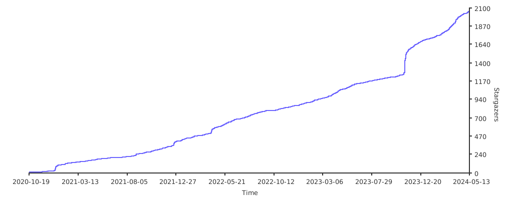](https://starchart.cc/fantastic-admin/basic)
|
||||
</details>
|
||||
|
||||
## Ecosystem
|
||||
|
||||
<table>
|
||||
<tr>
|
||||
<th colspan="3" align="center">
|
||||
<a href="https://hooray.github.io/fantastic-startkit/" target="_blank">Fantastic-startkit</a>
|
||||
</th>
|
||||
</tr>
|
||||
<tr>
|
||||
<th colspan="3" align="center">
|
||||
A simple and easy-to-use Vue 3 project starter kit
|
||||
</th>
|
||||
</tr>
|
||||
</table>
|
||||
|
||||
<table>
|
||||
<tr>
|
||||
<th colspan="3" align="center">
|
||||
<a href="https://one-step-admin.hurui.me" target="_blank">One-step-admin</a>
|
||||
</th>
|
||||
</tr>
|
||||
<tr>
|
||||
<th colspan="3" align="center">
|
||||
A Vue admin framework built to help you move faster than the rest
|
||||
</th>
|
||||
</tr>
|
||||
<tr>
|
||||
<td><img src="https://one-step-admin.hurui.me/preview1.png" alt="" /></td>
|
||||
<td><img src="https://one-step-admin.hurui.me/preview2.png" alt="" /></td>
|
||||
<td><img src="https://one-step-admin.hurui.me/preview3.png" alt="" /></td>
|
||||
</tr>
|
||||
<tr>
|
||||
<td><img src="https://one-step-admin.hurui.me/preview4.png" alt="" /></td>
|
||||
<td><img src="https://one-step-admin.hurui.me/preview5.png" alt="" /></td>
|
||||
<td><img src="https://one-step-admin.hurui.me/preview6.png" alt="" /></td>
|
||||
</tr>
|
||||
</table>
|
||||
|
||||
<table>
|
||||
<tr>
|
||||
<th colspan="4" align="center">
|
||||
<a href="https://fantastic-mobile.hurui.me" target="_blank">Fantastic-mobile</a>
|
||||
</th>
|
||||
</tr>
|
||||
<tr>
|
||||
<th colspan="4" align="center">
|
||||
A distinctive mobile H5 framework
|
||||
</th>
|
||||
</tr>
|
||||
<tr>
|
||||
<td><img src="https://fantastic-mobile.hurui.me/preview1.png" alt="" /></td>
|
||||
<td><img src="https://fantastic-mobile.hurui.me/preview2.png" alt="" /></td>
|
||||
<td><img src="https://fantastic-mobile.hurui.me/preview3.png" alt="" /></td>
|
||||
<td><img src="https://fantastic-mobile.hurui.me/preview4.png" alt="" /></td>
|
||||
</tr>
|
||||
</table>
|
||||
@@ -1,78 +1,53 @@
|
||||
<p align="center">
|
||||
<img src="https://fantastic-admin.gitee.io/logo.png" width="200" height="200" />
|
||||
</p>
|
||||
**中文** | [English](./README.EN.md)
|
||||
<img src="https://fantastic-admin.hurui.me/logo.svg" align="right" width="80" height="80" alt="logo" />
|
||||
|
||||
<h1 align="center">Fantastic-admin</h1>
|
||||
# Fantastic-admin
|
||||
|
||||
<p align="center">一款<b>开箱即用</b>的 Vue3 中后台管理系统框架</p>
|
||||
面向 **AI** 的管理系统框架
|
||||
|
||||
<p align="center">
|
||||
<a href="https://fantastic-admin.gitee.io" target="_blank">官网</a>
|
||||
<sup><a href="https://fantastic-admin.github.io" target="_blank">备用地址</a></sup>
|
||||
<span> | </span>
|
||||
<a href="https://fantastic-admin.gitee.io/support.html" target="_blank">技术支持</a>
|
||||
<span> | </span>
|
||||
演示
|
||||
<sup><a href="https://fantastic-admin.gitee.io/basic-example" target="_blank">基础版</a> <a href="https://fantastic-admin.gitee.io/pro-example" target="_blank">专业版</a></sup>
|
||||
<span> | </span>
|
||||
购买
|
||||
<sup><a href="https://fantastic-admin.gitee.io/buy.html" target="_blank">专业版</a></sup>
|
||||
<p>
|
||||
|
||||
<p align="center">
|
||||
<a href="###"><img src="https://img.shields.io/github/license/fantastic-admin/basic?label=%E5%BC%80%E6%BA%90%E5%8D%8F%E8%AE%AE&style=flat-square" /></a>
|
||||
<a href="https://github.com/fantastic-admin/basic/releases" target="_blank"><img src="https://img.shields.io/github/v/release/fantastic-admin/basic?label=%E5%BD%93%E5%89%8D%E7%89%88%E6%9C%AC&style=flat-square" /></a>
|
||||
<a href="https://fantastic-admin.hurui.me" target="_blank">官网</a>
|
||||
<span> | </span>
|
||||
<a href="https://fantastic-admin.pages.dev" target="_blank">备用地址</a>
|
||||
</p>
|
||||
|
||||
<p>
|
||||
<a href="###"><img src="https://img.shields.io/github/license/fantastic-admin/basic?label=%E5%BC%80%E6%BA%90%E5%8D%8F%E8%AE%AE&style=flat-square" alt="" /></a>
|
||||
<a href="https://github.com/fantastic-admin/basic/releases" target="_blank"><img src="https://img.shields.io/github/v/release/fantastic-admin/basic?label=%E5%BD%93%E5%89%8D%E7%89%88%E6%9C%AC&style=flat-square" alt="" /></a>
|
||||
</p>
|
||||
|
||||

|
||||
|
||||
## 特点
|
||||
|
||||
- 可自由替换 UI 组件库,默认使用 Element Plus
|
||||
- 丰富的布局与主题,覆盖市面上各种中后台应用场景,兼容PC、平板和移动端
|
||||
- 提供系统配置文件,轻松实现个性化定制
|
||||
- 根据路由配置自动生成导航栏
|
||||
- 基于文件系统的路由
|
||||
- 支持全方位权限验证
|
||||
- 内置多级路由最佳缓存方案
|
||||
- 轻松实现国际化多语言适配
|
||||
- 提供接近于浏览器原生标签栏操作体验的标签页功能
|
||||
> 部分为专业版能力
|
||||
|
||||
- AI 友好的工程底座,内置多个 Skills
|
||||
- 一流的技术栈:Vue 3.6 / Vite 8 / Pinia / UnoCSS / VueUse / TypeScript / ESLint / Stylelint / ...
|
||||
- 自由选择喜爱的 UI 库,默认 Element Plus
|
||||
- 8 套默认主题方案且可扩展,给不同行业提供专属品牌气质
|
||||
- 7 款导航菜单模式,匹配产品发展的各个阶段
|
||||
- 精细可控的页面保活策略
|
||||
- 全方位权限验证
|
||||
- 国际化、RTL支持
|
||||
- 19 处预留插槽,灵活扩展产品内容
|
||||
|
||||
## 下载
|
||||
|
||||
> 本仓库为基础版
|
||||
|
||||
**直接拉取源码可能会包含未发布的内容,推荐去 [Github Releases](https://github.com/fantastic-admin/basic/releases) 页面下载稳定版本的压缩包**。如果确定需要拉取源码,请参考下列分支说明:
|
||||
|
||||
- `main` Vue3 版本框架源码分支,不含示例代码,可直接用于实际开发
|
||||
- `example` Vue3 版本演示源码分支,同线上演示站,包含大量示例,可用于参考学习
|
||||
- `vue2` Vue2 版本框架源码分支,不含示例代码,可直接用于实际开发(停止维护)
|
||||
- `vue2-example` Vue2 版本演示源码分支,包含大量示例,可用于参考学习(停止维护)
|
||||
|
||||
|
||||
## 预览
|
||||
|
||||
> 预览截图为 Vue3 专业版
|
||||
|
||||
<table>
|
||||
<tr>
|
||||
<td><img src="https://fantastic-admin.gitee.io/preview1.png" /></td>
|
||||
<td><img src="https://fantastic-admin.gitee.io/preview2.png" /></td>
|
||||
<td><img src="https://fantastic-admin.gitee.io/preview3.png" /></td>
|
||||
</tr>
|
||||
<tr>
|
||||
<td><img src="https://fantastic-admin.gitee.io/preview4.png" /></td>
|
||||
<td><img src="https://fantastic-admin.gitee.io/preview5.png" /></td>
|
||||
<td><img src="https://fantastic-admin.gitee.io/preview6.png" /></td>
|
||||
</tr>
|
||||
</table>
|
||||
直接拉取源码可能会包含未发布的内容,推荐去 [Github Releases](https://github.com/fantastic-admin/basic/releases) 页面下载稳定版本的压缩包。
|
||||
|
||||
## 支持
|
||||
|
||||
如果觉得 Fantastic-admin 这个框架不错,或者已经在使用了,希望你可以在 **Github** 或者 **Gitee(码云)** 帮我点个 ⭐ ,这将对我是极大的鼓励。
|
||||
如果觉得 Fantastic-admin 这个框架不错,或者已经在使用了,希望你可以在 **Github** / **Gitee** / **GitCode** 帮我点个 ⭐ ,这将对本产品的推广有极大帮助。
|
||||
|
||||
[](https://github.com/fantastic-admin/basic)
|
||||
|
||||
[](https://gitee.com/fantastic-admin/basic)
|
||||
|
||||
[](https://atomgit.com/fantastic-admin/basic)
|
||||
|
||||
<details>
|
||||
<summary>Github Stars 曲线</summary>
|
||||
|
||||
@@ -84,12 +59,12 @@
|
||||
<table>
|
||||
<tr>
|
||||
<th colspan="3" align="center">
|
||||
<a href="https://hooray.gitee.io/fantastic-startkit/" target="_blank">Fantastic-startkit</a>
|
||||
<a href="https://hooray.github.io/fantastic-startkit/" target="_blank">Fantastic-startkit</a>
|
||||
</th>
|
||||
</tr>
|
||||
<tr>
|
||||
<th colspan="3" align="center">
|
||||
一款开箱即用的 Vue3 项目启动套件
|
||||
一款简单好用的 Vue3 项目启动套件
|
||||
</th>
|
||||
</tr>
|
||||
</table>
|
||||
@@ -97,22 +72,41 @@
|
||||
<table>
|
||||
<tr>
|
||||
<th colspan="3" align="center">
|
||||
<a href="https://one-step-admin.gitee.io" target="_blank">One-step-admin</a>
|
||||
<a href="https://one-step-admin.hurui.me" target="_blank">One-step-admin</a>
|
||||
</th>
|
||||
</tr>
|
||||
<tr>
|
||||
<th colspan="3" align="center">
|
||||
一款干啥都快人一步的 Vue 中后台管理系统框架
|
||||
一款干啥都快人一步的 Vue 后台管理系统框架
|
||||
</th>
|
||||
</tr>
|
||||
<tr>
|
||||
<td><img src="https://one-step-admin.gitee.io/preview1.png" /></td>
|
||||
<td><img src="https://one-step-admin.gitee.io/preview2.png" /></td>
|
||||
<td><img src="https://one-step-admin.gitee.io/preview3.png" /></td>
|
||||
<td><img src="https://one-step-admin.hurui.me/preview1.png" alt="" /></td>
|
||||
<td><img src="https://one-step-admin.hurui.me/preview2.png" alt="" /></td>
|
||||
<td><img src="https://one-step-admin.hurui.me/preview3.png" alt="" /></td>
|
||||
</tr>
|
||||
<tr>
|
||||
<td><img src="https://one-step-admin.gitee.io/preview4.png" /></td>
|
||||
<td><img src="https://one-step-admin.gitee.io/preview5.png" /></td>
|
||||
<td><img src="https://one-step-admin.gitee.io/preview6.png" /></td>
|
||||
<td><img src="https://one-step-admin.hurui.me/preview4.png" alt="" /></td>
|
||||
<td><img src="https://one-step-admin.hurui.me/preview5.png" alt="" /></td>
|
||||
<td><img src="https://one-step-admin.hurui.me/preview6.png" alt="" /></td>
|
||||
</tr>
|
||||
</table>
|
||||
|
||||
<table>
|
||||
<tr>
|
||||
<th colspan="4" align="center">
|
||||
<a href="https://fantastic-mobile.hurui.me" target="_blank">Fantastic-mobile</a>
|
||||
</th>
|
||||
</tr>
|
||||
<tr>
|
||||
<th colspan="4" align="center">
|
||||
一款自成一派的移动端 H5 框架
|
||||
</th>
|
||||
</tr>
|
||||
<tr>
|
||||
<td><img src="https://fantastic-mobile.hurui.me/preview1.png" alt="" /></td>
|
||||
<td><img src="https://fantastic-mobile.hurui.me/preview2.png" alt="" /></td>
|
||||
<td><img src="https://fantastic-mobile.hurui.me/preview3.png" alt="" /></td>
|
||||
<td><img src="https://fantastic-mobile.hurui.me/preview4.png" alt="" /></td>
|
||||
</tr>
|
||||
</table>
|
||||
|
||||
@@ -0,0 +1,40 @@
|
||||
# 应用配置面板
|
||||
# Application configuration panel
|
||||
VITE_APP_SETTING = true
|
||||
|
||||
# 网站标题
|
||||
# Website title
|
||||
VITE_APP_TITLE = Fantastic-admin
|
||||
|
||||
# 网络请求地址,应用于 axios 的 baseURL
|
||||
# Network request address, applied to axios's baseURL
|
||||
VITE_APP_API_BASEURL = /
|
||||
|
||||
# localStorage/sessionStorage 前缀
|
||||
# localStorage/sessionStorage prefix
|
||||
VITE_APP_STORAGE_PREFIX = fa_dev_
|
||||
|
||||
# 调试工具,可设置 eruda 或 vconsole
|
||||
# Debugging tool, can set eruda or vconsole
|
||||
VITE_APP_DEBUG_TOOL =
|
||||
|
||||
# ===== 以下配置仅在开发环境生效 =====
|
||||
# ===== The following configuration is only effective in the development environment. =====
|
||||
|
||||
# 启用代理
|
||||
# Enable proxy
|
||||
VITE_ENABLE_PROXY = false
|
||||
|
||||
# 启用 Vue 开发工具
|
||||
# Enable Vue DevTools
|
||||
VITE_ENABLE_VUE_DEVTOOLS = false
|
||||
|
||||
# 启用 turbo console
|
||||
# Enable turbo console
|
||||
VITE_ENABLE_TURBO_CONSOLE = false
|
||||
|
||||
# 启动编辑器,用于 vite-plugin-vue-devtools 和 unplugin-turbo-console
|
||||
# 支持的编辑器 https://github.com/yyx990803/launch-editor#supported-editors
|
||||
# Launch the editor for vite-plugin-vue-devtools and unplugin-turbo-console
|
||||
# Supported editors https://github.com/yyx990803/launch-editor#supported-editors
|
||||
VITE_LAUNCH_EDITOR = code
|
||||
@@ -0,0 +1,38 @@
|
||||
# 应用配置面板
|
||||
# Application configuration panel
|
||||
VITE_APP_SETTING = false
|
||||
|
||||
# 网站标题
|
||||
# Website title
|
||||
VITE_APP_TITLE = Fantastic-admin
|
||||
|
||||
# 网络请求地址,应用于 axios 的 baseURL
|
||||
# Network request address, applied to axios's baseURL
|
||||
VITE_APP_API_BASEURL = /
|
||||
|
||||
# localStorage/sessionStorage 前缀
|
||||
# localStorage/sessionStorage prefix
|
||||
VITE_APP_STORAGE_PREFIX = fa_
|
||||
|
||||
# 调试工具,可设置 eruda 或 vconsole
|
||||
# Debugging tool, can set eruda or vconsole
|
||||
VITE_APP_DEBUG_TOOL =
|
||||
|
||||
# ===== 以下配置仅在生产环境生效 =====
|
||||
# ===== The following configuration is only effective in the production environment. =====
|
||||
|
||||
# 启用假数据
|
||||
# Enable build fake data
|
||||
VITE_BUILD_FAKE = false
|
||||
|
||||
# 启用 sourcemap
|
||||
# Enable build sourcemap
|
||||
VITE_BUILD_SOURCEMAP = false
|
||||
|
||||
# 压缩方式,支持 gzip 和 brotli
|
||||
# Build compression method, supports gzip and brotli
|
||||
VITE_BUILD_COMPRESS = gzip,brotli
|
||||
|
||||
# 构建后生成存档,支持 zip 和 tar
|
||||
# Generate archive after build, supports zip and tar
|
||||
VITE_BUILD_ARCHIVE =
|
||||
@@ -0,0 +1,38 @@
|
||||
# 应用配置面板
|
||||
# Application configuration panel
|
||||
VITE_APP_SETTING = false
|
||||
|
||||
# 网站标题
|
||||
# Website title
|
||||
VITE_APP_TITLE = Fantastic-admin
|
||||
|
||||
# 网络请求地址,应用于 axios 的 baseURL
|
||||
# Network request address, applied to axios's baseURL
|
||||
VITE_APP_API_BASEURL = /
|
||||
|
||||
# localStorage/sessionStorage 前缀
|
||||
# localStorage/sessionStorage prefix
|
||||
VITE_APP_STORAGE_PREFIX = fa_test_
|
||||
|
||||
# 调试工具,可设置 eruda 或 vconsole
|
||||
# Debugging tool, can set eruda or vconsole
|
||||
VITE_APP_DEBUG_TOOL =
|
||||
|
||||
# ===== 以下配置仅在测试环境生效 =====
|
||||
# ===== The following configuration is only effective in the test environment. =====
|
||||
|
||||
# 启用假数据
|
||||
# Enable build fake data
|
||||
VITE_BUILD_FAKE = true
|
||||
|
||||
# 启用 sourcemap
|
||||
# Enable build sourcemap
|
||||
VITE_BUILD_SOURCEMAP = true
|
||||
|
||||
# 压缩方式,支持 gzip 和 brotli
|
||||
# Build compression method, supports gzip and brotli
|
||||
VITE_BUILD_COMPRESS =
|
||||
|
||||
# 构建后生成存档,支持 zip 和 tar
|
||||
# Generate archive after build, supports zip and tar
|
||||
VITE_BUILD_ARCHIVE =
|
||||
@@ -0,0 +1,16 @@
|
||||
{
|
||||
"$schema": "https://shadcn-vue.com/schema.json",
|
||||
"style": "new-york-v4",
|
||||
"typescript": true,
|
||||
"tailwind": {
|
||||
"config": "tailwind.config.js",
|
||||
"css": "src/assets/index.css",
|
||||
"baseColor": "neutral",
|
||||
"cssVariables": true
|
||||
},
|
||||
"aliases": {
|
||||
"components": "@/ui/shadcn",
|
||||
"utils": "@/utils",
|
||||
"lib": "@/utils"
|
||||
}
|
||||
}
|
||||
@@ -2,10 +2,9 @@
|
||||
<html>
|
||||
<head>
|
||||
<meta charset="UTF-8" />
|
||||
<link rel="icon" href="/favicon.ico" />
|
||||
<link rel="stylesheet" href="/loading.css" />
|
||||
<link rel="icon" href="/favicon.svg" />
|
||||
<link rel="stylesheet" href="/browser_upgrade/index.css" />
|
||||
<meta name="viewport" content="width=device-width, initial-scale=1.0" />
|
||||
<meta name="viewport" content="width=device-width, initial-scale=1.0, maximum-scale=1.0, user-scalable=0, viewport-fit=cover"/>
|
||||
<meta http-equiv="Expires" content="0">
|
||||
<meta http-equiv="Pragma" content="no-cache">
|
||||
<meta http-equiv="Cache-control" content="no-cache">
|
||||
@@ -14,21 +13,12 @@
|
||||
</head>
|
||||
<body>
|
||||
<div id="app">
|
||||
<div class="fantastic-admin-home">
|
||||
<div class="loading">
|
||||
<div class="square"></div>
|
||||
<div class="square"></div>
|
||||
<div class="square"></div>
|
||||
<div class="square"></div>
|
||||
</div>
|
||||
<div class="text">载入中</div>
|
||||
</div>
|
||||
<div id="browser-upgrade">
|
||||
<div class="title">为了您的体验,推荐使用以下浏览器</div>
|
||||
<div class="browsers">
|
||||
<a href="https://www.microsoft.com/edge" target="_blank" class="browser">
|
||||
<img class="browser-icon" src="/browser_upgrade/edge.png" />
|
||||
<div class="browser-name">Mircosoft Edge</div>
|
||||
<div class="browser-name">Microsoft Edge</div>
|
||||
</a>
|
||||
<a href="https://www.google.cn/chrome/" target="_blank" class="browser">
|
||||
<img class="browser-icon" src="/browser_upgrade/chrome.png" />
|
||||
@@ -0,0 +1,216 @@
|
||||
<style>
|
||||
@keyframes rainbow {
|
||||
0% { --rainbow-color: #00a98e; }
|
||||
1.25% { --rainbow-color: #00a996; }
|
||||
2.5% { --rainbow-color: #00a99f; }
|
||||
3.75% { --rainbow-color: #00a9a7; }
|
||||
5% { --rainbow-color: #00a9b0; }
|
||||
6.25% { --rainbow-color: #00a9b8; }
|
||||
7.5% { --rainbow-color: #00a9c0; }
|
||||
8.75% { --rainbow-color: #00a8c7; }
|
||||
10% { --rainbow-color: #00a8cf; }
|
||||
11.25% { --rainbow-color: #00a7d5; }
|
||||
12.5% { --rainbow-color: #00a6dc; }
|
||||
13.75% { --rainbow-color: #00a6e2; }
|
||||
15% { --rainbow-color: #00a4e7; }
|
||||
16.25% { --rainbow-color: #00a3ec; }
|
||||
17.5% { --rainbow-color: #00a2f1; }
|
||||
18.75% { --rainbow-color: #00a0f4; }
|
||||
20% { --rainbow-color: #009ff7; }
|
||||
21.25% { --rainbow-color: #009dfa; }
|
||||
22.5% { --rainbow-color: #009bfc; }
|
||||
23.75% { --rainbow-color: #0098fd; }
|
||||
25% { --rainbow-color: #0096fd; }
|
||||
26.25% { --rainbow-color: #0093fd; }
|
||||
27.5% { --rainbow-color: #2e90fc; }
|
||||
28.75% { --rainbow-color: #4d8dfa; }
|
||||
30% { --rainbow-color: #638af8; }
|
||||
31.25% { --rainbow-color: #7587f5; }
|
||||
32.5% { --rainbow-color: #8583f1; }
|
||||
33.75% { --rainbow-color: #9280ed; }
|
||||
35% { --rainbow-color: #9f7ce9; }
|
||||
36.25% { --rainbow-color: #aa78e3; }
|
||||
37.5% { --rainbow-color: #b574dd; }
|
||||
38.75% { --rainbow-color: #be71d7; }
|
||||
40% { --rainbow-color: #c76dd1; }
|
||||
41.25% { --rainbow-color: #cf69c9; }
|
||||
42.5% { --rainbow-color: #d566c2; }
|
||||
43.75% { --rainbow-color: #dc63ba; }
|
||||
45% { --rainbow-color: #e160b3; }
|
||||
46.25% { --rainbow-color: #e65eab; }
|
||||
47.5% { --rainbow-color: #e95ca2; }
|
||||
48.75% { --rainbow-color: #ed5a9a; }
|
||||
50% { --rainbow-color: #ef5992; }
|
||||
51.25% { --rainbow-color: #f15989; }
|
||||
52.5% { --rainbow-color: #f25981; }
|
||||
53.75% { --rainbow-color: #f25a79; }
|
||||
55% { --rainbow-color: #f25c71; }
|
||||
56.25% { --rainbow-color: #f15e69; }
|
||||
57.5% { --rainbow-color: #ef6061; }
|
||||
58.75% { --rainbow-color: #ed635a; }
|
||||
60% { --rainbow-color: #eb6552; }
|
||||
61.25% { --rainbow-color: #e8694b; }
|
||||
62.5% { --rainbow-color: #e46c44; }
|
||||
63.75% { --rainbow-color: #e06f3d; }
|
||||
65% { --rainbow-color: #db7336; }
|
||||
66.25% { --rainbow-color: #d77630; }
|
||||
67.5% { --rainbow-color: #d17a2a; }
|
||||
68.75% { --rainbow-color: #cc7d24; }
|
||||
70% { --rainbow-color: #c6811e; }
|
||||
71.25% { --rainbow-color: #bf8418; }
|
||||
72.5% { --rainbow-color: #b98713; }
|
||||
73.75% { --rainbow-color: #b28a0f; }
|
||||
75% { --rainbow-color: #ab8d0c; }
|
||||
76.25% { --rainbow-color: #a3900b; }
|
||||
77.5% { --rainbow-color: #9c920d; }
|
||||
78.75% { --rainbow-color: #949510; }
|
||||
80% { --rainbow-color: #8b9715; }
|
||||
81.25% { --rainbow-color: #83991b; }
|
||||
82.5% { --rainbow-color: #7a9b21; }
|
||||
83.75% { --rainbow-color: #719d27; }
|
||||
85% { --rainbow-color: #679e2e; }
|
||||
86.25% { --rainbow-color: #5da035; }
|
||||
87.5% { --rainbow-color: #51a13c; }
|
||||
88.75% { --rainbow-color: #44a244; }
|
||||
90% { --rainbow-color: #34a44b; }
|
||||
91.25% { --rainbow-color: #1ba553; }
|
||||
92.5% { --rainbow-color: #00a65b; }
|
||||
93.75% { --rainbow-color: #00a663; }
|
||||
95% { --rainbow-color: #00a76c; }
|
||||
96.25% { --rainbow-color: #00a874; }
|
||||
97.5% { --rainbow-color: #00a87d; }
|
||||
98.75% { --rainbow-color: #00a985; }
|
||||
100% { --rainbow-color: #00a98e; }
|
||||
}
|
||||
|
||||
:root {
|
||||
--rainbow-color: #00a98e;
|
||||
animation: rainbow 20s linear infinite;
|
||||
}
|
||||
|
||||
.loading-container {
|
||||
position: fixed;
|
||||
top: 0;
|
||||
left: 0;
|
||||
z-index: 10000;
|
||||
display: flex;
|
||||
flex-direction: column;
|
||||
align-items: center;
|
||||
justify-content: center;
|
||||
width: 100%;
|
||||
height: 100%;
|
||||
color: var(--rainbow-color);
|
||||
user-select: none;
|
||||
background-color: oklch(var(--background));
|
||||
}
|
||||
|
||||
.loading-container *::before,
|
||||
.loading-container *::after {
|
||||
box-sizing: content-box;
|
||||
}
|
||||
|
||||
.loading-container .loading {
|
||||
display: flex;
|
||||
flex-wrap: wrap;
|
||||
align-items: center;
|
||||
justify-content: center;
|
||||
width: 40px;
|
||||
height: 40px;
|
||||
}
|
||||
|
||||
.loading-container .loading .square {
|
||||
display: flex;
|
||||
align-items: center;
|
||||
justify-content: center;
|
||||
width: 20px;
|
||||
height: 20px;
|
||||
}
|
||||
|
||||
.loading-container .loading .square::before {
|
||||
width: 10px;
|
||||
height: 10px;
|
||||
content: "";
|
||||
border: 3px solid var(--rainbow-color);
|
||||
border-radius: 15%;
|
||||
animation: square-to-dot-animation 2s linear infinite;
|
||||
}
|
||||
|
||||
.loading-container .loading .square:nth-child(1)::before {
|
||||
animation-delay: calc(150ms * 1);
|
||||
}
|
||||
|
||||
.loading-container .loading .square:nth-child(2)::before {
|
||||
animation-delay: calc(150ms * 2);
|
||||
}
|
||||
|
||||
.loading-container .loading .square:nth-child(3)::before {
|
||||
animation-delay: calc(150ms * 3);
|
||||
}
|
||||
|
||||
.loading-container .loading .square:nth-child(4)::before {
|
||||
animation-delay: calc(150ms * 4);
|
||||
}
|
||||
|
||||
@keyframes square-to-dot-animation {
|
||||
0%,
|
||||
33.33% {
|
||||
width: 10px;
|
||||
height: 10px;
|
||||
margin: initial;
|
||||
border-width: 3px;
|
||||
border-radius: 15%;
|
||||
transform: rotate(0deg);
|
||||
}
|
||||
|
||||
50%,
|
||||
83.33% {
|
||||
width: 0;
|
||||
height: 0;
|
||||
margin: 5px;
|
||||
border-width: 5px;
|
||||
border-radius: 100%;
|
||||
transform: rotate(180deg);
|
||||
}
|
||||
|
||||
100% {
|
||||
width: 10px;
|
||||
height: 10px;
|
||||
margin: initial;
|
||||
border-width: 3px;
|
||||
border-radius: 15%;
|
||||
transform: rotate(360deg);
|
||||
}
|
||||
}
|
||||
|
||||
.loading-container .name {
|
||||
position: relative;
|
||||
margin-top: 20px;
|
||||
font-size: 24px;
|
||||
line-height: 1.5;
|
||||
}
|
||||
|
||||
.loading-container .tips {
|
||||
position: relative;
|
||||
margin-top: 10px;
|
||||
font-size: 16px;
|
||||
opacity: 0.5;
|
||||
line-height: 1.5;
|
||||
}
|
||||
|
||||
.loading-container .tips::after {
|
||||
position: absolute;
|
||||
padding-left: 5px;
|
||||
content: "…";
|
||||
}
|
||||
</style>
|
||||
|
||||
<div class="loading-container">
|
||||
<div class="loading">
|
||||
<div class="square"></div>
|
||||
<div class="square"></div>
|
||||
<div class="square"></div>
|
||||
<div class="square"></div>
|
||||
</div>
|
||||
<div class="name">%VITE_APP_TITLE%</div>
|
||||
<div class="tips">载入中</div>
|
||||
</div>
|
||||
@@ -0,0 +1,82 @@
|
||||
{
|
||||
"name": "@fantastic-admin/core",
|
||||
"type": "module",
|
||||
"private": true,
|
||||
"scripts": {
|
||||
"dev": "vite",
|
||||
"build": "vue-tsc -b && vite build",
|
||||
"build:test": "vue-tsc -b && vite build --mode test",
|
||||
"serve": "http-server ./dist -o",
|
||||
"serve:test": "http-server ./dist-test -o",
|
||||
"svgo": "svgo -f src/assets/icons",
|
||||
"generate:icons": "tsx ./scripts/generate.icons.ts",
|
||||
"lint": "vue-tsc -b"
|
||||
},
|
||||
"dependencies": {
|
||||
"@fantastic-admin/components": "workspace:*",
|
||||
"@fantastic-admin/settings": "workspace:*",
|
||||
"@fantastic-admin/types": "workspace:*",
|
||||
"@vee-validate/zod": "catalog:",
|
||||
"@vueuse/core": "catalog:",
|
||||
"@vueuse/integrations": "catalog:",
|
||||
"@zumer/snapdom": "catalog:",
|
||||
"axios": "catalog:",
|
||||
"class-variance-authority": "catalog:",
|
||||
"clsx": "catalog:",
|
||||
"dayjs": "catalog:",
|
||||
"element-plus": "catalog:",
|
||||
"eruda": "catalog:",
|
||||
"es-toolkit": "catalog:",
|
||||
"hotkeys-js": "catalog:",
|
||||
"lucide-vue-next": "catalog:",
|
||||
"mitt": "catalog:",
|
||||
"nprogress": "catalog:",
|
||||
"path-browserify": "catalog:",
|
||||
"path-to-regexp": "catalog:",
|
||||
"pinia": "catalog:",
|
||||
"pinia-plugin-persistedstate": "catalog:",
|
||||
"pinyin-pro": "catalog:",
|
||||
"qs": "catalog:",
|
||||
"reka-ui": "catalog:",
|
||||
"scule": "catalog:",
|
||||
"tailwind-merge": "catalog:",
|
||||
"type-fest": "catalog:",
|
||||
"ua-parser-js": "catalog:",
|
||||
"vconsole": "catalog:",
|
||||
"vee-validate": "catalog:",
|
||||
"vue": "catalog:",
|
||||
"vue-router": "catalog:",
|
||||
"zod": "catalog:"
|
||||
},
|
||||
"devDependencies": {
|
||||
"@clack/prompts": "catalog:",
|
||||
"@faker-js/faker": "catalog:",
|
||||
"@fantastic-admin/copyright": "workspace:*",
|
||||
"@iconify/vue": "catalog:",
|
||||
"@spiriit/vite-plugin-svg-spritemap": "catalog:",
|
||||
"@types/nprogress": "catalog:",
|
||||
"@types/path-browserify": "catalog:",
|
||||
"@types/qs": "catalog:",
|
||||
"@vitejs/plugin-legacy": "catalog:",
|
||||
"@vitejs/plugin-vue": "catalog:",
|
||||
"@vitejs/plugin-vue-jsx": "catalog:",
|
||||
"@vue/tsconfig": "catalog:",
|
||||
"http-server": "catalog:",
|
||||
"postcss": "catalog:",
|
||||
"postcss-nested": "catalog:",
|
||||
"sass-embedded": "catalog:",
|
||||
"svgo": "catalog:",
|
||||
"tsx": "catalog:",
|
||||
"unplugin-auto-import": "catalog:",
|
||||
"unplugin-turbo-console": "catalog:",
|
||||
"unplugin-vue-components": "catalog:",
|
||||
"vite": "catalog:",
|
||||
"vite-plugin-app-loading": "catalog:",
|
||||
"vite-plugin-archiver": "catalog:",
|
||||
"vite-plugin-compression2": "catalog:",
|
||||
"vite-plugin-env-parse": "catalog:",
|
||||
"vite-plugin-fake-server": "catalog:",
|
||||
"vite-plugin-vue-devtools": "catalog:",
|
||||
"vue-tsc": "catalog:"
|
||||
}
|
||||
}
|
||||
@@ -0,0 +1,6 @@
|
||||
export default {
|
||||
plugins: {
|
||||
'autoprefixer': {},
|
||||
'postcss-nested': {},
|
||||
},
|
||||
}
|
||||

|
Before Width: | Height: | Size: 3.7 KiB After Width: | Height: | Size: 3.7 KiB |

|
Before Width: | Height: | Size: 4.0 KiB After Width: | Height: | Size: 4.0 KiB |
@@ -1,20 +1,20 @@
|
||||
#browser-upgrade {
|
||||
position: absolute;
|
||||
z-index: 10001;
|
||||
top: 0;
|
||||
left: 0;
|
||||
height: 100%;
|
||||
width: 100%;
|
||||
z-index: 10001;
|
||||
display: none;
|
||||
user-select: none;
|
||||
width: 100%;
|
||||
height: 100%;
|
||||
color: #736477;
|
||||
user-select: none;
|
||||
background-color: snow;
|
||||
}
|
||||
|
||||
#browser-upgrade .title {
|
||||
margin: 40px 0;
|
||||
text-align: center;
|
||||
font-size: 24px;
|
||||
text-align: center;
|
||||
}
|
||||
|
||||
#browser-upgrade .browsers {
|
||||
@@ -24,8 +24,8 @@
|
||||
#browser-upgrade .browsers .browser {
|
||||
display: inline-block;
|
||||
margin: 0 20px;
|
||||
cursor: pointer;
|
||||
text-decoration: none;
|
||||
cursor: pointer;
|
||||
}
|
||||
|
||||
#browser-upgrade .browsers .browser .browser-icon {
|
||||
@@ -37,10 +37,10 @@
|
||||
}
|
||||
|
||||
#browser-upgrade .browsers .browser .browser-name {
|
||||
text-align: center;
|
||||
margin-top: 10px;
|
||||
padding-bottom: 2px;
|
||||
margin-top: 10px;
|
||||
color: #736477;
|
||||
text-align: center;
|
||||
border-bottom: 1px solid transparent;
|
||||
}
|
||||
|
||||

@@ -0,0 +1,14 @@
|
||||
<svg xmlns="http://www.w3.org/2000/svg" viewBox="0 -21 206 206" xml:space="preserve">
|
||||
<path d="M0,82.57C0,58.4,0,34.23,0,10.06C0,1.35,1.35,0,10.03,0C45.36,0,80.7-0.01,116.03,0.03c1.77,0,3.59,0.26,5.29,0.74
|
||||
c3.07,0.87,3.57,3.21,2.45,5.8c-4.37,10.1-8.83,20.15-13.31,30.2c-1.44,3.23-4.06,4.26-7.54,4.25c-18.5-0.09-37,0.1-55.5-0.14
|
||||
c-4.95-0.06-6.49,2.12-6.46,6.47c0.02,3,0.11,6.01-0.02,9c-0.3,6.8,0.34,9.29,9.51,9.62c5.36,0.19,10.73,0.04,16.09,0.04
|
||||
c7.57,0,15.15-0.04,22.72,0.01c5.13,0.03,6.6,2.12,4.59,6.89C90.43,81.09,86.27,89,83.4,97.35c-2.59,7.55-8.57,7.27-14.28,7.56
|
||||
c-7.48,0.38-15,0.17-22.5,0.06c-3.69-0.05-4.96,1.04-4.86,5.18c0.36,15.83,0.26,31.67,0.12,47.5c-0.04,4.2-2.26,6.53-6.94,6.42
|
||||
c-9-0.21-18-0.06-27-0.06c-6.05,0-7.91-1.8-7.92-7.94C-0.02,131.57,0,107.07,0,82.57z" fill="#42b883" />
|
||||
<path d="M132.98,94.13c-8.21,18.88-16.33,37.1-24.06,55.48c-6.02,14.31-5.81,14.4-21.31,14.4c-6.67,0-13.33,0.05-20-0.01
|
||||
c-5.91-0.05-7.71-2.44-5.46-7.61c6.86-15.8,13.86-31.55,20.82-47.31c9.41-21.32,18.81-42.63,28.24-63.94
|
||||
c5.59-12.62,11.14-25.25,16.94-37.77c0.82-1.78,2.95-4.09,4.47-4.09c1.63,0,4,2.11,4.78,3.86c13.4,29.78,26.56,59.66,39.87,89.49
|
||||
c6.48,14.53,13.16,28.97,19.72,43.46c2.57,5.68,5.11,11.38,7.61,17.1c1.61,3.68-0.13,6.75-4.12,6.77
|
||||
c-23.83,0.08-47.66,0.09-71.49-0.01c-4.03-0.02-5.46-2.47-3.98-6.17c2.26-5.63,4.77-11.16,6.95-16.82c1.74-4.54,4.92-6.06,9.6-5.98
|
||||
c9.65,0.16,9.89-0.55,5.89-9.13c-4.57-9.81-8.76-19.8-13.14-29.7C134.08,95.62,133.68,95.17,132.98,94.13z" fill="#42b883" />
|
||||
</svg>
|
||||
|
After Width: | Height: | Size: 1.5 KiB |
@@ -0,0 +1,108 @@
|
||||
import { spawn } from 'node:child_process'
|
||||
import fs from 'node:fs'
|
||||
import path from 'node:path'
|
||||
import process from 'node:process'
|
||||
import * as p from '@clack/prompts'
|
||||
import { lookupCollection, lookupCollections } from '@iconify/json'
|
||||
|
||||
// 拿到全部图标集的原始数据
|
||||
const raw = await lookupCollections()
|
||||
|
||||
let lastChoose = fs.readFileSync(path.resolve(process.cwd(), 'src/iconify/index.json'), 'utf-8')
|
||||
lastChoose = JSON.parse(lastChoose)
|
||||
|
||||
// 取出可使用的图标集数据用于选择,并按名称排序
|
||||
const collections = Object.entries(raw).map(([id, item]) => ({
|
||||
...item,
|
||||
id,
|
||||
})).sort((a, b) => a.name.localeCompare(b.name))
|
||||
|
||||
p.intro('图标集生成工具')
|
||||
|
||||
/**
|
||||
* 分别会在对应目录下生成以下文件,其中(1)(3)用于离线下载并安装图标,(2)用于图标选择器使用
|
||||
* (1) src/iconify/index.json 记录用户交互信息
|
||||
* (2) src/iconify/data.json 包含多个图标集数据,仅记录图标名
|
||||
* (3) public/icons/*-raw.json 多个图标集的原始数据,独立存放,用于离线使用
|
||||
*/
|
||||
const answers = await p.group(
|
||||
{
|
||||
collections: () =>
|
||||
p.multiselect({
|
||||
message: '请选择需要生成的图标集',
|
||||
options: collections.map(item => ({
|
||||
label: item.name,
|
||||
value: item.id,
|
||||
hint: `${item.total} 个图标`,
|
||||
})),
|
||||
initialValues: lastChoose.collections,
|
||||
}),
|
||||
isOfflineUse: () =>
|
||||
p.confirm({
|
||||
message: '是否需要离线使用',
|
||||
initialValue: false,
|
||||
}),
|
||||
},
|
||||
{
|
||||
onCancel: () => {
|
||||
p.cancel('操作已取消')
|
||||
process.exit(0)
|
||||
},
|
||||
},
|
||||
)
|
||||
|
||||
const spinner = p.spinner()
|
||||
spinner.start('正在生成图标集...')
|
||||
|
||||
await fs.writeJSON(
|
||||
path.resolve(process.cwd(), 'src/iconify/index.json'),
|
||||
{
|
||||
collections: answers.collections,
|
||||
isOfflineUse: answers.isOfflineUse,
|
||||
},
|
||||
)
|
||||
|
||||
const outputDir = path.resolve(process.cwd(), 'public/icons')
|
||||
await fs.ensureDir(outputDir)
|
||||
await fs.emptyDir(outputDir)
|
||||
|
||||
const collectionsMeta: object[] = []
|
||||
for (const info of answers.collections) {
|
||||
const setData = await lookupCollection(info)
|
||||
|
||||
collectionsMeta.push({
|
||||
prefix: setData.prefix,
|
||||
info: setData.info,
|
||||
icons: Object.keys(setData.icons),
|
||||
})
|
||||
|
||||
const offlineFilePath = path.join(outputDir, `${info}-raw.json`)
|
||||
|
||||
if (answers.isOfflineUse) {
|
||||
await fs.writeJSON(offlineFilePath, setData)
|
||||
}
|
||||
}
|
||||
|
||||
await fs.writeJSON(
|
||||
path.resolve(process.cwd(), 'src/iconify/data.json'),
|
||||
collectionsMeta,
|
||||
)
|
||||
|
||||
// 使用 spawn 运行 eslint
|
||||
const eslint = spawn('eslint', ['src/iconify/data.json', 'src/iconify/index.json', '--cache', '--fix'], {
|
||||
stdio: 'inherit',
|
||||
shell: true,
|
||||
})
|
||||
|
||||
eslint.on('error', (err) => {
|
||||
p.log.error(`ESLint 执行失败: ${err.message}`)
|
||||
process.exit(1)
|
||||
})
|
||||
|
||||
eslint.on('close', (code) => {
|
||||
if (code !== 0) {
|
||||
p.log.error(`ESLint 执行失败,退出码: ${code}`)
|
||||
process.exit(code)
|
||||
}
|
||||
spinner.stop('图标集生成完成!')
|
||||
})
|
||||
@@ -0,0 +1,60 @@
|
||||
<script setup lang="ts">
|
||||
import dayjs from '@/utils/dayjs'
|
||||
import { ua } from '@/utils/ua'
|
||||
import Provider from './ui/provider/index.vue'
|
||||
import 'dayjs/locale/zh-cn'
|
||||
|
||||
const route = useRoute()
|
||||
|
||||
const appSettingsStore = useAppSettingsStore()
|
||||
|
||||
const { auth } = useAppAuth()
|
||||
const { generateTitle } = useAppMenu()
|
||||
|
||||
document.body.setAttribute('data-os', ua.getOS().name || '')
|
||||
|
||||
const isAuth = computed(() => {
|
||||
return route.matched.every((item) => {
|
||||
return auth(item.meta.auth ?? '')
|
||||
})
|
||||
})
|
||||
|
||||
// 设置网页 title
|
||||
watch([
|
||||
() => appSettingsStore.settings.app.dynamicTitle,
|
||||
() => appSettingsStore.title,
|
||||
], () => {
|
||||
nextTick(() => {
|
||||
if (appSettingsStore.settings.app.dynamicTitle && appSettingsStore.title) {
|
||||
document.title = `${generateTitle(appSettingsStore.title)} - ${import.meta.env.VITE_APP_TITLE}`
|
||||
}
|
||||
else {
|
||||
document.title = import.meta.env.VITE_APP_TITLE
|
||||
}
|
||||
})
|
||||
}, {
|
||||
immediate: true,
|
||||
deep: true,
|
||||
})
|
||||
|
||||
onMounted(() => {
|
||||
appSettingsStore.setMode(document.documentElement.clientWidth)
|
||||
dayjs.locale('zh-cn')
|
||||
window.addEventListener('resize', () => {
|
||||
appSettingsStore.setMode(document.documentElement.clientWidth)
|
||||
})
|
||||
})
|
||||
</script>
|
||||
|
||||
<template>
|
||||
<Provider>
|
||||
<RouterView v-slot="{ Component }">
|
||||
<AppNotSupportedMobile v-if="!appSettingsStore.settings.app.mobile && appSettingsStore.mode === 'mobile'" />
|
||||
<Component :is="Component" v-else-if="isAuth" />
|
||||
<AppNotAllowed v-else />
|
||||
</RouterView>
|
||||
<AppBackToTop />
|
||||
<FaToast :theme="appSettingsStore.currentColorScheme" />
|
||||
<AppSystemInfo />
|
||||
</Provider>
|
||||
</template>
|
||||
@@ -0,0 +1,109 @@
|
||||
import axios from 'axios'
|
||||
// import qs from 'qs'
|
||||
|
||||
// 请求重试配置
|
||||
const MAX_RETRY_COUNT = 3 // 最大重试次数
|
||||
const RETRY_DELAY = 1000 // 重试延迟时间(毫秒)
|
||||
|
||||
// 扩展 AxiosRequestConfig 类型
|
||||
declare module 'axios' {
|
||||
export interface AxiosRequestConfig {
|
||||
retry?: boolean
|
||||
retryCount?: number
|
||||
fake?: boolean
|
||||
}
|
||||
}
|
||||
|
||||
const api = axios.create({
|
||||
baseURL: (import.meta.env.DEV && import.meta.env.VITE_ENABLE_PROXY) ? '/proxy/' : import.meta.env.VITE_APP_API_BASEURL,
|
||||
timeout: 1000 * 60,
|
||||
responseType: 'json',
|
||||
})
|
||||
|
||||
api.interceptors.request.use(
|
||||
(request) => {
|
||||
// 如果设置了 fake 属性,强制使用 fake 的 baseURL
|
||||
if (request.fake) {
|
||||
request.baseURL = '/fake/'
|
||||
}
|
||||
// 全局拦截请求发送前提交的参数
|
||||
const appAccountStore = useAppAccountStore()
|
||||
// 设置请求头
|
||||
if (request.headers) {
|
||||
request.headers['Accept-Language'] = 'zh-CN'
|
||||
if (appAccountStore.isLogin) {
|
||||
request.headers.Token = appAccountStore.token
|
||||
}
|
||||
}
|
||||
// 是否将 POST 请求参数进行字符串化处理
|
||||
if (request.method === 'post') {
|
||||
// request.data = qs.stringify(request.data, {
|
||||
// arrayFormat: 'brackets',
|
||||
// })
|
||||
}
|
||||
return request
|
||||
},
|
||||
)
|
||||
|
||||
// 处理错误信息的函数
|
||||
function handleError(error: any) {
|
||||
if (error.status === 401) {
|
||||
useAppAccountStore().requestLogout()
|
||||
}
|
||||
else {
|
||||
faToast.error('Error', {
|
||||
description: error.message,
|
||||
})
|
||||
}
|
||||
return Promise.reject(error)
|
||||
}
|
||||
|
||||
api.interceptors.response.use(
|
||||
(response) => {
|
||||
/**
|
||||
* 全局拦截请求发送后返回的数据,如果数据有报错则在这做全局的错误提示
|
||||
* 假设返回数据格式为:{ status: 1, error: '', data: {} }
|
||||
* 规则是当 status 为 1 时表示请求成功,为 0 时表示接口需要登录或者登录状态失效,需要重新登录
|
||||
* 请求出错时 error 会返回错误信息
|
||||
*/
|
||||
if (typeof response.data === 'object') {
|
||||
if (response.data.status === 1) {
|
||||
if (response.data.error !== '') {
|
||||
faToast.warning('Warning', {
|
||||
description: response.data.error,
|
||||
})
|
||||
return Promise.reject(response.data)
|
||||
}
|
||||
}
|
||||
else {
|
||||
useAppAccountStore().requestLogout()
|
||||
}
|
||||
return Promise.resolve(response.data)
|
||||
}
|
||||
else {
|
||||
return Promise.reject(response.data)
|
||||
}
|
||||
},
|
||||
async (error) => {
|
||||
// 获取请求配置
|
||||
const config = error.config
|
||||
// 如果配置不存在或未启用重试,则直接处理错误
|
||||
if (!config || !config.retry) {
|
||||
return handleError(error)
|
||||
}
|
||||
// 设置重试次数
|
||||
config.retryCount = config.retryCount || 0
|
||||
// 判断是否超过重试次数
|
||||
if (config.retryCount >= MAX_RETRY_COUNT) {
|
||||
return handleError(error)
|
||||
}
|
||||
// 重试次数自增
|
||||
config.retryCount += 1
|
||||
// 延迟重试
|
||||
await new Promise(resolve => setTimeout(resolve, RETRY_DELAY))
|
||||
// 重新发起请求
|
||||
return api(config)
|
||||
},
|
||||
)
|
||||
|
||||
export default api
|
||||
@@ -1,28 +1,33 @@
|
||||
export default [
|
||||
import { faker } from '@faker-js/faker'
|
||||
import { defineFakeRoute } from 'vite-plugin-fake-server/client'
|
||||
|
||||
export default defineFakeRoute([
|
||||
{
|
||||
url: '/mock/app/route/list',
|
||||
url: '/fake/app/route/list',
|
||||
method: 'get',
|
||||
response: () => {
|
||||
return {
|
||||
error: '',
|
||||
status: 1,
|
||||
data: [
|
||||
// 主导航
|
||||
{
|
||||
meta: {
|
||||
title: '演示',
|
||||
icon: 'uim:box',
|
||||
},
|
||||
children: [
|
||||
// 次导航(一级路由)
|
||||
{
|
||||
path: '/multilevel_menu_example',
|
||||
component: 'Layout',
|
||||
redirect: '/multilevel_menu_example/page',
|
||||
name: 'multilevelMenuExample',
|
||||
meta: {
|
||||
title: '多级导航',
|
||||
icon: 'heroicons-solid:menu-alt-3',
|
||||
},
|
||||
children: [
|
||||
// 次导航(二级路由)
|
||||
{
|
||||
path: 'page',
|
||||
name: 'multilevelMenuExample1',
|
||||
@@ -34,11 +39,11 @@ export default [
|
||||
{
|
||||
path: 'level2',
|
||||
name: 'multilevelMenuExample2',
|
||||
redirect: '/multilevel_menu_example/level2/page',
|
||||
meta: {
|
||||
title: '导航2',
|
||||
},
|
||||
children: [
|
||||
// 次导航(三级路由)
|
||||
{
|
||||
path: 'page',
|
||||
name: 'multilevelMenuExample2-1',
|
||||
@@ -50,11 +55,11 @@ export default [
|
||||
{
|
||||
path: 'level3',
|
||||
name: 'multilevelMenuExample2-2',
|
||||
redirect: '/multilevel_menu_example/level2/level3/page1',
|
||||
meta: {
|
||||
title: '导航2-2',
|
||||
},
|
||||
children: [
|
||||
// 次导航(四级路由)
|
||||
{
|
||||
path: 'page1',
|
||||
name: 'multilevelMenuExample2-2-1',
|
||||
@@ -84,69 +89,58 @@ export default [
|
||||
},
|
||||
},
|
||||
{
|
||||
url: '/mock/app/menu/list',
|
||||
url: '/fake/app/account/login',
|
||||
method: 'post',
|
||||
response: ({ body }) => {
|
||||
return {
|
||||
error: '',
|
||||
status: 1,
|
||||
data: {
|
||||
account: body.account,
|
||||
token: `${body.account}:${faker.internet.jwt()}`,
|
||||
avatar: `https://api.dicebear.com/9.x/bottts-neutral/svg?seed=${body.account}`,
|
||||
},
|
||||
}
|
||||
},
|
||||
},
|
||||
{
|
||||
url: '/fake/app/account/permission',
|
||||
method: 'get',
|
||||
response: ({ headers }) => {
|
||||
let permissions: string[] = []
|
||||
if (headers.token?.indexOf('admin') === 0) {
|
||||
permissions = [
|
||||
'pages.general:browse',
|
||||
'pages.form:browse',
|
||||
'pages.list:browse',
|
||||
'pages.shop:browse',
|
||||
]
|
||||
}
|
||||
else if (headers.token?.indexOf('test') === 0) {
|
||||
permissions = [
|
||||
'pages.general:browse',
|
||||
]
|
||||
}
|
||||
return {
|
||||
error: '',
|
||||
status: 1,
|
||||
data: {
|
||||
permissions,
|
||||
},
|
||||
}
|
||||
},
|
||||
},
|
||||
{
|
||||
url: '/fake/app/account/password/edit',
|
||||
method: 'post',
|
||||
response: () => {
|
||||
return {
|
||||
error: '',
|
||||
status: 1,
|
||||
data: [
|
||||
{
|
||||
meta: {
|
||||
title: '演示',
|
||||
icon: 'uim:box',
|
||||
},
|
||||
children: [
|
||||
{
|
||||
meta: {
|
||||
title: '多级导航',
|
||||
icon: 'heroicons-solid:menu-alt-3',
|
||||
},
|
||||
children: [
|
||||
{
|
||||
path: '/multilevel_menu_example/page',
|
||||
meta: {
|
||||
title: '导航1',
|
||||
},
|
||||
},
|
||||
{
|
||||
meta: {
|
||||
title: '导航2',
|
||||
},
|
||||
children: [
|
||||
{
|
||||
path: '/multilevel_menu_example/level2/page',
|
||||
meta: {
|
||||
title: '导航2-1',
|
||||
},
|
||||
},
|
||||
{
|
||||
meta: {
|
||||
title: '导航2-2',
|
||||
},
|
||||
children: [
|
||||
{
|
||||
path: '/multilevel_menu_example/level2/level3/page1',
|
||||
meta: {
|
||||
title: '导航2-2-1',
|
||||
},
|
||||
},
|
||||
{
|
||||
path: '/multilevel_menu_example/level2/level3/page2',
|
||||
meta: {
|
||||
title: '导航2-2-2',
|
||||
},
|
||||
},
|
||||
],
|
||||
},
|
||||
],
|
||||
},
|
||||
],
|
||||
},
|
||||
],
|
||||
},
|
||||
],
|
||||
data: {
|
||||
isSuccess: true,
|
||||
},
|
||||
}
|
||||
},
|
||||
},
|
||||
]
|
||||
])
|
||||
@@ -0,0 +1,30 @@
|
||||
import api from '../index'
|
||||
|
||||
export default {
|
||||
// 后端获取路由数据
|
||||
routeList: () => api.get('app/route/list', {
|
||||
fake: true,
|
||||
}),
|
||||
|
||||
// 登录
|
||||
login: (data: {
|
||||
account: string
|
||||
password: string
|
||||
}) => api.post('app/account/login', data, {
|
||||
fake: true,
|
||||
}),
|
||||
|
||||
// 获取权限
|
||||
permission: () => api.get('app/account/permission', {
|
||||
fake: true,
|
||||
}),
|
||||
|
||||
// 修改密码
|
||||
passwordEdit: (data: {
|
||||
password: string
|
||||
newPassword: string
|
||||
}) => api.post('app/account/password/edit', data, {
|
||||
fake: true,
|
||||
}),
|
||||
|
||||
}
|
||||

@@ -0,0 +1 @@
|
||||
<svg xmlns="http://www.w3.org/2000/svg" width="200.781" height="200" class="icon" viewBox="0 0 1028 1024"><path d="M989.867 234.667H499.2c-17.067 0-34.133-21.334-34.133-42.667 0-25.6 12.8-42.667 34.133-42.667h490.667c17.066 0 34.133 17.067 34.133 42.667 0 21.333-12.8 42.667-34.133 42.667m-473.6 128h465.066c25.6 0 46.934 21.333 46.934 42.666 0 25.6-21.334 42.667-46.934 42.667H516.267c-25.6 0-46.934-17.067-46.934-42.667s21.334-42.666 46.934-42.666m0 298.666c-25.6 0-46.934-21.333-46.934-42.666 0-25.6 21.334-42.667 46.934-42.667h465.066c25.6 0 46.934 17.067 46.934 42.667s-21.334 42.666-46.934 42.666zm4.266 128H972.8c29.867 0 51.2 17.067 51.2 42.667s-21.333 42.667-51.2 42.667H520.533c-29.866 0-51.2-17.067-51.2-42.667s21.334-42.667 51.2-42.667m-192 25.6c-17.066 17.067-46.933 17.067-64 0L12.8 541.867c-17.067-17.067-17.067-51.2 0-68.267l251.733-273.067c17.067-17.066 46.934-17.066 64 0s17.067 51.2 0 68.267L106.667 507.733l221.866 238.934c17.067 21.333 17.067 51.2 0 68.266"/></svg>
|
||||
|
After Width: | Height: | Size: 986 B |

|
Before Width: | Height: | Size: 22 KiB After Width: | Height: | Size: 22 KiB |

@@ -0,0 +1,14 @@
|
||||
<svg xmlns="http://www.w3.org/2000/svg" viewBox="-25 -46 256 256" xml:space="preserve">
|
||||
<path d="M0,82.57C0,58.4,0,34.23,0,10.06C0,1.35,1.35,0,10.03,0C45.36,0,80.7-0.01,116.03,0.03c1.77,0,3.59,0.26,5.29,0.74
|
||||
c3.07,0.87,3.57,3.21,2.45,5.8c-4.37,10.1-8.83,20.15-13.31,30.2c-1.44,3.23-4.06,4.26-7.54,4.25c-18.5-0.09-37,0.1-55.5-0.14
|
||||
c-4.95-0.06-6.49,2.12-6.46,6.47c0.02,3,0.11,6.01-0.02,9c-0.3,6.8,0.34,9.29,9.51,9.62c5.36,0.19,10.73,0.04,16.09,0.04
|
||||
c7.57,0,15.15-0.04,22.72,0.01c5.13,0.03,6.6,2.12,4.59,6.89C90.43,81.09,86.27,89,83.4,97.35c-2.59,7.55-8.57,7.27-14.28,7.56
|
||||
c-7.48,0.38-15,0.17-22.5,0.06c-3.69-0.05-4.96,1.04-4.86,5.18c0.36,15.83,0.26,31.67,0.12,47.5c-0.04,4.2-2.26,6.53-6.94,6.42
|
||||
c-9-0.21-18-0.06-27-0.06c-6.05,0-7.91-1.8-7.92-7.94C-0.02,131.57,0,107.07,0,82.57z" fill="#35495e" />
|
||||
<path d="M132.98,94.13c-8.21,18.88-16.33,37.1-24.06,55.48c-6.02,14.31-5.81,14.4-21.31,14.4c-6.67,0-13.33,0.05-20-0.01
|
||||
c-5.91-0.05-7.71-2.44-5.46-7.61c6.86-15.8,13.86-31.55,20.82-47.31c9.41-21.32,18.81-42.63,28.24-63.94
|
||||
c5.59-12.62,11.14-25.25,16.94-37.77c0.82-1.78,2.95-4.09,4.47-4.09c1.63,0,4,2.11,4.78,3.86c13.4,29.78,26.56,59.66,39.87,89.49
|
||||
c6.48,14.53,13.16,28.97,19.72,43.46c2.57,5.68,5.11,11.38,7.61,17.1c1.61,3.68-0.13,6.75-4.12,6.77
|
||||
c-23.83,0.08-47.66,0.09-71.49-0.01c-4.03-0.02-5.46-2.47-3.98-6.17c2.26-5.63,4.77-11.16,6.95-16.82c1.74-4.54,4.92-6.06,9.6-5.98
|
||||
c9.65,0.16,9.89-0.55,5.89-9.13c-4.57-9.81-8.76-19.8-13.14-29.7C134.08,95.62,133.68,95.17,132.98,94.13z" fill="#42b883" />
|
||||
</svg>
|
||||
|
After Width: | Height: | Size: 1.5 KiB |
@@ -0,0 +1,80 @@
|
||||
/* 页面布局 CSS 变量 */
|
||||
:root {
|
||||
color-scheme: light;
|
||||
|
||||
/* 头部宽度(默认自适应宽度,可固定宽度,固定宽度后为居中显示) */
|
||||
--g-header-width: 100%;
|
||||
|
||||
/* 头部高度 */
|
||||
--g-header-height: 60px;
|
||||
|
||||
/* 侧边栏宽度 */
|
||||
--g-main-sidebar-width: 80px;
|
||||
--g-sub-sidebar-width: 220px;
|
||||
--g-sub-sidebar-collapse-width: 64px;
|
||||
|
||||
/* 侧边栏 Logo 区域高度 */
|
||||
--g-sidebar-logo-height: 50px;
|
||||
|
||||
/* 标签栏高度 */
|
||||
--g-tabbar-height: 50px;
|
||||
|
||||
/* 工具栏高度 */
|
||||
--g-toolbar-height: 50px;
|
||||
|
||||
&.dark {
|
||||
color-scheme: dark;
|
||||
}
|
||||
}
|
||||
|
||||
/* 明暗模式过渡动画 */
|
||||
::view-transition-old(root),
|
||||
::view-transition-new(root) {
|
||||
mix-blend-mode: normal;
|
||||
animation: none;
|
||||
}
|
||||
|
||||
::view-transition-old(root) {
|
||||
z-index: 0;
|
||||
}
|
||||
|
||||
::view-transition-new(root) {
|
||||
z-index: 1;
|
||||
}
|
||||
|
||||
.dark {
|
||||
&::view-transition-old(root) {
|
||||
z-index: 1;
|
||||
}
|
||||
|
||||
&::view-transition-new(root) {
|
||||
z-index: 0;
|
||||
}
|
||||
}
|
||||
|
||||
.disable-color-scheme-transition-duration *,
|
||||
.disable-color-scheme-transition-duration *::before,
|
||||
.disable-color-scheme-transition-duration *::after {
|
||||
transition-duration: 0ms !important;
|
||||
}
|
||||
|
||||
html,
|
||||
body {
|
||||
height: 100%;
|
||||
text-autospace: normal;
|
||||
}
|
||||
|
||||
body {
|
||||
box-sizing: border-box;
|
||||
margin: 0;
|
||||
-webkit-tap-highlight-color: transparent;
|
||||
}
|
||||
|
||||
#app {
|
||||
height: 100%;
|
||||
}
|
||||
|
||||
/* textarea 字体跟随系统 */
|
||||
textarea {
|
||||
font-family: inherit;
|
||||
}
|
||||
@@ -3,48 +3,48 @@
|
||||
|
||||
.bar {
|
||||
position: fixed;
|
||||
z-index: 1031;
|
||||
top: 0;
|
||||
left: 0;
|
||||
z-index: 3000;
|
||||
width: 100%;
|
||||
height: 2px;
|
||||
background: rgb(var(--ui-primary));
|
||||
background: oklch(var(--primary));
|
||||
}
|
||||
|
||||
.peg {
|
||||
display: block;
|
||||
position: absolute;
|
||||
right: 0;
|
||||
display: block;
|
||||
width: 100px;
|
||||
height: 100%;
|
||||
box-shadow: 0 0 10px oklch(var(--primary)), 0 0 5px oklch(var(--primary));
|
||||
opacity: 1;
|
||||
transform: rotate(3deg) translate(0, -4px);
|
||||
box-shadow: 0 0 10px rgb(var(--ui-primary)), 0 0 5px rgb(var(--ui-primary));
|
||||
}
|
||||
|
||||
.spinner {
|
||||
display: block;
|
||||
position: fixed;
|
||||
z-index: 1031;
|
||||
top: 11px;
|
||||
right: 14px;
|
||||
z-index: 2000;
|
||||
display: block;
|
||||
|
||||
.spinner-icon {
|
||||
box-sizing: border-box;
|
||||
width: 18px;
|
||||
height: 18px;
|
||||
box-sizing: border-box;
|
||||
border: solid 2px transparent;
|
||||
border-top-color: oklch(var(--primary));
|
||||
border-left-color: oklch(var(--primary));
|
||||
border-radius: 50%;
|
||||
border-top-color: rgb(var(--ui-primary));
|
||||
border-left-color: rgb(var(--ui-primary));
|
||||
animation: nprogress-spinner 400ms linear infinite;
|
||||
}
|
||||
}
|
||||
}
|
||||
|
||||
.nprogress-custom-parent {
|
||||
overflow: hidden;
|
||||
position: relative;
|
||||
overflow: hidden;
|
||||
|
||||
#nprogress .spinner,
|
||||
#nprogress .bar {
|
||||
@@ -7,9 +7,9 @@
|
||||
} @else {
|
||||
/* stylelint-disable-next-line value-no-vendor-prefix */
|
||||
display: -webkit-box;
|
||||
overflow: hidden;
|
||||
-webkit-box-orient: vertical;
|
||||
-webkit-line-clamp: $line;
|
||||
overflow: hidden;
|
||||
}
|
||||
}
|
||||
|
||||
@@ -28,8 +28,8 @@
|
||||
}
|
||||
|
||||
@if $type == xy {
|
||||
left: 50%;
|
||||
top: 50%;
|
||||
left: 50%;
|
||||
transform: translateX(-50%) translateY(-50%);
|
||||
}
|
||||
}
|
||||
@@ -46,8 +46,8 @@
|
||||
|
||||
&::before,
|
||||
&::after {
|
||||
content: "";
|
||||
display: block;
|
||||
clear: both;
|
||||
display: block;
|
||||
content: "";
|
||||
}
|
||||
}
|
||||
@@ -0,0 +1,94 @@
|
||||
<script setup lang="ts">
|
||||
import type { HTMLAttributes } from 'vue'
|
||||
import { cn } from '@/utils'
|
||||
import eventBus from '@/utils/eventBus'
|
||||
import Profile from './profile.vue'
|
||||
|
||||
defineOptions({
|
||||
name: 'AppAccountButton',
|
||||
})
|
||||
|
||||
const props = withDefaults(defineProps<{
|
||||
onlyAvatar?: boolean
|
||||
dropdownAlign?: 'start' | 'center' | 'end'
|
||||
dropdownSide?: 'left' | 'right' | 'top' | 'bottom'
|
||||
buttonVariant?: 'secondary' | 'ghost'
|
||||
class?: HTMLAttributes['class']
|
||||
}>(), {
|
||||
dropdownAlign: 'end',
|
||||
dropdownSide: 'right',
|
||||
buttonVariant: 'ghost',
|
||||
})
|
||||
|
||||
const router = useRouter()
|
||||
|
||||
const appSettingsStore = useAppSettingsStore()
|
||||
const appAccountStore = useAppAccountStore()
|
||||
|
||||
const { generateTitle } = useAppMenu()
|
||||
|
||||
const profileModal = useFaModal().create({
|
||||
alignCenter: true,
|
||||
header: false,
|
||||
footer: false,
|
||||
closeOnClickOverlay: false,
|
||||
closeOnPressEscape: false,
|
||||
class: 'h-[500px] sm:max-w-xl overflow-hidden',
|
||||
contentClass: 'min-h-full p-0 flex',
|
||||
content: () => h(Profile),
|
||||
})
|
||||
</script>
|
||||
|
||||
<template>
|
||||
<FaDropdown
|
||||
:align="dropdownAlign" :side="dropdownSide" :items="[
|
||||
[
|
||||
...(appSettingsStore.settings.app.home.enable
|
||||
? [{ label: generateTitle(appSettingsStore.settings.app.home.title), icon: 'i-mdi:home', handle: () => router.push({ path: appSettingsStore.settings.app.home.fullPath }) }]
|
||||
: []),
|
||||
{ label: '个人设置', icon: 'i-mdi:account', handle: () => profileModal.open() },
|
||||
],
|
||||
[
|
||||
...(appSettingsStore.mode === 'pc'
|
||||
? [{ label: '快捷键', icon: 'i-mdi:keyboard', handle: () => eventBus.emit('global-hotkeys-intro-toggle') }]
|
||||
: []),
|
||||
],
|
||||
[
|
||||
{
|
||||
label: '退出登录',
|
||||
icon: 'i-mdi:logout',
|
||||
handle: () => appAccountStore.logout(appSettingsStore.settings.app.home.fullPath),
|
||||
},
|
||||
],
|
||||
]" class="flex-center"
|
||||
>
|
||||
<template #header>
|
||||
<div class="flex-center-start gap-2">
|
||||
<FaAvatar :src="appAccountStore.avatar" :fallback="appAccountStore.account.slice(0, 2)" shape="square" />
|
||||
<div class="min-w-0 space-y-1">
|
||||
<div class="text-base lh-none truncate">
|
||||
{{ appAccountStore.account }}
|
||||
</div>
|
||||
<div class="text-xs text-secondary-foreground/50 font-normal">
|
||||
[ xyz@xyz.com ]
|
||||
</div>
|
||||
</div>
|
||||
</div>
|
||||
</template>
|
||||
<FaButton
|
||||
:variant="buttonVariant" size="icon-sm" :class="cn('flex-center gap-1 p-2', {
|
||||
'p-1': onlyAvatar,
|
||||
}, props.class)"
|
||||
>
|
||||
<FaAvatar :src="appAccountStore.avatar" :class="cn('size-6', { 'size-full': onlyAvatar })">
|
||||
<FaIcon name="i-carbon:user-avatar-filled" class="text-secondary-foreground/50 size-6" />
|
||||
</FaAvatar>
|
||||
<div v-if="!onlyAvatar" class="flex-center-between flex-1 gap-2 min-w-0">
|
||||
<div class="text-start flex-1 truncate">
|
||||
{{ appAccountStore.account }}
|
||||
</div>
|
||||
<FaIcon name="i-material-symbols:expand-all-rounded" />
|
||||
</div>
|
||||
</FaButton>
|
||||
</FaDropdown>
|
||||
</template>
|
||||
@@ -0,0 +1,36 @@
|
||||
<script setup lang="ts">
|
||||
import EditPassword from '@/components/AppAccountForm/edit-password.vue'
|
||||
|
||||
const active = ref(0)
|
||||
const tabs = ref([
|
||||
{
|
||||
title: '基本设置',
|
||||
description: '账号的基本信息,头像、昵称等',
|
||||
},
|
||||
{
|
||||
title: '安全设置',
|
||||
description: '定期修改密码可以提高帐号安全性',
|
||||
},
|
||||
])
|
||||
</script>
|
||||
|
||||
<template>
|
||||
<div class="min-h-full w-full">
|
||||
<div class="border-b border-e bg-background flex flex-row right-0 top-0 fixed z-1 overflow-auto md:(flex-col h-full w-40 inset-s-0 bottom-0)">
|
||||
<div v-for="(tab, index) in tabs" :key="index" class="px-4 py-3 flex-shrink-0 cursor-pointer transition-background-color space-y-2 hover-bg-accent/50" :class="{ 'bg-accent hover-bg-accent!': active === index }" @click="active = index">
|
||||
<div class="text-base text-accent-foreground leading-tight">
|
||||
{{ tab.title }}
|
||||
</div>
|
||||
<div class="text-xs text-accent-foreground/50">
|
||||
{{ tab.description }}
|
||||
</div>
|
||||
</div>
|
||||
</div>
|
||||
<div class="p-10 pt-20 flex-col-center min-h-full md:(ms-40 pt-10)">
|
||||
<div v-if="active === 0">
|
||||
请开发者自行扩展
|
||||
</div>
|
||||
<EditPassword v-if="active === 1" />
|
||||
</div>
|
||||
</div>
|
||||
</template>
|
||||
@@ -0,0 +1,101 @@
|
||||
<script setup lang="ts">
|
||||
import { toTypedSchema } from '@vee-validate/zod'
|
||||
import { useForm } from 'vee-validate'
|
||||
import * as z from 'zod'
|
||||
import { FormControl, FormField, FormItem, FormMessage } from '@/ui/shadcn/ui/form'
|
||||
|
||||
defineOptions({
|
||||
name: 'EditPasswordForm',
|
||||
})
|
||||
|
||||
const appAccountStore = useAppAccountStore()
|
||||
|
||||
const loading = ref(false)
|
||||
|
||||
const form = useForm({
|
||||
validationSchema: toTypedSchema(
|
||||
z.object({
|
||||
password: z.string().min(1, '请输入原密码'),
|
||||
newPassword: z.string().min(1, '请输入新密码').min(6, '密码长度为6到18位').max(18, '密码长度为6到18位'),
|
||||
checkPassword: z.string().min(1, '请确认新密码'),
|
||||
}).refine(data => data.newPassword === data.checkPassword, {
|
||||
message: '两次输入的密码不一致',
|
||||
path: ['checkPassword'],
|
||||
}),
|
||||
),
|
||||
initialValues: {
|
||||
password: '',
|
||||
newPassword: '',
|
||||
checkPassword: '',
|
||||
},
|
||||
})
|
||||
const onSubmit = form.handleSubmit((values) => {
|
||||
loading.value = true
|
||||
appAccountStore.editPassword(values).then(async () => {
|
||||
faToast.success('模拟修改成功,请重新登录')
|
||||
appAccountStore.logout()
|
||||
}).finally(() => {
|
||||
loading.value = false
|
||||
})
|
||||
})
|
||||
</script>
|
||||
|
||||
<template>
|
||||
<div class="flex-col-stretch-center w-full">
|
||||
<div class="mb-6 space-y-2">
|
||||
<h3 class="text-4xl font-bold">
|
||||
修改密码
|
||||
</h3>
|
||||
<p class="text-sm text-muted-foreground lg:text-base">
|
||||
请输入原密码、新密码和确认密码
|
||||
</p>
|
||||
</div>
|
||||
<form @submit="onSubmit">
|
||||
<FormField v-slot="{ componentField, errors }" name="password">
|
||||
<FormItem class="pb-6 relative space-y-0">
|
||||
<FormControl>
|
||||
<FaInput type="password" placeholder="原密码" class="w-full" :class="{ 'border-destructive': errors.length }" v-bind="componentField">
|
||||
<template #start>
|
||||
<FaIcon name="i-lucide:lock" />
|
||||
</template>
|
||||
</FaInput>
|
||||
</FormControl>
|
||||
<Transition enter-active-class="transition-opacity" enter-from-class="opacity-0" leave-active-class="transition-opacity" leave-to-class="opacity-0">
|
||||
<FormMessage class="text-xs bottom-1 absolute" />
|
||||
</Transition>
|
||||
</FormItem>
|
||||
</FormField>
|
||||
<FormField v-slot="{ componentField, errors }" name="newPassword">
|
||||
<FormItem class="pb-6 relative space-y-0">
|
||||
<FormControl>
|
||||
<FaInput type="password" placeholder="新密码" class="w-full" :class="{ 'border-destructive': errors.length }" v-bind="componentField">
|
||||
<template #start>
|
||||
<FaIcon name="i-lucide:lock" />
|
||||
</template>
|
||||
</FaInput>
|
||||
</FormControl>
|
||||
<Transition enter-active-class="transition-opacity" enter-from-class="opacity-0" leave-active-class="transition-opacity" leave-to-class="opacity-0">
|
||||
<FormMessage class="text-xs bottom-1 absolute" />
|
||||
</Transition>
|
||||
</FormItem>
|
||||
</FormField>
|
||||
<FormField v-slot="{ componentField, errors }" name="checkPassword">
|
||||
<FormItem class="pb-6 relative space-y-0">
|
||||
<FormControl>
|
||||
<FaInput type="password" placeholder="确认密码" class="w-full" :class="{ 'border-destructive': errors.length }" v-bind="componentField">
|
||||
<template #start>
|
||||
<FaIcon name="i-lucide:lock" />
|
||||
</template>
|
||||
</FaInput>
|
||||
</FormControl>
|
||||
<Transition enter-active-class="transition-opacity" enter-from-class="opacity-0" leave-active-class="transition-opacity" leave-to-class="opacity-0">
|
||||
<FormMessage class="text-xs bottom-1 absolute" />
|
||||
</Transition>
|
||||
</FormItem>
|
||||
</FormField>
|
||||
<FaButton :loading="loading" size="lg" class="mt-8 w-full" type="submit">
|
||||
保存
|
||||
</FaButton>
|
||||
</form>
|
||||
</div>
|
||||
</template>
|
||||
@@ -0,0 +1,158 @@
|
||||
<script setup lang="ts">
|
||||
import { toTypedSchema } from '@vee-validate/zod'
|
||||
import { useForm } from 'vee-validate'
|
||||
import * as z from 'zod'
|
||||
import { FormControl, FormField, FormItem, FormMessage } from '@/ui/shadcn/ui/form'
|
||||
|
||||
defineOptions({
|
||||
name: 'LoginForm',
|
||||
})
|
||||
|
||||
const props = defineProps<{
|
||||
account?: string
|
||||
}>()
|
||||
|
||||
const emits = defineEmits<{
|
||||
onLogin: [account?: string]
|
||||
onRegister: [account?: string]
|
||||
onResetPassword: [account?: string]
|
||||
}>()
|
||||
|
||||
const appAccountStore = useAppAccountStore()
|
||||
|
||||
const title = import.meta.env.VITE_APP_TITLE
|
||||
const loading = ref(false)
|
||||
|
||||
// 登录方式,default 账号密码登录,qrcode 扫码登录
|
||||
const type = ref<'default' | 'qrcode'>('default')
|
||||
|
||||
const form = useForm({
|
||||
validationSchema: toTypedSchema(z.object({
|
||||
account: z.string().min(1, '请输入用户名'),
|
||||
password: z.string().min(1, '请输入密码'),
|
||||
remember: z.boolean(),
|
||||
})),
|
||||
initialValues: {
|
||||
account: props.account ?? localStorage.getItem('login_account') ?? '',
|
||||
password: '',
|
||||
remember: localStorage.getItem('login_account') !== null,
|
||||
},
|
||||
})
|
||||
const onSubmit = form.handleSubmit((values) => {
|
||||
loading.value = true
|
||||
appAccountStore.login(values).then(() => {
|
||||
if (values.remember) {
|
||||
localStorage.setItem('login_account', values.account)
|
||||
}
|
||||
else {
|
||||
localStorage.removeItem('login_account')
|
||||
}
|
||||
emits('onLogin', values.account)
|
||||
}).finally(() => {
|
||||
loading.value = false
|
||||
})
|
||||
})
|
||||
|
||||
function testAccount(account: string) {
|
||||
form.setFieldValue('account', account)
|
||||
form.setFieldValue('password', '123456')
|
||||
onSubmit()
|
||||
}
|
||||
</script>
|
||||
|
||||
<template>
|
||||
<div class="p-12 flex-col-stretch-center min-h-500px w-full">
|
||||
<div class="mb-6 space-y-2">
|
||||
<h3 class="text-4xl font-bold">
|
||||
欢迎使用 👋🏻
|
||||
</h3>
|
||||
<p class="text-sm text-muted-foreground lg:text-base">
|
||||
{{ title }}
|
||||
</p>
|
||||
</div>
|
||||
<div class="mb-4">
|
||||
<FaTabs
|
||||
v-model="type" :list="[
|
||||
{ label: '账号密码登录', value: 'default' },
|
||||
{ label: '扫码登录', value: 'qrcode' },
|
||||
]" class="inline-flex"
|
||||
/>
|
||||
</div>
|
||||
<div v-show="type === 'default'">
|
||||
<form @submit="onSubmit">
|
||||
<FormField v-slot="{ componentField, errors }" name="account">
|
||||
<FormItem class="pb-6 relative space-y-0">
|
||||
<FormControl>
|
||||
<FaInput type="text" placeholder="用户名" class="w-full" :class="{ 'border-destructive': errors.length }" v-bind="componentField">
|
||||
<template #start>
|
||||
<FaIcon name="i-lucide:user" />
|
||||
</template>
|
||||
</FaInput>
|
||||
</FormControl>
|
||||
<Transition enter-active-class="transition-opacity" enter-from-class="opacity-0" leave-active-class="transition-opacity" leave-to-class="opacity-0">
|
||||
<FormMessage class="text-xs bottom-1 absolute" />
|
||||
</Transition>
|
||||
</FormItem>
|
||||
</FormField>
|
||||
<FormField v-slot="{ componentField, errors }" name="password">
|
||||
<FormItem class="pb-6 relative space-y-0">
|
||||
<FormControl>
|
||||
<FaInput type="password" placeholder="密码" class="w-full" :class="{ 'border-destructive': errors.length }" v-bind="componentField">
|
||||
<template #start>
|
||||
<FaIcon name="i-lucide:lock" />
|
||||
</template>
|
||||
</FaInput>
|
||||
</FormControl>
|
||||
<Transition enter-active-class="transition-opacity" enter-from-class="opacity-0" leave-active-class="transition-opacity" leave-to-class="opacity-0">
|
||||
<FormMessage class="text-xs bottom-1 absolute" />
|
||||
</Transition>
|
||||
</FormItem>
|
||||
</FormField>
|
||||
<div class="mb-4 flex-center-between">
|
||||
<div class="flex-center-start">
|
||||
<FormField v-slot="{ componentField }" type="checkbox" name="remember">
|
||||
<FormItem>
|
||||
<FormControl>
|
||||
<FaCheckbox v-bind="componentField">
|
||||
记住我
|
||||
</FaCheckbox>
|
||||
</FormControl>
|
||||
</FormItem>
|
||||
</FormField>
|
||||
</div>
|
||||
<FaButton variant="link" class="p-0 h-auto" type="button" @click="emits('onResetPassword', form.values.account)">
|
||||
忘记密码了?
|
||||
</FaButton>
|
||||
</div>
|
||||
<FaButton :loading="loading" size="lg" class="w-full" type="submit">
|
||||
登录
|
||||
</FaButton>
|
||||
<div class="text-sm mt-4 flex-center gap-2">
|
||||
<span class="text-secondary-foreground op-50">还没有帐号?</span>
|
||||
<FaButton variant="link" class="p-0 h-auto" type="button" @click="emits('onRegister', form.values.account)">
|
||||
注册新帐号
|
||||
</FaButton>
|
||||
</div>
|
||||
</form>
|
||||
<div class="mt-4 text-center -mb-4">
|
||||
<FaDivider>演示账号一键登录</FaDivider>
|
||||
<div class="space-x-2">
|
||||
<FaButton variant="default" size="sm" plain @click="testAccount('admin')">
|
||||
admin
|
||||
</FaButton>
|
||||
<FaButton variant="outline" size="sm" plain @click="testAccount('test')">
|
||||
test
|
||||
</FaButton>
|
||||
</div>
|
||||
</div>
|
||||
</div>
|
||||
<div v-show="type === 'qrcode'">
|
||||
<div class="flex-col-center">
|
||||
<img src="https://s2.loli.net/2024/04/26/GsahtuIZ9XOg5jr.png" class="h-[250px] w-[250px]">
|
||||
<div class="text-sm text-secondary-foreground mt-2 op-50">
|
||||
请使用微信扫码登录
|
||||
</div>
|
||||
</div>
|
||||
</div>
|
||||
</div>
|
||||
</template>
|
||||
@@ -0,0 +1,112 @@
|
||||
<script setup lang="ts">
|
||||
import { toTypedSchema } from '@vee-validate/zod'
|
||||
import { useForm } from 'vee-validate'
|
||||
import * as z from 'zod'
|
||||
import { FormControl, FormDescription, FormField, FormItem, FormMessage } from '@/ui/shadcn/ui/form'
|
||||
|
||||
defineOptions({
|
||||
name: 'RegisterForm',
|
||||
})
|
||||
|
||||
const props = defineProps<{
|
||||
account?: string
|
||||
}>()
|
||||
|
||||
const emits = defineEmits<{
|
||||
onLogin: [account?: string]
|
||||
onRegister: [account?: string]
|
||||
}>()
|
||||
|
||||
const loading = ref(false)
|
||||
|
||||
const form = useForm({
|
||||
validationSchema: toTypedSchema(
|
||||
z.object({
|
||||
account: z.string().min(1, '请输入用户名'),
|
||||
password: z.string().min(1, '请输入密码').min(6, '密码长度为6到18位').max(18, '密码长度为6到18位'),
|
||||
checkPassword: z.string().min(1, '请再次输入密码'),
|
||||
}).refine(data => data.password === data.checkPassword, {
|
||||
message: '两次输入的密码不一致',
|
||||
path: ['checkPassword'],
|
||||
}),
|
||||
),
|
||||
initialValues: {
|
||||
account: props.account ?? '',
|
||||
password: '',
|
||||
checkPassword: '',
|
||||
},
|
||||
})
|
||||
const onSubmit = form.handleSubmit((values) => {
|
||||
loading.value = true
|
||||
emits('onRegister', values.account)
|
||||
})
|
||||
</script>
|
||||
|
||||
<template>
|
||||
<div class="p-12 flex-col-stretch-center min-h-500px w-full">
|
||||
<form @submit="onSubmit">
|
||||
<div class="mb-8 space-y-2">
|
||||
<h3 class="text-4xl font-bold">
|
||||
探索从这里开始 🚀
|
||||
</h3>
|
||||
<p class="text-sm text-muted-foreground lg:text-base">
|
||||
演示系统未提供该功能
|
||||
</p>
|
||||
</div>
|
||||
<FormField v-slot="{ componentField, errors }" name="account">
|
||||
<FormItem class="pb-6 relative space-y-0">
|
||||
<FormControl>
|
||||
<FaInput type="text" placeholder="用户名" class="w-full" :class="{ 'border-destructive': errors.length }" v-bind="componentField">
|
||||
<template #start>
|
||||
<FaIcon name="i-lucide:user" />
|
||||
</template>
|
||||
</FaInput>
|
||||
</FormControl>
|
||||
<Transition enter-active-class="transition-opacity" enter-from-class="opacity-0" leave-active-class="transition-opacity" leave-to-class="opacity-0">
|
||||
<FormMessage class="text-xs bottom-1 absolute" />
|
||||
</Transition>
|
||||
</FormItem>
|
||||
</FormField>
|
||||
<FormField v-slot="{ componentField, value, errors }" name="password">
|
||||
<FormItem class="pb-6 relative space-y-0">
|
||||
<FormControl>
|
||||
<FaInput type="password" placeholder="密码" class="w-full" :class="{ 'border-destructive': errors.length }" v-bind="componentField">
|
||||
<template #start>
|
||||
<FaIcon name="i-lucide:lock" />
|
||||
</template>
|
||||
</FaInput>
|
||||
</FormControl>
|
||||
<FormDescription>
|
||||
<FaPasswordStrength :password="value" />
|
||||
</FormDescription>
|
||||
<Transition enter-active-class="transition-opacity" enter-from-class="opacity-0" leave-active-class="transition-opacity" leave-to-class="opacity-0">
|
||||
<FormMessage class="text-xs bottom-1 absolute" />
|
||||
</Transition>
|
||||
</FormItem>
|
||||
</FormField>
|
||||
<FormField v-slot="{ componentField, errors }" name="checkPassword">
|
||||
<FormItem class="pb-6 relative space-y-0">
|
||||
<FormControl>
|
||||
<FaInput type="password" placeholder="确认密码" class="w-full" :class="{ 'border-destructive': errors.length }" v-bind="componentField">
|
||||
<template #start>
|
||||
<FaIcon name="i-lucide:lock" />
|
||||
</template>
|
||||
</FaInput>
|
||||
</FormControl>
|
||||
<Transition enter-active-class="transition-opacity" enter-from-class="opacity-0" leave-active-class="transition-opacity" leave-to-class="opacity-0">
|
||||
<FormMessage class="text-xs bottom-1 absolute" />
|
||||
</Transition>
|
||||
</FormItem>
|
||||
</FormField>
|
||||
<FaButton :loading="loading" size="lg" class="mt-4 w-full" type="submit">
|
||||
注册
|
||||
</FaButton>
|
||||
<div class="text-sm mt-4 flex-center gap-2">
|
||||
<span class="text-secondary-foreground op-50">已经有帐号?</span>
|
||||
<FaButton variant="link" class="p-0 h-auto" @click="emits('onLogin', form.values.account)">
|
||||
去登录
|
||||
</FaButton>
|
||||
</div>
|
||||
</form>
|
||||
</div>
|
||||
</template>
|
||||
@@ -0,0 +1,116 @@
|
||||
<script setup lang="ts">
|
||||
import { toTypedSchema } from '@vee-validate/zod'
|
||||
import { useForm } from 'vee-validate'
|
||||
import * as z from 'zod'
|
||||
import { FormControl, FormField, FormItem, FormMessage } from '@/ui/shadcn/ui/form'
|
||||
|
||||
defineOptions({
|
||||
name: 'ResetPasswordForm',
|
||||
})
|
||||
|
||||
const props = defineProps<{
|
||||
account?: string
|
||||
}>()
|
||||
|
||||
const emits = defineEmits<{
|
||||
onLogin: [account?: string]
|
||||
onResetPassword: [account?: string]
|
||||
}>()
|
||||
|
||||
const loading = ref(false)
|
||||
|
||||
const form = useForm({
|
||||
validationSchema: toTypedSchema(z.object({
|
||||
account: z.string().min(1, '请输入用户名'),
|
||||
captcha: z.string().min(6, '请输入验证码'),
|
||||
newPassword: z.string().min(1, '请输入新密码').min(6, '密码长度为6到18位').max(18, '密码长度为6到18位'),
|
||||
})),
|
||||
initialValues: {
|
||||
account: props.account ?? '',
|
||||
captcha: '',
|
||||
newPassword: '',
|
||||
},
|
||||
})
|
||||
const onSubmit = form.handleSubmit((values) => {
|
||||
loading.value = true
|
||||
emits('onResetPassword', values.account)
|
||||
})
|
||||
|
||||
const countdown = ref(0)
|
||||
const countdownInterval = ref(Number.NaN)
|
||||
function handleSendCaptcha() {
|
||||
countdown.value = 60
|
||||
countdownInterval.value = window.setInterval(() => {
|
||||
countdown.value--
|
||||
if (countdown.value === 0) {
|
||||
clearInterval(countdownInterval.value)
|
||||
}
|
||||
}, 1000)
|
||||
}
|
||||
</script>
|
||||
|
||||
<template>
|
||||
<div class="p-12 flex-col-stretch-center min-h-500px w-full">
|
||||
<form @submit="onSubmit">
|
||||
<div class="mb-8 space-y-2">
|
||||
<h3 class="text-4xl font-bold">
|
||||
忘记密码了? 🔒
|
||||
</h3>
|
||||
<p class="text-sm text-muted-foreground lg:text-base">
|
||||
演示系统未提供该功能
|
||||
</p>
|
||||
</div>
|
||||
<FormField v-slot="{ componentField, errors }" name="account">
|
||||
<FormItem class="pb-6 relative space-y-0">
|
||||
<FormControl>
|
||||
<FaInput type="text" placeholder="用户名" class="w-full" :class="{ 'border-destructive': errors.length }" v-bind="componentField">
|
||||
<template #start>
|
||||
<FaIcon name="i-lucide:user" />
|
||||
</template>
|
||||
</FaInput>
|
||||
</FormControl>
|
||||
<Transition enter-active-class="transition-opacity" enter-from-class="opacity-0" leave-active-class="transition-opacity" leave-to-class="opacity-0">
|
||||
<FormMessage class="text-xs bottom-1 absolute" />
|
||||
</Transition>
|
||||
</FormItem>
|
||||
</FormField>
|
||||
<div class="flex-start-between gap-2">
|
||||
<FormField v-slot="{ componentField, value, setValue }" name="captcha">
|
||||
<FormItem class="pb-6 relative space-y-0">
|
||||
<FormControl>
|
||||
<FaInputOTP :model-value="value" :name="componentField.name" :length="6" class="border-destructive" @update:model-value="val => setValue(val)" />
|
||||
</FormControl>
|
||||
<Transition enter-active-class="transition-opacity" enter-from-class="opacity-0" leave-active-class="transition-opacity" leave-to-class="opacity-0">
|
||||
<FormMessage class="text-xs bottom-1 absolute" />
|
||||
</Transition>
|
||||
</FormItem>
|
||||
</FormField>
|
||||
<FaButton variant="outline" :disabled="countdown > 0" class="px-4 flex-1" @click="handleSendCaptcha">
|
||||
{{ countdown === 0 ? '发送验证码' : `${countdown} 秒后重发` }}
|
||||
</FaButton>
|
||||
</div>
|
||||
<FormField v-slot="{ componentField, errors }" name="newPassword">
|
||||
<FormItem class="pb-6 relative space-y-0">
|
||||
<FormControl>
|
||||
<FaInput type="password" placeholder="新密码" class="w-full" :class="{ 'border-destructive': errors.length }" v-bind="componentField">
|
||||
<template #start>
|
||||
<FaIcon name="i-lucide:lock" />
|
||||
</template>
|
||||
</FaInput>
|
||||
</FormControl>
|
||||
<Transition enter-active-class="transition-opacity" enter-from-class="opacity-0" leave-active-class="transition-opacity" leave-to-class="opacity-0">
|
||||
<FormMessage class="text-xs bottom-1 absolute" />
|
||||
</Transition>
|
||||
</FormItem>
|
||||
</FormField>
|
||||
<FaButton :loading="loading" size="lg" class="mt-4 w-full" type="submit">
|
||||
确认
|
||||
</FaButton>
|
||||
<div class="text-sm mt-4 flex-center gap-2">
|
||||
<FaButton variant="link" class="p-0 h-auto" @click="emits('onLogin', form.values.account)">
|
||||
去登录
|
||||
</FaButton>
|
||||
</div>
|
||||
</form>
|
||||
</div>
|
||||
</template>
|
||||
@@ -0,0 +1,21 @@
|
||||
<script setup lang="ts">
|
||||
defineOptions({
|
||||
name: 'AppAuth',
|
||||
})
|
||||
|
||||
const props = defineProps<{
|
||||
value: string | string[]
|
||||
all?: boolean
|
||||
}>()
|
||||
|
||||
const isCheck = computed(() => {
|
||||
return props.all
|
||||
? useAppAuth().authAll(typeof props.value === 'string' ? [props.value] : props.value)
|
||||
: useAppAuth().auth(props.value)
|
||||
})
|
||||
</script>
|
||||
|
||||
<template>
|
||||
<slot v-if="isCheck" />
|
||||
<slot v-else name="no-auth" />
|
||||
</template>
|
||||
@@ -0,0 +1,69 @@
|
||||
<script setup lang="ts">
|
||||
import { useTimeoutFn } from '@vueuse/core'
|
||||
|
||||
defineOptions({
|
||||
name: 'AppBackToTop',
|
||||
})
|
||||
|
||||
const transitionClass = {
|
||||
enterActiveClass: 'ease-out duration-300',
|
||||
enterFromClass: 'opacity-0 translate-y-4 lg-translate-y-0 lg-scale-95',
|
||||
enterToClass: 'opacity-100 translate-y-0 lg-scale-100',
|
||||
leaveActiveClass: 'ease-in duration-200',
|
||||
leaveFromClass: 'opacity-100 translate-y-0 lg-scale-100',
|
||||
leaveToClass: 'opacity-0 translate-y-4 lg-translate-y-0 lg-scale-95',
|
||||
}
|
||||
|
||||
onMounted(() => {
|
||||
window.addEventListener('scroll', handleScroll)
|
||||
handleScroll()
|
||||
})
|
||||
onBeforeUnmount(() => {
|
||||
window.removeEventListener('scroll', handleScroll)
|
||||
})
|
||||
|
||||
let timeout: (() => void) | undefined
|
||||
|
||||
const show = ref(false)
|
||||
const scrollTop = ref(0)
|
||||
function handleScroll() {
|
||||
scrollTop.value = document.documentElement.scrollTop
|
||||
}
|
||||
watch(scrollTop, (val) => {
|
||||
if (val >= 200) {
|
||||
handleMouseenter()
|
||||
handleMouseleave()
|
||||
}
|
||||
})
|
||||
|
||||
function handleMouseenter() {
|
||||
timeout?.()
|
||||
// 此处setTimeout是为了避免移动端下和click事件同时触发
|
||||
setTimeout(() => {
|
||||
show.value = true
|
||||
}, 0)
|
||||
}
|
||||
|
||||
function handleMouseleave() {
|
||||
;({ stop: timeout } = useTimeoutFn(() => {
|
||||
show.value = false
|
||||
}, 2000))
|
||||
}
|
||||
|
||||
function handleBackToTop() {
|
||||
show.value && document.documentElement.scrollTo({
|
||||
top: 0,
|
||||
behavior: 'smooth',
|
||||
})
|
||||
}
|
||||
</script>
|
||||
|
||||
<template>
|
||||
<Teleport to="body">
|
||||
<Transition v-bind="transitionClass">
|
||||
<FaButton v-if="scrollTop >= 200" variant="outline" size="icon" class="rounded-full h-12 w-12 transition-all inset-b-4 fixed z-2000 dark:bg-background -inset-e-9 dark:hover:bg-background/50" :class="{ 'inset-e-3!': show }" @mouseenter="handleMouseenter" @mouseleave="handleMouseleave" @click="handleBackToTop">
|
||||
<FaIcon name="i-icon-park-outline:to-top-one" class="size-6" />
|
||||
</FaButton>
|
||||
</Transition>
|
||||
</Teleport>
|
||||
</template>
|
||||
@@ -0,0 +1,20 @@
|
||||
<script setup lang="ts">
|
||||
defineOptions({
|
||||
name: 'AppCopyright',
|
||||
})
|
||||
|
||||
const route = useRoute()
|
||||
const appSettingsStore = useAppSettingsStore()
|
||||
</script>
|
||||
|
||||
<template>
|
||||
<footer v-if="route.meta.copyright ?? appSettingsStore.settings.app.copyright.enable" class="text-sm text-secondary-foreground/50 my-4 px-4 flex flex-wrap items-center justify-center">
|
||||
<span class="px-1">Copyright</span>
|
||||
<FaIcon name="i-ri:copyright-line" class="size-5" />
|
||||
<span v-if="appSettingsStore.settings.app.copyright.dates" class="px-1">{{ appSettingsStore.settings.app.copyright.dates }}</span>
|
||||
<template v-if="appSettingsStore.settings.app.copyright.company">
|
||||
<a v-if="appSettingsStore.settings.app.copyright.website" :href="appSettingsStore.settings.app.copyright.website" target="_blank" rel="noopener" class="px-1 text-center no-underline transition-colors hover-text-secondary-foreground">{{ appSettingsStore.settings.app.copyright.company }}</a>
|
||||
<span v-else class="px-1">{{ appSettingsStore.settings.app.copyright.company }}</span>
|
||||
</template>
|
||||
</footer>
|
||||
</template>
|
||||
@@ -0,0 +1,53 @@
|
||||
<script setup lang="ts">
|
||||
defineOptions({
|
||||
name: 'AppNotAllowed',
|
||||
})
|
||||
|
||||
const route = useRoute()
|
||||
const router = useRouter()
|
||||
|
||||
const appSettingsStore = useAppSettingsStore()
|
||||
const appTabbarStore = useAppTabbarStore()
|
||||
|
||||
onMounted(() => {
|
||||
if (appSettingsStore.settings.topbar.tabbar) {
|
||||
appTabbarStore.remove(route.meta.activeMenu || route.fullPath)
|
||||
}
|
||||
})
|
||||
|
||||
function goBack() {
|
||||
router.push(appSettingsStore.settings.app.home.fullPath)
|
||||
}
|
||||
</script>
|
||||
|
||||
<template>
|
||||
<div class="flex flex-col h-full">
|
||||
<div class="flex h-[5vh] lg:h-[10vh]">
|
||||
<div class="w-[5vh] lg:w-[10vh]" />
|
||||
<div class="border-inline border-dashed flex-1" />
|
||||
<div class="w-[5vh] lg:w-[10vh]" />
|
||||
</div>
|
||||
<div class="border-block border-dashed flex flex-1">
|
||||
<div class="w-[5vh] lg:w-[10vh]" />
|
||||
<div class="border-inline border-dashed flex-center flex-1 relative">
|
||||
<div class="p-4 flex-col-center gap-4 lg:p-12">
|
||||
<h1 class="text-6xl font-bold m-0 lg:text-9xl">
|
||||
403
|
||||
</h1>
|
||||
<div class="text-xl text-secondary-foreground/50 mx-0 text-center">
|
||||
抱歉,你无权访问该页面
|
||||
</div>
|
||||
<FaButton variant="link" class="text-unset" @click="goBack">
|
||||
返回主页
|
||||
</FaButton>
|
||||
</div>
|
||||
</div>
|
||||
<div class="w-[5vh] lg:w-[10vh]" />
|
||||
</div>
|
||||
<div class="flex h-[5vh] lg:h-[10vh]">
|
||||
<div class="w-[5vh] lg:w-[10vh]" />
|
||||
<div class="border-inline border-dashed flex-1" />
|
||||
<div class="w-[5vh] lg:w-[10vh]" />
|
||||
</div>
|
||||
</div>
|
||||
</template>
|
||||
@@ -0,0 +1,34 @@
|
||||
<script setup lang="ts">
|
||||
defineOptions({
|
||||
name: 'AppNotSupportedMobile',
|
||||
})
|
||||
</script>
|
||||
|
||||
<template>
|
||||
<div class="flex flex-col h-full">
|
||||
<div class="flex h-[5vh] lg:h-[10vh]">
|
||||
<div class="w-[5vh] lg:w-[10vh]" />
|
||||
<div class="border-inline border-dashed flex-1" />
|
||||
<div class="w-[5vh] lg:w-[10vh]" />
|
||||
</div>
|
||||
<div class="border-block border-dashed flex flex-1">
|
||||
<div class="w-[5vh] lg:w-[10vh]" />
|
||||
<div class="border-inline border-dashed flex-center flex-1 relative">
|
||||
<div class="p-4 flex-col-center gap-4 lg:p-12">
|
||||
<h1 class="text-6xl font-bold m-0 lg:text-9xl">
|
||||
<FaIcon name="i-tdesign:mobile-blocked-filled" />
|
||||
</h1>
|
||||
<div class="text-xl text-secondary-foreground/50 mx-0 text-center">
|
||||
抱歉,本网站不支持移动设备访问,请切换到桌面设备
|
||||
</div>
|
||||
</div>
|
||||
</div>
|
||||
<div class="w-[5vh] lg:w-[10vh]" />
|
||||
</div>
|
||||
<div class="flex h-[5vh] lg:h-[10vh]">
|
||||
<div class="w-[5vh] lg:w-[10vh]" />
|
||||
<div class="border-inline border-dashed flex-1" />
|
||||
<div class="w-[5vh] lg:w-[10vh]" />
|
||||
</div>
|
||||
</div>
|
||||
</template>
|
||||
@@ -1,41 +1,49 @@
|
||||
<script setup lang="ts">
|
||||
import eventBus from '@/utils/eventBus'
|
||||
|
||||
defineOptions({
|
||||
name: 'AppSystemInfo',
|
||||
})
|
||||
|
||||
const isShow = ref(false)
|
||||
|
||||
const { pkg, lastBuildTime } = __SYSTEM_INFO__
|
||||
|
||||
onMounted(() => {
|
||||
eventBus.on('global-system-info-toggle', () => {
|
||||
isShow.value = !isShow.value
|
||||
eventBus.on('global-system-info-open', () => {
|
||||
isShow.value = true
|
||||
})
|
||||
})
|
||||
|
||||
onUnmounted(() => {
|
||||
eventBus.off('global-system-info-open')
|
||||
})
|
||||
</script>
|
||||
|
||||
<template>
|
||||
<HSlideover v-model="isShow" title="系统信息">
|
||||
<div class="px-4">
|
||||
<h2 class="m-0 text-lg font-bold">
|
||||
<FaDrawer v-model="isShow" title="系统信息" :footer="false">
|
||||
<div v-if="pkg.version">
|
||||
<FaDivider>
|
||||
版本号
|
||||
</h2>
|
||||
<div class="my-4 text-center text-lg font-sans">
|
||||
</FaDivider>
|
||||
<div class="text-lg font-bold font-sans text-center">
|
||||
{{ pkg.version }}
|
||||
</div>
|
||||
</div>
|
||||
<div class="px-4">
|
||||
<h2 class="m-0 text-lg font-bold">
|
||||
<div>
|
||||
<FaDivider>
|
||||
最后编译时间
|
||||
</h2>
|
||||
<div class="my-4 text-center text-lg font-sans">
|
||||
</FaDivider>
|
||||
<div class="text-lg font-bold font-sans text-center">
|
||||
{{ lastBuildTime }}
|
||||
</div>
|
||||
</div>
|
||||
<div class="px-4">
|
||||
<h2 class="m-0 text-lg font-bold">
|
||||
<div>
|
||||
<FaDivider>
|
||||
生产环境依赖
|
||||
</h2>
|
||||
<ul class="list-none pl-0 text-sm">
|
||||
<li v-for="(val, key) in (pkg.dependencies as object)" :key="key" class="flex items-center justify-between rounded px-2 py-1.5 hover:bg-stone-1 dark:hover:bg-stone-9">
|
||||
</FaDivider>
|
||||
<ul class="text-sm list-none">
|
||||
<li v-for="(val, key) in (pkg.dependencies as object)" :key="key" class="px-2 py-1.5 rounded-lg flex items-center justify-between hover-bg-secondary">
|
||||
<div class="font-bold">
|
||||
{{ key }}
|
||||
</div>
|
||||
@@ -45,12 +53,12 @@ onMounted(() => {
|
||||
</li>
|
||||
</ul>
|
||||
</div>
|
||||
<div class="px-4">
|
||||
<h2 class="m-0 text-lg font-bold">
|
||||
<div>
|
||||
<FaDivider>
|
||||
开发环境依赖
|
||||
</h2>
|
||||
<ul class="list-none pl-0 text-sm">
|
||||
<li v-for="(val, key) in (pkg.devDependencies as object)" :key="key" class="flex items-center justify-between rounded px-2 py-1.5 hover:bg-stone-1 dark:hover:bg-stone-9">
|
||||
</FaDivider>
|
||||
<ul class="text-sm list-none">
|
||||
<li v-for="(val, key) in (pkg.devDependencies as object)" :key="key" class="px-2 py-1.5 rounded-lg flex items-center justify-between hover-bg-secondary">
|
||||
<div class="font-bold">
|
||||
{{ key }}
|
||||
</div>
|
||||
@@ -60,5 +68,5 @@ onMounted(() => {
|
||||
</li>
|
||||
</ul>
|
||||
</div>
|
||||
</HSlideover>
|
||||
</FaDrawer>
|
||||
</template>
|
||||
@@ -1,12 +1,9 @@
|
||||
import useSettingsStore from '@/store/modules/settings'
|
||||
import useUserStore from '@/store/modules/user'
|
||||
|
||||
export default function useAuth() {
|
||||
export function useAppAuth() {
|
||||
function hasPermission(permission: string) {
|
||||
const settingsStore = useSettingsStore()
|
||||
const userStore = useUserStore()
|
||||
if (settingsStore.settings.app.enablePermission) {
|
||||
return userStore.permissions.includes(permission)
|
||||
const appSettingsStore = useAppSettingsStore()
|
||||
const appAccountStore = useAppAccountStore()
|
||||
if (appSettingsStore.settings.app.account.auth) {
|
||||
return appAccountStore.permissions.includes(permission)
|
||||
}
|
||||
else {
|
||||
return true
|
||||
@@ -0,0 +1,27 @@
|
||||
export function useAppMenu() {
|
||||
const router = useRouter()
|
||||
|
||||
const appSettingsStore = useAppSettingsStore()
|
||||
const appMenuStore = useAppMenuStore()
|
||||
|
||||
function generateTitle(title: string | (() => any) = '[ 无标题 ]') {
|
||||
return typeof title === 'function'
|
||||
? title()
|
||||
: title
|
||||
}
|
||||
|
||||
function switchTo(index: number) {
|
||||
appMenuStore.setActived(index)
|
||||
if (
|
||||
appSettingsStore.settings.menu.mainMenuClickMode === 'jump'
|
||||
|| (appSettingsStore.settings.menu.mainMenuClickMode === 'smart' && appMenuStore.sidebarMenusHasOnlyMenu)
|
||||
) {
|
||||
router.push(appMenuStore.sidebarMenusFirstDeepestPath)
|
||||
}
|
||||
}
|
||||
|
||||
return {
|
||||
generateTitle,
|
||||
switchTo,
|
||||
}
|
||||
}
|
||||
@@ -0,0 +1,20 @@
|
||||
export function useAppPage() {
|
||||
const router = useRouter()
|
||||
|
||||
const appSettingsStore = useAppSettingsStore()
|
||||
|
||||
function reload() {
|
||||
appSettingsStore.setIsReloading(true)
|
||||
router.push({
|
||||
name: 'reload',
|
||||
}).then(() => {
|
||||
setTimeout(() => {
|
||||
appSettingsStore.setIsReloading(false)
|
||||
}, 100)
|
||||
})
|
||||
}
|
||||
|
||||
return {
|
||||
reload,
|
||||
}
|
||||
}
|
||||
@@ -0,0 +1,150 @@
|
||||
export function useAppTabbar() {
|
||||
const route = useRoute()
|
||||
const router = useRouter()
|
||||
|
||||
const appTabbarStore = useAppTabbarStore()
|
||||
|
||||
function getId() {
|
||||
return route.fullPath
|
||||
}
|
||||
|
||||
function closeById(tabId = getId()) {
|
||||
if (checkClose(tabId, false)) {
|
||||
const activedTabId = getId()
|
||||
// 如果关闭的标签正好是当前路由
|
||||
if (tabId === activedTabId) {
|
||||
const index = appTabbarStore.list.findIndex(item => item.tabId === tabId)
|
||||
if (index > 0) {
|
||||
router.close(appTabbarStore.list[index - 1].fullPath)
|
||||
}
|
||||
else {
|
||||
router.close(appTabbarStore.list[index + 1].fullPath)
|
||||
}
|
||||
}
|
||||
else {
|
||||
appTabbarStore.remove(tabId)
|
||||
}
|
||||
}
|
||||
}
|
||||
|
||||
/**
|
||||
* 关闭两侧标签页
|
||||
*/
|
||||
function closeOtherSide(tabId = getId()) {
|
||||
const activedTabId = getId()
|
||||
// 如果操作的是非当前路由标签页,则先跳转到指定路由标签页
|
||||
if (tabId !== activedTabId) {
|
||||
const index = appTabbarStore.list.findIndex(item => item.tabId === tabId)
|
||||
router.push(appTabbarStore.list[index].fullPath)
|
||||
}
|
||||
appTabbarStore.removeOtherSide(tabId)
|
||||
}
|
||||
|
||||
/**
|
||||
* 关闭左侧标签页
|
||||
*/
|
||||
function closeLeftSide(tabId = getId()) {
|
||||
const activedTabId = getId()
|
||||
// 如果操作的是非当前路由标签页,需要判断当前标签页是否在指定标签页左侧,如果是则先跳转到指定路由标签页
|
||||
if (tabId !== activedTabId) {
|
||||
const index = appTabbarStore.list.findIndex(item => item.tabId === tabId)
|
||||
const activedIndex = appTabbarStore.list.findIndex(item => item.tabId === activedTabId)
|
||||
if (activedIndex < index) {
|
||||
router.push(appTabbarStore.list[index].fullPath)
|
||||
}
|
||||
}
|
||||
appTabbarStore.removeLeftSide(tabId)
|
||||
}
|
||||
|
||||
/**
|
||||
* 关闭右侧标签页
|
||||
*/
|
||||
function closeRightSide(tabId = getId()) {
|
||||
const activedTabId = getId()
|
||||
// 如果操作的是非当前路由标签页,需要判断当前标签页是否在指定标签页右侧,如果是则先跳转到指定路由标签页
|
||||
if (tabId !== activedTabId) {
|
||||
const index = appTabbarStore.list.findIndex(item => item.tabId === tabId)
|
||||
const activedIndex = appTabbarStore.list.findIndex(item => item.tabId === activedTabId)
|
||||
if (activedIndex > index) {
|
||||
router.push(appTabbarStore.list[index].fullPath)
|
||||
}
|
||||
}
|
||||
appTabbarStore.removeRightSide(tabId)
|
||||
}
|
||||
|
||||
/**
|
||||
* 校验指定标签是否可关闭
|
||||
*/
|
||||
function checkClose(tabId = getId(), checkOnly = true) {
|
||||
let flag = true
|
||||
const index = appTabbarStore.list.findIndex(item => item.tabId === tabId)
|
||||
if (index < 0) {
|
||||
flag = false
|
||||
!checkOnly && faToast.warning('关闭的标签页不存在', {
|
||||
position: 'top-center',
|
||||
})
|
||||
}
|
||||
else if (appTabbarStore.list.length <= 1) {
|
||||
flag = false
|
||||
!checkOnly && faToast.warning('当前只有一个标签页,不可关闭', {
|
||||
position: 'top-center',
|
||||
})
|
||||
}
|
||||
return flag
|
||||
}
|
||||
|
||||
/**
|
||||
* 校验指定标签两侧是否有可关闭的标签
|
||||
*/
|
||||
function checkCloseOtherSide(tabId = getId()) {
|
||||
return appTabbarStore.list.some((item) => {
|
||||
return item.tabId !== tabId
|
||||
})
|
||||
}
|
||||
|
||||
/**
|
||||
* 校验指定标签左侧是否有可关闭的标签
|
||||
*/
|
||||
function checkCloseLeftSide(tabId = getId()) {
|
||||
let flag = true
|
||||
if (tabId === appTabbarStore.list[0]?.tabId) {
|
||||
flag = false
|
||||
}
|
||||
else {
|
||||
const index = appTabbarStore.list.findIndex(item => item.tabId === tabId)
|
||||
flag = appTabbarStore.list.some((item, i) => {
|
||||
return i < index && item.tabId !== tabId
|
||||
})
|
||||
}
|
||||
return flag
|
||||
}
|
||||
|
||||
/**
|
||||
* 校验指定标签右侧是否有可关闭的标签
|
||||
*/
|
||||
function checkCloseRightSide(tabId = getId()) {
|
||||
let flag = true
|
||||
if (tabId === appTabbarStore.list.at(-1)?.tabId) {
|
||||
flag = false
|
||||
}
|
||||
else {
|
||||
const index = appTabbarStore.list.findIndex(item => item.tabId === tabId)
|
||||
flag = appTabbarStore.list.some((item, i) => {
|
||||
return i >= index && item.tabId !== tabId
|
||||
})
|
||||
}
|
||||
return flag
|
||||
}
|
||||
|
||||
return {
|
||||
getId,
|
||||
closeById,
|
||||
closeOtherSide,
|
||||
closeLeftSide,
|
||||
closeRightSide,
|
||||
checkClose,
|
||||
checkCloseOtherSide,
|
||||
checkCloseLeftSide,
|
||||
checkCloseRightSide,
|
||||
}
|
||||
}
|
||||
@@ -0,0 +1,46 @@
|
||||
export function usePagination() {
|
||||
const pagination = ref({
|
||||
page: 1,
|
||||
size: 10,
|
||||
total: 0,
|
||||
sort: null as string | null,
|
||||
order: null as string | null,
|
||||
})
|
||||
|
||||
function getParams() {
|
||||
return {
|
||||
// page,size 和 from,limit 是分页的两种方式,方便兼容两种接口
|
||||
page: pagination.value.page,
|
||||
size: pagination.value.size,
|
||||
from: (pagination.value.page - 1) * pagination.value.size,
|
||||
limit: pagination.value.size,
|
||||
...(
|
||||
pagination.value.sort && pagination.value.order && {
|
||||
sort: pagination.value.sort,
|
||||
order: pagination.value.order,
|
||||
}
|
||||
),
|
||||
}
|
||||
}
|
||||
|
||||
async function onSizeChange(size: number) {
|
||||
pagination.value.size = size
|
||||
}
|
||||
|
||||
async function onCurrentChange(page: number) {
|
||||
pagination.value.page = page
|
||||
}
|
||||
|
||||
async function onSortChange(prop: string, order: string) {
|
||||
pagination.value.sort = prop
|
||||
pagination.value.order = order === 'ascending' ? 'asc' : 'desc'
|
||||
}
|
||||
|
||||
return {
|
||||
pagination,
|
||||
getParams,
|
||||
onSizeChange,
|
||||
onCurrentChange,
|
||||
onSortChange,
|
||||
}
|
||||
}
|
||||
@@ -0,0 +1,107 @@
|
||||
# Hotkeys 设计说明
|
||||
|
||||
这个目录参考 `fantastic-admin/v6-dev/apps/example/src/hotkeys` 的设计,目标是把当前项目里分散在各组件中的快捷键逻辑收拢成一套轻量方案。
|
||||
|
||||
## 设计目标
|
||||
|
||||
当前方案只解决 4 件事:
|
||||
|
||||
1. 快捷键定义不要散落在多个组件里重复写
|
||||
2. 快捷键帮助面板不要再手写一份展示文案
|
||||
3. 业务组件不要反复手写 `hotkeys()` / `unbind()`
|
||||
4. 不引入过重的 command system
|
||||
|
||||
所以采用:
|
||||
|
||||
- `registry.ts` 统一定义
|
||||
- `useHotkeys.ts` 统一注册
|
||||
- 业务 handler 仍留在业务组件
|
||||
|
||||
这是一种“集中定义 + 就地执行”的轻量折中方案。
|
||||
|
||||
## 目录职责
|
||||
|
||||
### `registry.ts`
|
||||
|
||||
统一维护当前项目的快捷键元数据:
|
||||
|
||||
- id
|
||||
- keys
|
||||
- enabled
|
||||
- help
|
||||
|
||||
这里负责:
|
||||
|
||||
- 统一的 id 常量
|
||||
- 真实键位
|
||||
- 是否启用的条件
|
||||
- 帮助面板展示文案
|
||||
- 聚合业务扩展
|
||||
|
||||
> 注意:这里不放业务逻辑 handler。
|
||||
|
||||
### `registry.extend.ts`
|
||||
|
||||
用于放置项目自定义扩展快捷键,避免把业务项全部堆进内建定义中。
|
||||
|
||||
### `types.ts`
|
||||
|
||||
定义快捷键系统的基础类型,包括:
|
||||
|
||||
- `HotkeyBinding`
|
||||
- `HotkeyContext`
|
||||
- `HotkeyHelpMeta`
|
||||
- `HotkeyHandler`
|
||||
|
||||
### `useHotkeys.ts`
|
||||
|
||||
对 `hotkeys-js` 的薄封装,提供:
|
||||
|
||||
- `useHotkey`:注册单个快捷键
|
||||
- `useHotkeyBindings`:批量注册快捷键
|
||||
|
||||
并统一处理:
|
||||
|
||||
- 注册 / 卸载
|
||||
- `active` 启停
|
||||
- `binding.enabled` 可用性判断
|
||||
- 默认 `preventDefault`
|
||||
|
||||
## 当前项目已落地的快捷键
|
||||
|
||||
### 全局
|
||||
|
||||
- `system.info.open`
|
||||
- `menuSearch.open`
|
||||
- `page.reload`
|
||||
|
||||
### 主导航
|
||||
|
||||
- `menu.next`
|
||||
- `menu.prev`
|
||||
|
||||
### 标签栏
|
||||
|
||||
- `tabbar.prev`
|
||||
- `tabbar.next`
|
||||
- `tabbar.closeCurrent`
|
||||
- `tabbar.gotoVisibleIndex`
|
||||
- `tabbar.gotoLast`
|
||||
|
||||
### 菜单搜索弹窗
|
||||
|
||||
- `menuSearch.moveUp`
|
||||
- `menuSearch.moveDown`
|
||||
- `menuSearch.confirm`
|
||||
- `menuSearch.close`
|
||||
|
||||
## 使用约定
|
||||
|
||||
1. 新增快捷键,优先在 `registry.ts` 或 `registry.extend.ts` 补定义
|
||||
2. 展示在帮助面板中的快捷键,必须配置 `help`
|
||||
3. handler 尽量保留在最了解业务的组件中
|
||||
4. 不直接在业务组件里继续散写 `hotkeys('xxx')`
|
||||
|
||||
## 现阶段差异
|
||||
|
||||
参考项目里还有页面最大化相关快捷键;当前项目暂未引入对应页面最大化能力,所以本次迁移只保留当前项目已有功能,并把原有 `F5` 页面刷新也纳入统一 registry 管理。
|
||||
@@ -0,0 +1,22 @@
|
||||
import type { HotkeyBinding } from './types'
|
||||
|
||||
/**
|
||||
* 业务扩展快捷键 id
|
||||
*
|
||||
* 使用方式:
|
||||
*
|
||||
* export const EXT_HOTKEY_ID = {
|
||||
* demoOpen: 'demo.open',
|
||||
* } as const
|
||||
*/
|
||||
export const EXT_HOTKEY_ID = {} as const
|
||||
|
||||
/**
|
||||
* 业务扩展全局快捷键
|
||||
*/
|
||||
export const extendGlobalHotkeyBindings: HotkeyBinding[] = []
|
||||
|
||||
/**
|
||||
* 业务扩展局部快捷键
|
||||
*/
|
||||
export const extendScopedHotkeyBindings: HotkeyBinding[] = []
|
||||
@@ -0,0 +1,210 @@
|
||||
import type { HotkeyBinding } from './types'
|
||||
import { EXT_HOTKEY_ID, extendGlobalHotkeyBindings, extendScopedHotkeyBindings } from './registry.extend'
|
||||
|
||||
export const HOTKEY_ID = {
|
||||
systemInfoOpen: 'system.info.open',
|
||||
menuSearchOpen: 'menuSearch.open',
|
||||
menuNext: 'menu.next',
|
||||
menuPrev: 'menu.prev',
|
||||
tabbarPrev: 'tabbar.prev',
|
||||
tabbarNext: 'tabbar.next',
|
||||
tabbarCloseCurrent: 'tabbar.closeCurrent',
|
||||
tabbarGotoVisibleIndex: 'tabbar.gotoVisibleIndex',
|
||||
tabbarGotoLast: 'tabbar.gotoLast',
|
||||
pageReload: 'page.reload',
|
||||
menuSearchMoveUp: 'menuSearch.moveUp',
|
||||
menuSearchMoveDown: 'menuSearch.moveDown',
|
||||
menuSearchConfirm: 'menuSearch.confirm',
|
||||
menuSearchClose: 'menuSearch.close',
|
||||
...EXT_HOTKEY_ID,
|
||||
} as const
|
||||
|
||||
export const hotkeyIds = Object.values(HOTKEY_ID)
|
||||
|
||||
/**
|
||||
* Hotkeys registry 维护约定
|
||||
*
|
||||
* 1. 新增快捷键优先在这里补充定义,不要在业务组件里直接写死键位字符串
|
||||
* 2. 这里仅维护“定义”和“展示元数据”,不要把业务 handler 塞进 registry
|
||||
* 3. 配置类开关尽量写在 enabled / help.visible 中,避免帮助面板与真实行为不一致
|
||||
* 4. 需要展示在快捷键帮助面板中的项,必须补充 help
|
||||
* 5. 仅局部场景使用的快捷键,也建议在这里定义,再由对应组件按需注册
|
||||
*/
|
||||
export const globalHotkeyBindings: HotkeyBinding[] = [
|
||||
{
|
||||
id: HOTKEY_ID.systemInfoOpen,
|
||||
keys: ['command+i', 'ctrl+i'],
|
||||
help: {
|
||||
group: 'global',
|
||||
titleKey: 'global.system',
|
||||
order: 10,
|
||||
displayKeys: {
|
||||
default: ['Ctrl', 'I'],
|
||||
mac: ['⌘', 'I'],
|
||||
},
|
||||
},
|
||||
},
|
||||
{
|
||||
id: HOTKEY_ID.menuSearchOpen,
|
||||
keys: ['command+k', 'ctrl+k'],
|
||||
enabled: ctx => ctx.settings.toolbar.menuSearch.enable && ctx.settings.toolbar.menuSearch.hotkeys,
|
||||
help: {
|
||||
group: 'global',
|
||||
titleKey: 'global.search',
|
||||
order: 20,
|
||||
visible: ctx => ctx.settings.toolbar.menuSearch.enable && ctx.settings.toolbar.menuSearch.hotkeys,
|
||||
displayKeys: {
|
||||
default: ['Ctrl', 'K'],
|
||||
mac: ['⌘', 'K'],
|
||||
},
|
||||
},
|
||||
},
|
||||
{
|
||||
id: HOTKEY_ID.menuNext,
|
||||
keys: ['alt+`'],
|
||||
enabled: ctx => ctx.settings.menu.hotkeys && ['side', 'head'].includes(ctx.settings.menu.mode),
|
||||
help: {
|
||||
group: 'nav',
|
||||
titleKey: 'nav.next',
|
||||
order: 10,
|
||||
visible: ctx => ctx.settings.menu.hotkeys && ['side', 'head'].includes(ctx.settings.menu.mode),
|
||||
displayKeys: {
|
||||
default: ['Alt', '`'],
|
||||
mac: ['⌥', '`'],
|
||||
},
|
||||
},
|
||||
},
|
||||
{
|
||||
id: HOTKEY_ID.menuPrev,
|
||||
keys: ['alt+shift+`'],
|
||||
enabled: ctx => ctx.settings.menu.hotkeys && ['side', 'head'].includes(ctx.settings.menu.mode),
|
||||
help: {
|
||||
group: 'nav',
|
||||
titleKey: 'nav.prev',
|
||||
order: 20,
|
||||
visible: ctx => ctx.settings.menu.hotkeys && ['side', 'head'].includes(ctx.settings.menu.mode),
|
||||
displayKeys: {
|
||||
default: ['Alt', 'Shift', '`'],
|
||||
mac: ['⌥', '⇧', '`'],
|
||||
},
|
||||
},
|
||||
},
|
||||
{
|
||||
id: HOTKEY_ID.tabbarPrev,
|
||||
keys: ['alt+left'],
|
||||
enabled: ctx => ctx.settings.topbar.tabbar && ctx.settings.tabbar.hotkeys,
|
||||
help: {
|
||||
group: 'tabbar',
|
||||
titleKey: 'tabbar.prev',
|
||||
order: 10,
|
||||
visible: ctx => ctx.settings.topbar.tabbar && ctx.settings.tabbar.hotkeys,
|
||||
displayKeys: {
|
||||
default: ['Alt', '←'],
|
||||
mac: ['⌥', '←'],
|
||||
},
|
||||
},
|
||||
},
|
||||
{
|
||||
id: HOTKEY_ID.tabbarNext,
|
||||
keys: ['alt+right'],
|
||||
enabled: ctx => ctx.settings.topbar.tabbar && ctx.settings.tabbar.hotkeys,
|
||||
help: {
|
||||
group: 'tabbar',
|
||||
titleKey: 'tabbar.next',
|
||||
order: 20,
|
||||
visible: ctx => ctx.settings.topbar.tabbar && ctx.settings.tabbar.hotkeys,
|
||||
displayKeys: {
|
||||
default: ['Alt', '→'],
|
||||
mac: ['⌥', '→'],
|
||||
},
|
||||
},
|
||||
},
|
||||
{
|
||||
id: HOTKEY_ID.tabbarCloseCurrent,
|
||||
keys: ['alt+w'],
|
||||
enabled: ctx => ctx.settings.topbar.tabbar && ctx.settings.tabbar.hotkeys,
|
||||
help: {
|
||||
group: 'tabbar',
|
||||
titleKey: 'tabbar.close',
|
||||
order: 30,
|
||||
visible: ctx => ctx.settings.topbar.tabbar && ctx.settings.tabbar.hotkeys,
|
||||
displayKeys: {
|
||||
default: ['Alt', 'W'],
|
||||
mac: ['⌥', 'W'],
|
||||
},
|
||||
},
|
||||
},
|
||||
{
|
||||
id: HOTKEY_ID.tabbarGotoVisibleIndex,
|
||||
keys: ['alt+1', 'alt+2', 'alt+3', 'alt+4', 'alt+5', 'alt+6', 'alt+7', 'alt+8', 'alt+9'],
|
||||
enabled: ctx => ctx.settings.topbar.tabbar && ctx.settings.tabbar.hotkeys,
|
||||
help: {
|
||||
group: 'tabbar',
|
||||
titleKey: 'tabbar.n',
|
||||
order: 40,
|
||||
visible: ctx => ctx.settings.topbar.tabbar && ctx.settings.tabbar.hotkeys,
|
||||
displayKeys: {
|
||||
default: ['Alt', '1~9'],
|
||||
mac: ['⌥', '1~9'],
|
||||
},
|
||||
},
|
||||
},
|
||||
{
|
||||
id: HOTKEY_ID.tabbarGotoLast,
|
||||
keys: ['alt+0'],
|
||||
enabled: ctx => ctx.settings.topbar.tabbar && ctx.settings.tabbar.hotkeys,
|
||||
help: {
|
||||
group: 'tabbar',
|
||||
titleKey: 'tabbar.last',
|
||||
order: 50,
|
||||
visible: ctx => ctx.settings.topbar.tabbar && ctx.settings.tabbar.hotkeys,
|
||||
displayKeys: {
|
||||
default: ['Alt', '0'],
|
||||
mac: ['⌥', '0'],
|
||||
},
|
||||
},
|
||||
},
|
||||
{
|
||||
id: HOTKEY_ID.pageReload,
|
||||
keys: ['f5'],
|
||||
},
|
||||
...extendGlobalHotkeyBindings,
|
||||
]
|
||||
|
||||
export const menuSearchHotkeyBindings: HotkeyBinding[] = [
|
||||
{
|
||||
id: HOTKEY_ID.menuSearchMoveUp,
|
||||
keys: ['up'],
|
||||
},
|
||||
{
|
||||
id: HOTKEY_ID.menuSearchMoveDown,
|
||||
keys: ['down'],
|
||||
},
|
||||
{
|
||||
id: HOTKEY_ID.menuSearchConfirm,
|
||||
keys: ['enter'],
|
||||
},
|
||||
{
|
||||
id: HOTKEY_ID.menuSearchClose,
|
||||
keys: ['esc'],
|
||||
},
|
||||
]
|
||||
|
||||
export const hotkeyBindings: HotkeyBinding[] = [
|
||||
...globalHotkeyBindings,
|
||||
...menuSearchHotkeyBindings,
|
||||
...extendScopedHotkeyBindings,
|
||||
]
|
||||
|
||||
if (import.meta.env.DEV) {
|
||||
const registeredIds = hotkeyBindings.map(item => item.id)
|
||||
const missingIds = hotkeyIds.filter(id => !registeredIds.includes(id))
|
||||
const duplicateIds = registeredIds.filter((id, index) => registeredIds.indexOf(id) !== index)
|
||||
|
||||
if (missingIds.length || duplicateIds.length) {
|
||||
console.warn('[hotkeys] registry consistency check failed', {
|
||||
missingIds,
|
||||
duplicateIds: [...new Set(duplicateIds)],
|
||||
})
|
||||
}
|
||||
}
|
||||